

Every four years, there’s a winner and a loser–well, a lot of losers. What sets the one who is elected President from the rest of the candidates? Their logo.
Well, maybe not completely. Here at FreeLogoServices, we love logos and love studying the effect of logos on consumers and–in this case–voters. Of course, we know that Presidential elections don’t come down to who has the better logo, but we still thought we’d see what makes a winner’s logo.
The most powerful past presidential logos
1992 – Bill Clinton vs. George H.W. Bush
Clinton’s logo is 1992 is expertly designed. All of the parts fit in nicely together, and it is very visually appealing to the eye, which is quite different from Bush’s logo. “Bush” and “Quayle” are different sizes, colors, and fonts. This causes a little disconnect between the running mates. “Clinton” and “Gore” are the same font, size, and angle. They are different colors, but that’s because they complement each other. That makes a strong logo.
1996 – Bill Clinton vs. Bob Dole
This is a tough one here. Neither of these logos is that great. Clinton should have stuck with the same design as he had back in ‘92. But, nevertheless, Clinton wins this logo faceoff because his design is more descriptive than Dole’s. Clinton includes the year — maybe to simply differentiate from his previous running — and Dole just includes his and his running mate’s names. Clinton’s is also more vertically balanced and symmetrical, which is pleasing to the eye.
2000 – George W. Bush vs. Al Gore
The difference between these two logos is all about the aesthetic. Gore’s logo is more comfortable to look at with the lighter blue color and the curved line. Bush’s is more harder and firmer, with square edges and rough corners–a little less comforting than Gore’s. But what do the American people want from their President–Gore’s soft edges or Bush’s tough lines? Bush won out, so it looks like that worked.
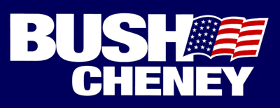
2004 – George W. Bush vs. John Kerry
These two are almost too similar. The colors, the imagery, the message. It’s tough to tell who’s going to come out on top judging by the logos. But, the distinguishing factor here is typeface. Kerry used a serif font, which may have been a little formal for his campaign. Bush used an all-capital, block sans serif font. Bush’s font was much more authoritative than Kerry’s, and that power he portrayed through his font may well have got him the win.
2008 – Barack Obama vs. John McCain
The thing that sets Obama’s logo apart from McCain’s is simple: Obama’s is red, white, and blue; and McCain’s is yellow, white, and blue. Seems like a rookie mistake to me. Why would you leave out red and substitute it with yellow? It doesn’t make much sense, but it seems this logo helped Obama win his first election simply because he utilized the national colors.
2012 – Barack Obama vs. Mitt Romney
The key difference here? The tagline. Both in 2008 and 2012, Obama tried to target the youth by campaigning strongly on the Internet–a tactic he also later used to promote Obamacare. Obama used “BarackObama.com” as his tagline in 2012 to try and drive people to his website, which must have worked. Romney, on the other hand, used the phrase “Believe in America” as his tagline. As strong of a phrase as that is, it doesn’t have the same call-to-action as Obama’s.

