Maintaining a business brand is like maintaining your own personal style. You present yourself in a way that’s consistent with your style, whether that’s through clothes, colors, or a haircut. As trends come and go, you buy new clothes and test new haircuts. So it makes sense that a business brand needs some occasional updates, too.
Make no mistake — going through a brand refresh takes a lot of energy, effort, and resources. So how do you know when it’s time to update, and how do you do it?
At FreeLogoServices, we decided our own brand needed some updating. And today, we’re excited to release our new logo design.
We hope you can learn from our experience. So in this post, we’ll walk you through:
- The reasons why we updated our logo
- What we changed about our brand
- How we chose our new design
Why did we update our logo?
Since FreeLogoServices’ inception six years ago, our company has evolved. From company size to annual revenue to product offerings, we’ve grown in many ways. During this time, managing our brand had fallen to a lower priority, and we knew we needed to make some changes.
We refreshed our brand for three primary reasons:
1. Our old logo no longer fit modern marketing.
In 2011, when FreeLogoServices first launched, the business social media landscape was vastly different. Of course, people had social media accounts. But Facebook and Twitter were primarily for personal use — few businesses used it to communicate with, let alone acquire, new customers. Nowadays, social media is a major opportunity for businesses. But our old logo didn’t fit on these channels — literally.
Like many businesses, we have a long company name. And because we used our company name as our logo, it didn’t fit well in social media profile boxes. It was too wide to be uploaded clearly. These profile boxes are shown in every single published post. They’re a brand’s primary impression.
We needed to find a better icon to fill these boxes.
![]()
2. Our market had evolved.
Many of our direct competitors, as well as other companies that service small businesses, have updated their social media and digital presences. And some new logo design startups have popped up. There’s a lot more noise out there now.
How our customers use our product — their logo — has also changed. Most communication has shifted to digital channels, and it was time for us to do the same. To stay competitive in the marketplace and to better reflect our great customers, we needed to up our game!
3. We wanted to shift our brand focus to the most important people of all — our customers!
Because of our long company name, we had abbreviated FreeLogoServices with a stylized “FLS.” But that’s an internal acronym. Using “FLS” is just a way for us to shorten time at the computer when typing our company name. It means nothing to our customers!
Instead, we wanted to replace it with an eye-catching icon that was meaningful to our customers. With a new icon, we hope to create a logo that customers recognize and learn to associate with our brand.
What changes did we make, and why?
Our update consists of 3 main features: a new icon, dropping the .com, and new typography.
Introducing our new icon
Using our original color pallette, we designed a completely new logo icon. We did away with the vertical line of gray dots to the right of our company name. Instead, we created a new icon and pulled it to the left of our company name. This layout makes it easier to separate the icon as a stand-alone image to be used on social media profiles.
Michael Forsher, our senior designer, led the charge in creating our new design concept. “I felt it was important to pay homage to our original logo design in some way,” explained Forsher. “By using gray dots in our new logo, we still reference the vertical dotted line of the old logo.”
![]()
But in the updated logo, he designed a new layout to represent the user experience of our logo maker, shown in the screenshot below. Each dot represents a different logo template. He highlighted the center “logo” in orange to represent the idea of finding the perfect logo. Forsher joked, “The orange dot is our customer’s logo bull’s eye!”
![]()
No more .com
As previously mentioned, our old logo was too long to fit on many modern marketing channels. Despite the fact that we designed a new icon, we still wanted to shorten our overall logo length. So we dropped “.com” from the end. In this day and age, nearly every business has an online presence. It’s redundant to emphasize that we do too.
In addition, our business has become more than just an online logo maker. For example, we now offer a website development service that includes custom copywriting and design by a marketing specialist. We provide individualized services — not just a self-service platform. The “.com” felt limiting since our services go beyond a simple online platform.
Updated typography
We updated our logo font with Ubuntu. Why Ubuntu? Because it’s modern, has just enough style, yet is still crisp and clean. You can read more about the Ubuntu story here, but to briefly explain, “Ubuntu” is an ancient African word meaning “humanity to others.”
It’s the belief in a universal bond of sharing that connects all humanity. We love that it connects with our mission of helping small businesses connect with others and grow. It jibes with our company culture and reflects our small business customer community.
How we put the plan into action
To create our new logo design, our marketing team held many brainstorming sessions. After several rounds of review and feedback with Craig Bloem, our founder & CEO, we settled on our new design.
When asked about his goals for our brand revitalization, Bloem explained, “2017 has been a great year for us so far in terms of revenue, product growth, and team growth. The company has expanded so much since I first founded it — it was time that we applied my company vision to our branding.”
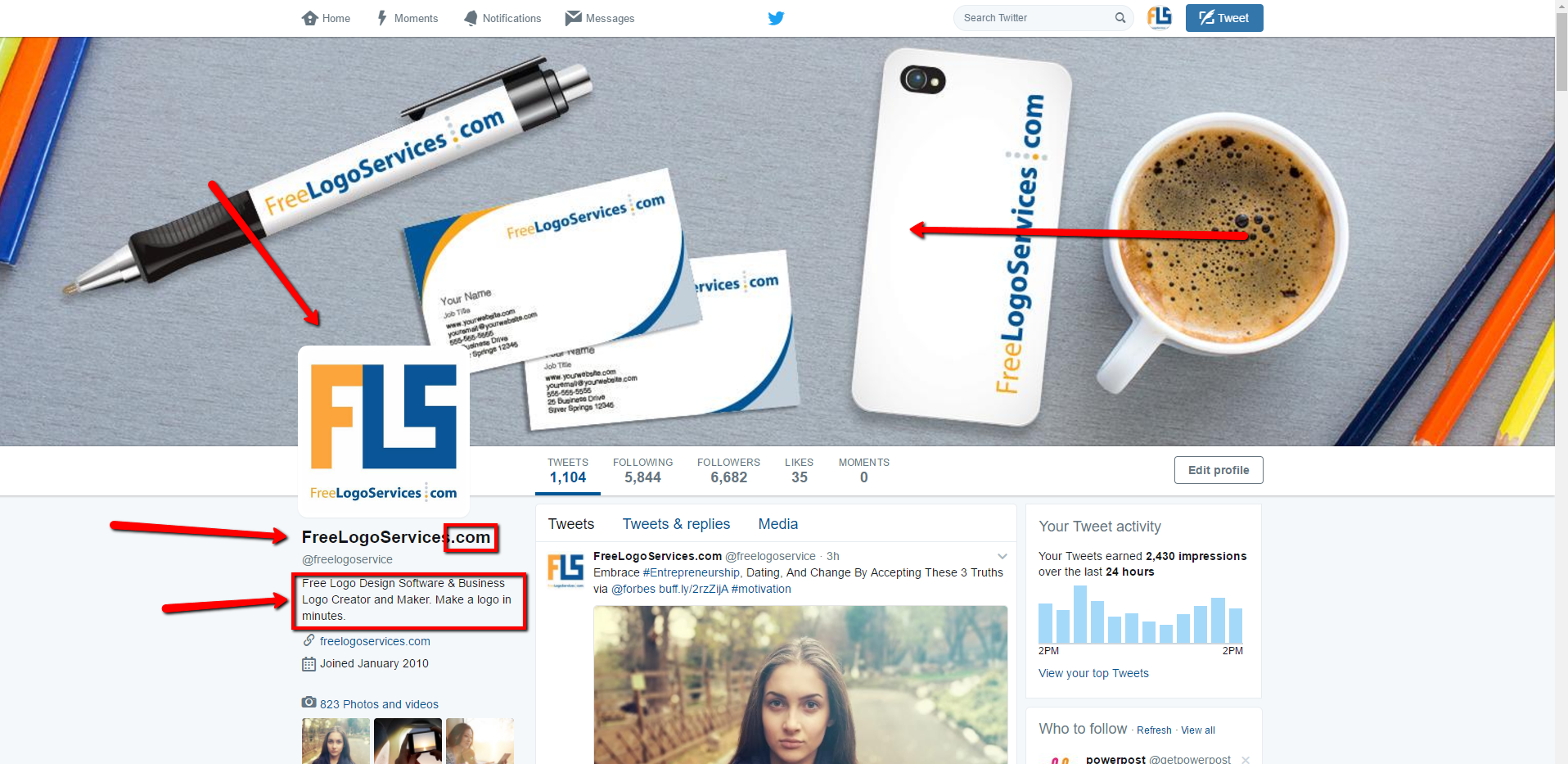
In addition to our logo, we also updated imagery (such as cover photos) and company “about us” descriptions to breath new life into our brand. Instead of the product-focused image you see in the screenshot below, we swapped in a more customer-focused image.
Once we finalized all these pieces, our marketing team dedicated an entire day to updating our channels. Consistency and thoroughness were our top priorities. That meant we had to go through:
- Social media profiles: Twitter, Facebook, LinkedIn, Pinterest, Google+.
- Partner site profiles: Visually, SlideShare, Crunchbase.
- Website: Our homepage needed an updated image file.
- Blog: We updated our background image and logo.
- Email: We had to update our email templates with the new logo.
- Branded content: This also meant we had to replace all old content (infographics, for example) uploaded to sites like Visually, SlideShare, and the blog.
From beginning to end, this process took several weeks. After all, each teammate involved also had their usual day-to-day work to do.
Now that we’ve completed this project, does that mean all these channels will remain static? Of course not! While we probably won’t update our logo design anytime soon, we do plan to freshen up our social media channels with new cover photos from time to time.
Until then, we’re checking this off the to-do list.