Trying to create the perfect logo for your travel blog?
Having trouble knowing where to start?
One of the signs of a truly professional blog is great graphics and an amazing logo that is both memorable and creative. While it can seem daunting to make a logo for your travel blog, it’s worth doing and with a little bit of effort, you’ll be able to create the perfect representation of your brand.
Luckily, we’re here to help. Below we’ll tell you how to create the perfect logo for your travel blog.
1. Do Your Research
Before you start designing your travel blog logo, it’s a great idea to do some research. Try to look at as many logos as you can to start getting some inspiration.
Competing blogs are one of the best places to start looking. Look at what types of logos other travel blogs you admire or compete with have. Check if there are any trends, notice how many colors they use, and take note of anything else that stands out.
Kiersten Rich’s travel blog logo is the perfect example of a whimsical, free-spirited wordmark logo design. As the face behind The Blonde Abroad, she has chosen to keep her blog image-focused. Her theme is old-school polaroid photography meets feminine chic with a muted, earthy, and dusty rose color palette. For her logo design, she combines a Sans Serif font with a cursive, hand-drawn font.
![]()
It can also pay to take a look at the logos of larger companies such as Facebook and Coca-Cola as well. By researching other logos you’ll be able to determine what you like but also how you may be able to stand out from competitors.
2. Consider Using Symbolism
It’s also important to think about symbolism and metaphors when creating your logo. It can be a great idea to include an icon or a symbol in your logo that means something to you and your brand.
Many travel blogs feature a backpack or hiking boots in their logo. While these can be good choices to consider using, you should also try to differentiate yourself from other blogs as well.
For Matt, the mastermind behind NomadicMatt.com, his use of the backpacker icon makes sense here. When one thinks of a nomadic lifestyle, the image of a backpacker usually comes to mind. He’s chosen a no-frills logo with a modern Sans Serif font to ensure that his travel blog speaks for itself. The New York Times best-selling author is all about helping others travel affordably while still having a great time.
![]()
Not feeling the backpacker symbol? A compass, North star, sailboat or mountains are other perfect icons to use as well. Just make sure the icon you choose reflects the type of travel you like doing. If you travel to cities, perhaps a skyline would be more fitting. If you do road trips, look at cars or vans for your logo.
You may also want to go deeper with your imagery. Look at symbols throughout history and try to think of visual double entendres you could use if you really want your logo to stand out.
3. Choose Your Typography Carefully
You’ll also need to think carefully about the font you use when designing your logo. Choosing the right typography is essential.
It’s important to find a font to use that looks professional but that also shows your brand personality. You should also make sure that you use a font that is legible and that visitors will easily be able to read.
Hippie in Heels founder Rachel Jones has chosen a whimsical inked cursive font. Jones’ logo choice works perfectly with her travel blog theme: Girly and sophisticated, yet playful and spontaneous. The font she’s chosen is legible thanks to the generous amount of negative space between the letters.
![]()
In some cases, combining two complementary fonts can have a great effect. You should also experiment with the colors of your font as well as the symmetry within your logo. The dusty baby blue hue you see in Jones’ logo is a light hue, but not so light that it blends in with the white background of her travel blog.
The perfect font can speak volumes about your brand, so make sure you carefully consider which one to use.
4. Pick the Right Colors
Color psychology is also important to keep in mind when designing a logo for your travel site.
Different colors can have different effects on the mind and choosing the right colors can influence how your blog visitors view your brand. Blue can have a calming effect, for example, while red is the color of attraction and excitement.
For Lia and Jeremy, the couple at the helm of PracticalWanderlust.com, they chose bright pastel colors. The mix of seafoam green and coral pink immediately tells you that you’re in for a reasonable, yet entertaining, ride when reading their travel blog. The seafoam green coupled with the no-frills font style is low-key and – for lack of a better word – practical. The coral pink of “Wanderlust” with a cursive font gives off an aura of excitement and desire.
![]()
Be sure to think about the colors you use in your logo carefully. Having no more than two or three colors in your logo is ideal.
5. Keep It Consistent With Your Site
If you already have a lot of infographics, images, and videos on your site, then you need to consider making a logo that stays consistent across mediums. Take a look at any graphics you’ve created in the past and consider the overall look of your site.
When creating a logo you may want to consider where else it will appear (aside from your travel blog). How will the design look on your social media pages? Will you be adding it to brand merchandise down the road? You don’t want to have to re-brand in the future just because your logo doesn’t fit other mediums.
For Daniel James, the solo traveler behind DanFlyingSolo.com, he understood the need for branding consistency across not only his website, but also his social media channels and videos.
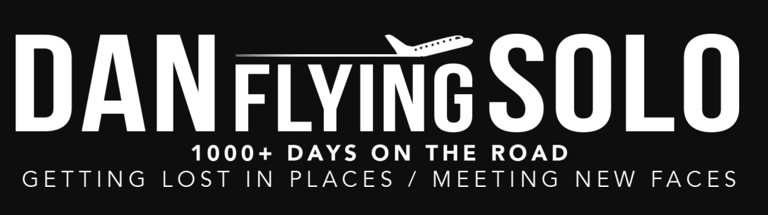
His transparent logo is capable of being transplanted onto any background, which means he doesn’t need to fuss around with multiple versions of his design.
Remember that you shouldn’t only think about your logo itself. You should also consider how it will match the entire look of your blog as well.
Creating the Perfect Logo For Your Travel Blog
If you’re trying to create a great logo for your travel blog, take your time and think long and hard about it first. By using the tips above you’ll be able to create an amazing logo that gives your readers the right first impression.
Looking for help taking your travel blog to the next level? Click here to learn how you can create a stronger brand personality.