If you’re just starting out as an entrepreneur or a business owner, you may not know much about logo design. Before planning out your first logo design, take some time to learn about a few of the tips and tricks involved in creating a memorable, attractive logo. One trick to consider is to use negative space in your logo design.
What is negative space?
![]() According to Creative Bloq, it’s “the space that surrounds an object in an image.” It’s the space without content, the spaces between the words, and the space around symbols in your logo.
According to Creative Bloq, it’s “the space that surrounds an object in an image.” It’s the space without content, the spaces between the words, and the space around symbols in your logo.
According to Creative Bloq, it’s “the space that surrounds an object in an image.” It’s the space without content, the spaces between the words, and the space around symbols in your logo.
One good example of this is the 1986 NBC logo. This iconic logo cleverly displayed the peacock’s feathers in bold color but used negative space to depict the bird’s body. Read on to learn 5 steps on how to use negative space in your logo.
5 steps on how to use negative space in your logo
1. Play a mind game
![]() Negative space is often used to play tricks on the viewer’s mind. Many works of art rely on negative space to communicate another layer of meaning, or to fool the viewer about what he is seeing for the first few seconds.
Negative space is often used to play tricks on the viewer’s mind. Many works of art rely on negative space to communicate another layer of meaning, or to fool the viewer about what he is seeing for the first few seconds.
In the world of logos, one great example of negative space is in the Guild of Food Writers‘ logo. The logo features the name of the organization in a simple sans-serif, black font. Above the name is the nib of a fine ink pen. However, the space between the two prongs of the pen nib is shaped like a spoon. The image is simple, yet it manages to communicate both the concept of high-quality writing and food.
2. Create a symbol by combining letters
![]() If you’re interested in using negative space, try pushing letters or symbols closer together within your logo and see what happens. Have you ever noticed the hidden arrow within the FedEx logo?
If you’re interested in using negative space, try pushing letters or symbols closer together within your logo and see what happens. Have you ever noticed the hidden arrow within the FedEx logo?
The negative space between the “E” and the “x” forms a neat white arrow, aptly illustrating the company’s forward motion. Again, this logo is simple, but it makes such effective use of color and negative space that it has garnered multiple design awards.
3. Make a cut-out
Is there a symbol that you already use for your business? Place that symbol in solid color on a white background and really look at it. Is there part of it that you could cut out to reveal a second shape, one that also reflects your business and mission?
The Girl Scouts organization based its logo on the shape of a girl’s face, putting girls literally at the center of the brand.
4. Put words in the image
![]() You can also make an iconic image bigger and then put text inside it using negative space. The restaurant, Boom! Burgers, features the black shape of a cow, bearing the word “Boom” on its hide in white negative space.
You can also make an iconic image bigger and then put text inside it using negative space. The restaurant, Boom! Burgers, features the black shape of a cow, bearing the word “Boom” on its hide in white negative space.
The exclamation point is crafted cleverly with the cow’s tail. Since cows are often depicted as being spotted black and white, the image makes visual sense to viewers as well as having a big impact.
5. Use the product image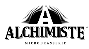
Do you specialize in one particular product? Perhaps you can find a way to subtly include it in your logo by way of negative space. The Alchimiste Microbrasserie in Joliette, Quebec uses “A” as part of their logo; but instead of sticking with a plain capital letter, they turned the negative space inside the “A” into the shape of a beer bottle. There may be a way for you to do something similar with your logo.
To get more ideas for using negative space in your logo design, browse through some of the templates in our logo maker. Remember to keep your use of negative space subtle yet effective, and you’ll succeed in getting the attention of your target audience.