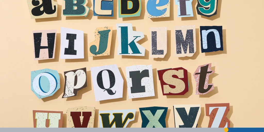
When it comes to fonts, most people fall into one of two camps: team serif or team sans-serif. Some folks swear by the sleek, minimalist look of sans-serif typefaces, while others can’t resist the elegant details of serif fonts.
But whether you’re a designer working on a logo, a writer publishing articles, or just someone who appreciates the finer points of typography, it’s impossible to deny the timeless appeal of serif fonts. They’ve been around for centuries, and in 2025, they’re not just surviving, they’re thriving.
In this article, we’ll explore what makes serif typefaces so distinctive, their history, how they compare with popular sans-serif fonts, the best serif fonts to use in 2025, and how to pair them effectively for your next design project.
- What Are Serif Fonts?
- A Short History of Serif Fonts
- Serif vs Sans Serif: The Eternal Debate
- Why Serif Fonts Are Still Relevant in 2025
- Popular Serif Font Subgenres
- Best Serif Fonts in 2025
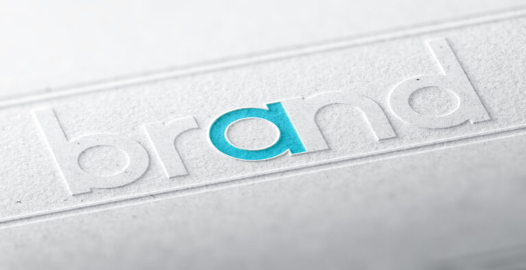
- Famous Brands That Use Serif Fonts
- How Designers Use Serif Fonts in 2025
What Are Serif Fonts?
At its simplest, a serif font is any typeface with little decorative strokes (called serifs) at the ends of its letterforms. These decorative strokes can be subtle and rounded, or bold and angular, depending on the style of the typeface.
Why does this matter?
Because those tiny lines change the entire feel of the text, a serif font can make your words feel elegant, professional, and more polished compared to their sans-serif cousins.
A Quick Example:
- Serif: Times New Roman, Baskerville, Garamond
- Sans-serif: Helvetica, Arial, Futura
One look at each, and you can instantly see the difference. Serif fonts bring a touch of refinement, while sans serif fonts feel cleaner and more minimalist.
The Importance of Font Selection
You might be asking yourself: Does a little embellishment at the end of a letter really make that much of a difference in my content?
The short answer is yes. How your text looks is just as important as what your text says. If a font choice looks out of place, it could ruin the reading experience.
German typographer and book designer, Hans Peter Willberg, had a profound quote that speaks to the elevated importance of font selection.
“Typefaces are not only there to be read, you also see them.”
With sans-serif fonts or serif fonts, your readers will not only read the text, but they will also look at the letterforms as important visual elements of your content.
A Short History of Serif Fonts
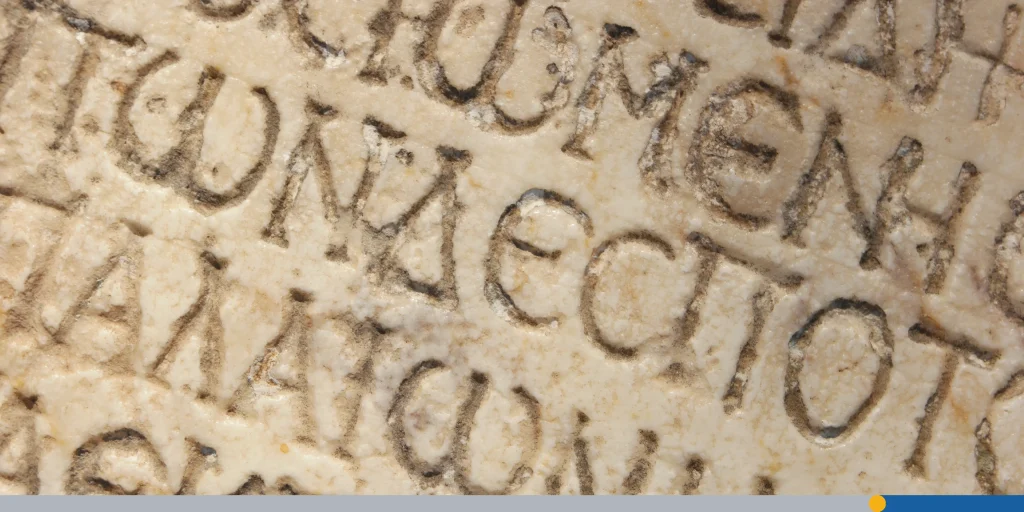
Let’s take a quick look at the fascinating history of the serif font. The origins of serif typefaces go back to ancient Rome.
If you’ve ever seen Roman inscriptions carved into stone, you’ll notice the sharp, flared edges at the ends of the letters. These weren’t just decorative; they helped chiselers end their strokes cleanly, which eventually inspired the serifs in printed typography.
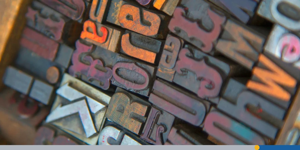
Fast-forward to the 15th century, and serif fonts became the standard for printed books. The earliest serif typefaces were modeled after calligraphy, giving them a natural, handwritten flow. Over time, printers refined them into distinct subgenres like old style, transitional, and modern serifs.
The Sans-Serif Typeface Emerges
The term “sans-serif” was first used in Vincent Figgins’ specimen book from 1832, but it wasn’t until the early 20th century that the sans-serif font saw widespread use.
Fonts like Helvetica, Futura, and Arial lead the charge. These fonts dropped the extra strokes in favor of clean, functional lines, which made them especially suitable for signage, branding, and eventually mobile apps and screens.
But here’s the twist: while sans-serif fonts became trendy for their neutral and contemporary feel, serif fonts never truly went away. In fact, their widespread use in books, magazines, and branding shows just how versatile they are.
Today, many major brands decide to use the serif font for their brand efforts because of the timeless quality of the typeface.
Serif vs Sans Serif: The Eternal Debate
While both fonts have their unique attributes and are often used in tandem, many designers lean towards either one or the other.
Here are the main differences between serif fonts and sans-serif fonts.
- Serif fonts are known for their decorative strokes, high contrast letterforms, and suitability for body copy in books, magazines, and long articles. They’re highly legible in print, making them perfect for book covers and professional branding.
- Sans-serif typefaces, on the other hand, are clean, modern, and minimalist. They’re often considered more functional, making them the preferred choice for mobile apps, web design, and logos that need to look sleek and contemporary.
Example in Action:
- A luxury fashion magazine might use Didot (a high contrast serif) for its headings and body text, while pairing it with Helvetica (a grotesque sans serif) for captions and sidebars.
- A tech startup, meanwhile, might prefer Futura (geometric sans serif) for its logo to appear bold and innovative, while still sprinkling in serifs for editorial articles on its blog.
But here’s the truth: it’s not a competition. Both serif and sans serif fonts have their place, and smart designers seeking balance often combine them for maximum effect.
Try it for yourself! Use FreeLogoServices‘ AI-powered logo design tool to experiment with pairing serif and sans-serif fonts to elevate your logo and branding materials to the next level!
Why Serif Fonts Are Still Relevant in 2025
In an age dominated by mobile apps, screens, and minimalist branding, you might think that serif fonts would fade into the background. But the opposite is true.
Here’s why:
- Technology caught up: Modern screens render high-contrast serifs beautifully, eliminating the legibility issues that plagued early web typography.
- Nostalgia sells: In an era of digital minimalism, brands use serif fonts to create a sense of warmth, trust, and human connection.
- Versatility: From book covers to apps, serif fonts adapt across genres. Their features give them enough character to stand out while still being professional.
- Sophistication: Serif fonts immediately convey elegance, making them ideal for industries like fashion, publishing, finance, and hospitality.
Popular Serif Font Subgenres
Just like sans-serif typefaces have their own categories (geometric sans serifs, humanist sans serifs, and grotesque sans serifs), serif fonts also have subgenres. Understanding them will help you choose the right one for your project.
1. Old Style Serifs
These are the classics, inspired by calligraphy and early printing presses. They feature diagonal stress, moderate contrast, and rounded characters.
- Example: Garamond, Bembo
- Suitable for: Body text, book covers, and long-form articles.
2. Transitional Serifs
A step between old-style and modern serifs, they show more contrast and sharper serifs.
- Example: Baskerville
- Suitable for: Headings, branding, magazines.
3. Modern Serifs
With high contrast and thin, sharp serifs, these fonts scream sophistication. They’re often used in magazines and advertisements.
- Example: Didot, Bodoni
- Suitable for: Luxury logos, advertisements, fashion magazines.
4. Slab Serifs
These fonts feature thick, block-like serifs. They’re bold, strong, and perfect for headlines and logos.
- Example: Rockwell, Courier
- Suitable for: Headlines, logos, advertisements, and retro-inspired projects.
5. Contemporary/Hybrid Serifs
These fonts feature a mix of classic serifs with modern proportions and are designed specifically for screens and mobile apps.
- Example: Merriweather, Lora
- Suitable for: Web design, apps, body text in digital articles.
Best Serif Fonts in 2025
Let’s dive into the stars of the show: the best serif fonts in 2025. These are the typefaces that designers love for their versatility, legibility, and elegant charm.
1. Garamond
A timeless serif font perfect for body copy in books. Elegant yet highly readable, it’s ideal for print and web.
2. Georgia
Designed for screens, making it highly functional for mobile apps and web projects. It balances traditional serifs with modern legibility.
3. Times New Roman
The classic serif font with widespread use. Though sometimes considered old-fashioned, it remains one of the most professional choices for articles, magazines, and academic work.
4. Baskerville
Known for its high contrast and sharp features, it’s perfect for book covers, advertisements, and branding that needs an elegant touch.
5. Didot
Sleek and contemporary, with striking thin-thick strokes. Didot is commonly used in fashion magazines and luxury logos.
6. Bodoni
A close cousin of Didot, but slightly more playful. Great for headings, display text, and advertisements.
7. Playfair Display
A modern take on serif typefaces that’s free and easy to use. Available on Google Fonts, making it accessible for designers seeking high-quality free fonts.
8. Merriweather
Designed for readability on screens. A versatile serif font that pairs well with popular sans-serif fonts like Roboto or Helvetica.
9. Abril Fatface
A bold serif font designed for headlines and display use. Its dramatic style makes it suitable for advertisements and branding.
10. Lora
A balanced serif font with contemporary charm. Works equally well in body text and headlines.
Famous Brands That Use Serif Fonts
Serif fonts are everywhere, even in iconic logos you see daily. Some brands that rely on them include:
- The New York Times: Baskerville-inspired, authoritative, and timeless.
- Vogue: Didot, sleek and fashionable.
- Time Magazine: Bold serifs that demand attention.
- Tiffany & Co.: Elegant serif lettering that screams luxury.
- Penguin Books: Garamond and other serif fonts in their editorial work.
Serif Fonts vs Popular Sans Serif Fonts
To fully appreciate serif typefaces, it helps to see them alongside their sans-serif counterparts.
Some of the most popular sans-serif fonts today include:
- Helvetica: The king of neutral and functional design.
- Futura: A geometric sans serif with circles and sleek design.
- Arial: A widespread, professional, and versatile choice.
Where serif fonts excel in elegance and character, sans serif fonts shine in minimalist clarity and legibility on screens. Smart designers often mix the two to create a sense of balance.
How Designers Use Serif Fonts in 2025
Here are some ways serif typefaces are being used across industries:
- Branding: Companies looking to convey tradition, trust, or luxury often create logos with serif fonts. Think Vogue or Tiffany & Co.
- Print: Books, magazines, and advertisements still rely heavily on serifs for readability and sophistication.
- Web and mobile apps: Thanks to Google Fonts and improved screens, serif fonts are being used in apps and websites more than ever.
- Headings and display: High contrast serif fonts like Didot are perfect for grabbing attention in headlines and display projects.
Pairing Serif & Sans Serif Fonts
One of the best tricks for designers is mixing serif and sans fonts. The contrast creates hierarchy and improves legibility.
Examples of Pairings:
- Playfair Display (serif) and Helvetica (sans-serif): Fashion and lifestyle websites.
- Merriweather (serif) and Roboto (sans-serif): Digital articles and apps.
- Baskerville (serif) + Futura (geometric sans-serif): Editorial and book covers.
By balancing serifs with sans-serif typefaces, you create designs that feel both contemporary and classic.
Conclusion
Serif fonts are more than just a nod to tradition; they’re versatile, professional, and perfectly suited to both print and digital projects in 2025. Regardless of whether you’re designing a logo, building a website, or laying out a magazine, serif fonts bring personality and sophistication that other typefaces can’t always match.
The key is knowing when to use them. Pair them with sans-serif fonts for balance, experiment with different weights for contrast, and choose fonts that align with your brand’s style and message.
Create a unique logo and marketing material that incorporates both serif and sans-serif typefaces using FreeLogoServices‘ innovative design tool. The AI-powered platform makes it easy for you to customize every element of your design, even without prior experience. Get started today!
FREQUENTLY ASKED QUESTIONS
What’s the difference between serif fonts and sans-serif fonts?
Serif fonts have decorative strokes at the ends of letters, giving them a more elegant and traditional feel. Sans-serif fonts lack these strokes, making them cleaner, simpler, and often more functional for screens.
How do serif fonts compare to popular sans-serif fonts like Helvetica or Futura?
Serif fonts offer elegance, tradition, and decorative detail, while popular sans serif fonts like Helvetica, Arial, and Futura provide simplicity, versatility, and minimalist style. The best choice depends on your project.
Are serif fonts still popular in 2025?
Yes! Thanks to modern screens and their versatility, serif fonts are widely used in branding, apps, articles, and even logos. They are now just as popular, if not more popular, than sans-serif fonts for branding purposes.
What are some popular free serif fonts on Google Fonts?
Try Playfair Display, Merriweather, Lora, and Abril Fatface. They’re all high-quality, free fonts perfect for web and print.
What’s the difference between geometric, humanist, and grotesque sans-serif typefaces?
- Geometric sans serifs (like Futura) use simple shapes like circles.
- Humanist sans serifs (like Gill Sans) mimic handwriting for a warmer look.
- Grotesque sans serifs (like Helvetica) are more neutral and professional.
Which serif fonts are best for long-form body text?
Fonts like Garamond, Georgia, and Merriweather are highly legible and perfect for body copy in books and articles.
Can I mix serif and sans-serif fonts?
Absolutely. In fact, pairing the two creates visual balance. Use serif fonts for headings and sans-serif fonts for body text to maximize legibility.