Marketing and branding in the music industry are constantly changing. Thanks to digital music, the way the industry connects with listeners has had to evolve. Inc. points out that social media is the new game changer. In fact, do you recall that Justin Bieber got his big break from YouTube videos?
Video marketing, in particular, has quietly replaced MTV music videos. These videos were our first music ads. Today we’re more likely to find new artists from videos shared on social media. To make a mark on social media, you have to create a call signal, better known as a music logo.
The benefits of music logos
Goal #1: Create a connection on social media. To do this, focus on creating a unique music logo. This logo should be an image that reflects your company across the board. You’ll need it for things like your YouTube thumbnail and other social media profile images.
All in all, logos are the key to online branding. Your logo should give users (or listeners) an overall feel for a music company. From the color to the graphics to the vibe of the logo—it represents everything about your business in a square-shaped pic.
Using logos for music businesses
Speaking of thumbnails and social media profiles, how you use your music logo is the cleft note for your brand. It introduces your business before a consumer takes a listen or step further in connecting with your organization. If you’re trying to attract new talent, musicians to purchase instruments, or listeners to a new artist, your logo is the first symbol they’ll see for your brand.
In other words, you’ve got to give the logo your everything.
Music logo inspiration
To help you out, we’ve put together some music logo inspiration. This should sing bright notes to your brand. Let’s go through these logos and give each one a first impression review. This will help you apply logo brand knowledge to your music logo.
![]()
Abbey Road Studios
Ok, the name of this music recording studio says it all. As the place where the Beatles recorded their records, Abbey Road Studios doesn’t need a lot more for branding. However, a quick peek at their music logo is inspirational. Here are the beats:
- Black and red lettering on a white background
- A symbol of a cube, the two back panels are solid black, the front panel is white and unlined
- Abbey Road Studios in block lettering with Abbey Road in black, Studios in red
And that’s it! Simple, yet effective. The read on this music logo is that Abbey Road Studios is “outside of the box.” They offer bold, creative recording options. What more could a musician ask for?
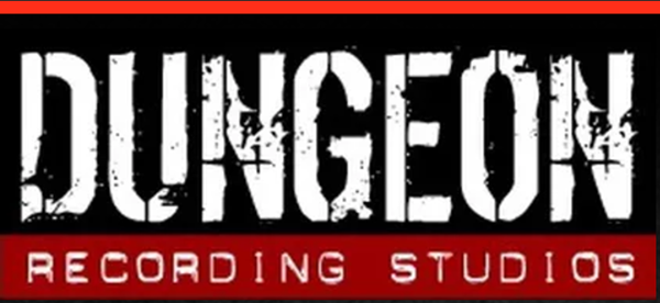
Dungeon Recording Studios
Here is another historic recording studio. Dungeon Recording Studios is the birthplace of the heaviest acts. Outkast, Gnarls Barkley, Janelle Monae and Future….these acts are all part of the Dungeon Family. The studio, located in Miami, Florida, is also home to Iggy Pop, Sofia Vergara, and Dashboard Confessional. Talk about an eclectic music mix! Now onto the logo:
- Another red, black, and white logo
- Dungeon is in large white block letters that are textured to look like concrete walls
- Recording Studios is in smaller letters in, what looks like, handheld label machine printing
- Recording Studios is in white embossed lettering on a brick red background
The feel is very much like what you would see in a dungeon. The coloring, the texturing, and the use of the handheld label design all work. Plus, while the Dungeon Family is predominantly rap and hip hop, the logo is more universal. It attracts acts including rock and roll, emo, and pop with ease.

Shazam
Let’s turn the tables a second to Shazam. This is a music-related business that focuses on streaming music discovery. With Shazam you can identify a song by any lyric or line. This app also lets listeners discover musicians, artists, and charted songs. How does the Shazam app look?
- Includes a symbol of two interlocking Cs that form an S
- The letters are printed in white and centered on a light blue filled-in circle
- The symbol is turned off-key so it looks like it is spinning
Here is the first impression of the Shazam logo. It resembles an album spinning without referencing music at all. That’s a good sign for a music logo! The color blue is calm yet inspiring. The white symbols pop out for a fresh look. The linking Cs represent the fact that Shazam links to new music. It all gives the right vibe for this music business.
Elements to include in a music logo
To give you something to run with, here’s a list of the elements to focus on when finding your music logo muse:
- Music symbols work better than full-scale, detailed images
- Monochromatic color schemes are most common
- Keep the wording to a minimum and let the logo make the music, so to speak
- The more universal, the better to attract more diverse artists
Now, are you ready to bring your music logo to life? Keep looking at other music brand logos to inspire you. Do like we did and give each logo your first impression. Figure out what works, and what fails big time, and apply that knowledge to your own brand logo.
Another important fact to point out, the simpler the logo, the better. Do you know why music businesses stick to monochromatic color schemes? It makes it far easier to translate different colors for online logos.
That’s the key here, you want to create a logo that works for both print and digital music marketing. So make it easier to share your business online with a logo that follows in your footsteps.
> Ready to get started? Take a look at some of our music logo designs.