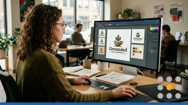
Desktop. Laptop. Tablet. Smartphone. Smartwatch. Phew! While the number of ways customers can find you online continues to grow, the way they’re actually seeing you has continued to shrink. Smaller screens call for new strategies when it comes to getting your message to the masses — and one of those new strategies is to have a logo design that’s responsive.
A responsive logo is one which adjusts — or responds — to the size of the screen on which it’s being viewed, just like a responsive website. Think about a website you’ve visited on your mobile phone that wasn’t responsive. Super hard to read and nearly impossible to navigate, right? Responsive design provides a better browsing experience on smaller screens.
But why would a logo need to be responsive? Well, the fact is, some don’t. A simple, clean logo can be as easily recognizable on a small screen as it is on a large one but, a more complex logo — say, one with words — might benefit from responsive design.
Basically, we’re talking about a stripped down version of the original business logo. As the screen on which it’s viewed gets smaller, a responsive logo will reduce in size and detail to maintain readability. The trick: it must also remain recognizable in order to stay true to the brand. The Chanel logo is a great example of creating a responsive design that remains 100% true to their brand. Coca Cola’s logo is another.
Responsive design isn’t just for the big guys, however. According to a report from GSMA Intelligence, there are now more than 5 billion mobile phone users worldwide. At the same time, BrightEdge research found that 57% of all online traffic is mobile, which means if you have a website, potential customers are finding you — and your logo — on their phones. In addition to all of that, Google’s latest algorithm favors businesses that are mobile-friendly – and the more mobile-friendly you are, the better.
With that in mind, what should you keep in mind when working with a designer to make your logo responsive? We’ve come up with three things:
Keep it Simple.
What can you remove from your current logo design that will still allow you to keep the integrity of your brand? Fewer details such as drop shadows, small copy and fewer colors are some easy ways to make your logo responsive.
Keep it Flexible.
A flexible logo design means it can appear in many more places, giving you much more exposure. The key, again, is to ensure that it can be narrowed down to its bare essentials without losing its identity.
Keep Adjustments Minimal
Wholesale changes aren’t what you’re after here. The key is to simply create a logo design that works on smaller screens. For horizontal designs like the MasterCard logo, that might mean stacking the circles above the brand name. For beveled designs like Mazda’s logo, simply going to a flat black (or white, depending on the background) might be an option.
So, does this mean that all logo designs need to be responsive in nature? Probably not, but an easy way to know if YOURS should be is to view it on your phone. Nobody’s a better judge of your logo than you and if you’re having trouble making it out, chances are potential customers will as well.


