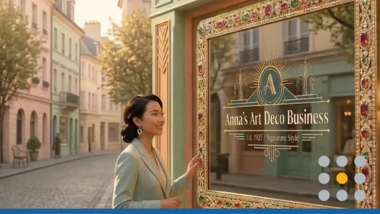
It’s all about minimalist logo designs these days, but creating a minimalist logo is harder than it looks. While we gawk and stare at sleek and modern technology logos, it’s important to understand that their logo design process most likely took a team of designers, countless hours, and thousands (or millions) of dollars to get the design juuust right.
We understand that you neither have the time nor the resources to undergo such a rebranding endeavor, which is why we’ve created a helpful guide on how to create your own minimalist and modern version of your existing logo.
Why you should simplify your logo design
First, let’s delve into why you should simplify your business logo. There are three key reasons why you should trim superfluous design elements from your logo:
- You save time. Removing the fluff from your current logo design can save time when it comes to needing to order promotional products. Business owners are often let frustrated when they’re unable to put their complex design on something as small as a ballpoint pen. Having a minimalist logo design opens the doors to a wider variety of promotional products such as coffee mugs, koozies, phone cases, and hats. With a simplified logo, you can guarantee the design won’t look overwhelming on the product.
- You save money. Does your logo include colors? If yes, how many colors? If your business logo is comprised of more than three colors, then you can expect to pay extra to get your logo printed in color on any promotional products and direct mail flyers. Printing in color is expensive, which is why you will often see some businesses print their logo in black and white.
- You save your brand. These days, customers are engaged more in a brand that advertises themselves in a more visual manner. Designing a logo that’s more streamlined and modern will help bring your business into the new consumer era. Simplified designs will not only allow customers to easily identify your brand, but also help them recall your brand again in the future.
What to remove from your logo to make it more modern
Now that you know why it’s important you re-design your logo and make it more simplified, let’s get into how you can go about doing this. Below is a list of what design elements you can take out of your logo design to make it more minimalist.
Extra colors
As mentioned above, logo designs with more than three colors tend to get busy. You will often find that many logos with multiple colors also don’t have enough negative space. When design elements are too close together and there are too many colors, you end up getting a jumbled mess that takes customers way too long to identify your brand. Don’t forget that more colors also means more money spent on printing your logo.
Frilly fonts
While you may think curly and frilly fonts make a logo design look unique, they are often more of an eyesore. Fonts such as Curlz, Bradley Hand, Papyrus, Vivaldi and Brush Script usually detract from the overall logo design. It’s important that your font matches your intentions for how you want customers to view your business. If you want your business to be viewed as an industry expert or trustworthy, then a frilly font should not be your first choice.
Complex shapes
Intricate shapes should have no place in logo design. Not only do these shapes not transcribe well on print products, but also don’t look professional on websites and other digital marketing material. Logos that include 3D shapes or multiple shapes often look crowded and unbalanced. If you are going to include a shape in your logo design, make sure it is large enough for customers to identify what it is. Badge and emblem logos look great as hexagons, triangles, circles, and squares.
Business slogan
Removing your business slogan from your logo is a bit more tricky than removing these other design elements on the list. Oftentimes your business slogan (if it’s catchy enough) is what gives your business more visibility. In order to determine whether or not to remove this piece of your logo, it’s best to ask your current customers whether or not they would still recognize your brand without the slogan. If the answer is yes, then experiment with some new designs without the slogan. Removing the business slogan will free up valuable space in your logo design which will make other elements of the logo stand out.
Trademark or Incorporation Symbols
Any of these trademark symbols look familiar? ™️ ©️ ®️ The Trademark, Copyright, and Registered Trademark symbols all protect your brand and logo design. However, if you have already filed a trademark for your logo design, then having the symbol on your logo isn’t really necessary. Your brand is already protected by law and you have the paperwork to prove it. Including LLC, Inc, or Co. in your logo design can also disrupt the overall appearance of your brand’s image. Most customers will also leave these details out when recalling your business name, so it’s best to drop them from your logo altogether and just include them on official business documents.
Logo redesign next steps
Already thinking about what design elements you can remove from your logo design? Great! The next thing you can do is contact our professional logo designers to see how they can help you rebrand your business. Our logo designers have experience in creating logos from scratch or editing existing logos. Simply tell our designers what you’re looking to remove from your old logo and they’ll get to work and present you with a handful of new options.
Want to scrap your existing logo and start fresh? That’s perfectly fine as well. At FreeLogoServices, you can create a new logo in minutes. You can design as many logos as you want for free – just pay for the one you love.


