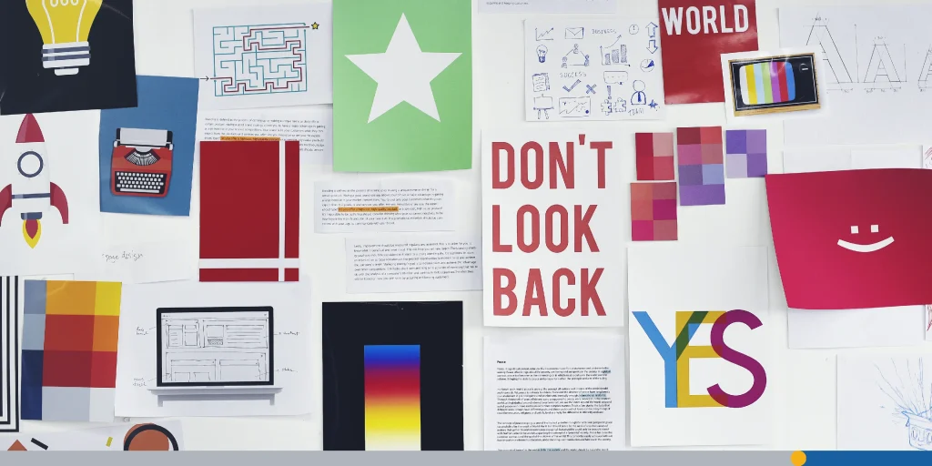
Today, we’re going to discuss something every designer knows about but not everyone can explain: visual hierarchy. It’s that magical set of design principles that guides your eyes, like an invisible GPS, through a website, poster, or app.
From the biggest headline to the tiniest footnote, visual hierarchy makes sure you notice the right stuff, in the right order, at the right time.
In this article, we’ll break down what visual hierarchy is, why it matters, how to create it, and how top designers are using it in 2025.
- What Is Visual Hierarchy?
- Why Is Visual Hierarchy Important?
- The Visual Hierarchy Principles You Need to Know
- How to Create Visual Hierarchy Step-by-Step
- Real-World Examples of Visual Hierarchy in Action
- Visual Hierarchy in Web Design for 2025
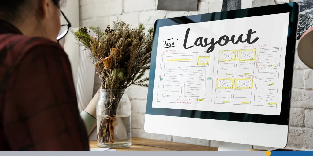
What Is Visual Hierarchy?
Visual hierarchy is the arrangement and presentation of visual elements in a way that suggests importance. It’s the reason you notice a bold headline before the body text or why a bright red button draws your attention faster than a pale gray one.
In short, it’s how designers guide the viewer’s eye across a layout.
It’s not just about pretty designs, it’s about communication. Strong visual hierarchy helps viewers understand your message quickly and clearly.
UI designer Steve Krug had this to say about the principles of visual hierarchy in his best-selling book, Don’t Make Me Think:
“Pages with a clear visual hierarchy have three traits: The more important something is, the more prominent it is. The most important elements are either larger, bolder, in a distinctive color, set off by more white space, or nearer the top of the page, or some combination of the above.”
Why Is Visual Hierarchy Important?
Imagine walking into a cluttered room where everything is shouting for attention. Not very enjoyable, right? That’s what happens when a design lacks hierarchy. A clear visual hierarchy does three big things:
- It draws attention to the most important elements first.
- It helps the user process information in a logical, intuitive order.
- It creates a more enjoyable user experience, reducing visual clutter.
In digital design, especially web design and UI, hierarchy can mean the difference between a click and a user who leaves the website – commonly known as bounce rate. Web designers rely heavily on hierarchy to make websites easy to navigate and guide users toward desired actions (like signing up or making a purchase).
In a recent study, 94% of people said that easy navigation is the most indispensable website feature, while 83% believe that a beautiful/updated appearance on a website is also a must.
The Visual Hierarchy Principles You Need to Know
Ready to start mastering visual hierarchy? Let’s break down the core design principles that help create it.
1. Size & Scale
Bigger isn’t always better, but it is more noticeable.
- Larger elements tend to carry more visual weight.
- The main focal point should be the largest item on the screen.
- Smaller elements still have their place. For example, they’re perfect for supporting information.
2. Color & Contrast
Color isn’t just about branding; it’s a powerful visual cue.
- Use bright colors to attract users’ attention to CTAs or chief elements.
- Employ color contrast (think light text on a dark background or vice versa) to amplify readability.
- Use bold, high-contrast color combinations to highlight high-priority information.
3. Typography & Text Styling
Not all text is created equal. Typography is an often overlooked aspect of visual hierarchy and can play a large role in a page’s overall readability.
- Bold text catches the eye more than regular text.
- Font size helps create contrast between headers and body text.
- Use consistent fonts for brand consistency, but play with size, weight, and spacing to establish hierarchy.
4. White Space & Negative Space
This is the silent hero of design. Sometimes the white space can be just as important as the space that’s filled up with text, graphics, and other design elements.
- White space (or negative space) helps separate groups of information.
- It keeps the entire layout from becoming overwhelming.
- A little breathing room gives individual elements space to shine.
5. Alignment & Placement
Where something sits matters; NNGroup’s eye-tracking studies revealed that users (in left-to-right reading cultures) typically scan heavy blocks of content in a pattern that looks like the letter F.
Graphic designers often utilize the F pattern to decide where to put the most important information.
- Place important elements in high-visibility zones (like the top-left corner in Western cultures).
- Use leading lines or grids to guide the viewer’s eye.
- Consider eye movements and how people typically scan a visual field (F-patterns, Z-patterns, etc.).
6. Gestalt Principles
Straight from psychology class to your design toolkit. Gestalt psychology is a school of thought that seeks to understand how the human brain perceives experiences.
- Gestalt psychology teaches us that the mind groups similar visual elements together.
- This helps create a sense of order and builds on comprehension.
- Deploy proximity, similarity, and continuity to effectively communicate visual relationships.
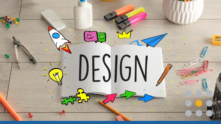
How to Create Visual Hierarchy Step-by-Step
Now that you know the basic principles of visual hierarchy, let’s walk through how to create hierarchy in your designs from scratch.
Step 1: Identify the Essential Visual Design Elements
What’s the point of your design? A product launch? An article? A signup form? Pick your key elements, the things you absolutely want users to see or do.
Ask yourself: What’s the focal point? What action should be taken?
Step 2: Assign an Order of Importance
Not everything can be a headline. Rank each visual element by how important it is. Use size, color, and spacing to reflect that order.
Step 3: Choose a Layout That Supports Your Goals
Let your entire layout support the hierarchy. Consider using grids, columns, or cards. Use design patterns that make sense for your medium (for example, mobile vs desktop).
Step 4: Apply Graphic Design Techniques
This is where the magic happens. Use larger elements, bright colors, and bold text for top-priority items. Use white space to separate and highlight. Align and group related items to lower visual clutter.
Step 5: Test & Adjust
Just like writing, design is all about rewriting. Look at your layout. Where does your eye go first?
Ask others what they notice first. If it’s not the main focal point, tweak it. Use tools like heatmaps or A/B testing on a web page to measure productivity.
Common Mistakes to Avoid
Even experienced designers fall into these traps:
- Giving everything equal importance: If everything shouts, nothing gets heard.
- Ignoring white space: Crowded layouts feel overwhelming.
- Too many colors: Stick to a few color combinations to avoid chaos.
- Bad contrast: Light gray on a light background? No thanks.
- Forgetting mobile: What works on desktop may not translate well to a smaller visual field.
Real-World Examples of Visual Hierarchy in Action
Some of the most iconic brands of all time use simple visual hierarchy principles to make sure their websites have the visual appeal necessary to draw in millions of customers. Here are a few examples that we can learn from.
1. Apple’s Product Pages
Apple’s site is a masterclass in visual design.
- Large product images immediately become the main focal point.
- Short, bold headlines lead into smaller body text, guiding the viewer’s eye naturally.
- Plenty of white space gives each design element breathing room, so the entire page feels calm and premium.
Apple uses hierarchy to convey importance; every element feels intentional, and the minimalism draws attention to the product itself.
2. Spotify UI
Spotify employs color and contrast to highlight what matters most.
- The now-playing bar is bold, persistent, and easy to spot.
- Playlist names are larger and bolder than individual track titles.
- Bright colors and bold text highlight crucial information such as “New,” “Liked,” or curated playlists.
This balance of larger elements (like album covers) and smaller elements (like song metadata) creates a smooth, enjoyable user experience that keeps the focus on music.
3. Amazon’s Product Pages
Amazon has one of the busiest websites on the internet, with an annual revenue of $637.96 billion in 2024, yet it manages to keep things usable thanks to a clear visual hierarchy.
- The product title is large and bold, instantly grabbing attention.
- Price is often displayed in bright colors (like red or orange) against a light background to attract attention.
- The “Add to Cart” and “Buy Now” buttons use bold, high-contrast color combinations, standing out from other elements on the page.
- Smaller elements such as product details, recommendations, and shipping info are arranged around the focal points but never overshadow them.
Amazon’s hierarchy is functional above all; it uses visual cues to highlight crucial information that moves shoppers quickly toward purchase decisions.
4. Facebook’s News Feed
Facebook (now Meta) demonstrates how hierarchy works in dynamic content.
- Posts are structured so that profile names and images act as the main focal point, making it easy to label the poster at a glance.
- Bold text for names and high-contrast images or videos draw attention before the body text of posts.
- Engagement buttons (Like, Comment, Share) are grouped consistently at the bottom, creating design patterns users recognize instantly.
Despite millions of pieces of content competing for attention, Facebook’s layout relies on a strong visual hierarchy to keep the platform scannable and intuitive.

Visual Hierarchy in Web Design for 2025
Web design trends evolve, but strong visual hierarchy is here to stay. In 2025, we’re seeing:
- AI-assisted layouts that auto-prioritize important elements.
- Increased use of dark background themes with neon accents.
- Animated visual cues like bouncing arrows or hover effects to create emphasis.
- Micro-interactions guide users from one section to another.
Web designers must think not only about the arranging elements on the screen but also about motion, feedback, and responsiveness. The modern web page is alive, and so is its hierarchy.
Conclusion
In the end, visual hierarchy is all about communication. It helps your users make sense of what they’re seeing. It lets your most important elements shine, keeps your designs clean, and makes your content more visually appealing.
Whether you’re working on a business website, an app interface, or your next Instagram ad, it’s important to design with purpose. Build hierarchy into every layout and you’ll not only attract users, you’ll keep them.
Having a great logo is a principal part of building a cohesive visual hierarchy. Use FreeLogoServices‘ AI-powered design tools to create a stunning logo you can use across all of your platforms.
FREQUENTLY ASKED QUESTIONS
What is visual hierarchy in graphic design?
Visual hierarchy is the arrangement of visual elements to show their order of importance. It helps guide the viewer’s eye through a design in a clear and purposeful way.
Why is visual hierarchy important in web design?
Because it helps users notice elements that matter most, like CTAs, navigation, and content. A good visual hierarchy makes a web page easier to use and more likely to convert visitors.
How can I create an effective visual hierarchy?
Start by identifying your indispensable elements. Then use size, color, spacing, and alignment to make those elements stand out. Don’t forget to use white space and test how your design performs visually.
Can too much visual hierarchy be bad?
Yes, if it becomes too complicated. Overusing contrast or making too many elements on the page stand out can create visual clutter. Keep it simple and clear.
What’s the difference between white space and negative space?
They’re the same thing. Both refer to the empty areas around visual elements that help define the layout and reduce clutter.
Is visual hierarchy only for websites?
Not at all. It’s used in print, branding, packaging, advertising, and anywhere that design is meant to effectively communicate a message.

