Whenever you think of powerful branding in the logistics and transport industry, only a handful of logos are as instantly recognizable (or as cleverly designed) as the FedEx logo. From its bold typeface to the infamous hidden arrow, the FedEx brand tells a story of innovation, speed, and reliable delivery.
If you’re just starting a transport company or looking to revamp your own brand, the FedEx logo offers a prime example of how smart design and hidden symbolism can skyrocket brand recognition.
Let’s unpack the fascinating evolution of the FedEx logo, from its roots as Federal Express to its current status as an iconic logo used by one of the most trusted logistics brands in the world. Along the way, you’ll uncover how a seemingly simple mark became a visual branding powerhouse, and how you can apply these insights to your own business.
- The Early Days: The Original Federal Express
- The 1994 Redesign: Crafting an Iconic Symbol with the Help of Designer Lindon Leader
- The Famous Hidden Arrow: Logo Design Mastery
- A Spectrum of Services: The FedEx Logo Color System
- Why the FedEx Logo Is So Effective
- What FedEx Got Right: Lessons for Your Transport Company
The Early Days: The Original Federal Express
It all began in 1971 when Fred Smith, a Yale University graduate, envisioned a company that could deliver packages overnight, a revolutionary idea at the time. That idea became Federal Express Corporation, a name inspired by his desire to emphasize speed, reliability, and national importance, echoing entities like the Federal Reserve Bank and even the US government.
In those early days, the logo was fairly straightforward. The first logo simply read “Federal Express,” using a typeface that reflected authority and formality. While professional, it lacked the design magic that would later come to define the famous FedEx logo.
The 1994 Redesign: Crafting an Iconic Symbol with the Help of Designer Lindon Leader
By the early 90s, “Federal Express” was a household name, but customers and employees had already adopted a catchier moniker: “FedEx.” The company wisely chose to embrace this, officially shortening its brand name in 1994. This change required a new logo, and they turned to the legendary designer Lindon Leader of Landor Associates. His mission was to create something that reflected the brand’s core values: speed, reliability, and forward-thinking precision.
Lindon Leader famously said, “I strive for two things in design: simplicity and clarity.” He achieved both with the new FedEx logo. He chose a clean, bold sans-serif font, a custom blend of Futura and Univers, to create a modern and approachable wordmark. But the true genius was hidden in plain sight.
By adjusting the spacing between the “E” and the “x,” Leader formed a perfect arrow in the negative space, a subliminal cue for movement and direction. This “hidden arrow” instantly became one of the most famous “Easter eggs” in design history.
The Famous Hidden Arrow: Logo Design Mastery
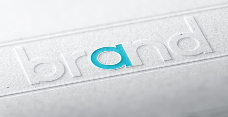
You may have looked at the FedEx logo dozens of times and never noticed the white arrow. But once you see it, you can’t unsee it. Nestled snugly between the uppercase “e” and lowercase “x”, the arrow is a clever use of white space that gives the FedEx logo meaning beyond just letters.
This visual branding trick has earned the logo over forty design awards and is featured in design textbooks around the world. The hidden arrow meaning reinforces FedEx’s core values: global connectivity, forward motion, and confidence.
Even though many companies try to mimic this technique today, few do it with such subtlety and effectiveness. This element moves past being a simple ‘Easter egg’ to become a smart design feature that works on both a subconscious and conscious level.
A Spectrum of Services: The FedEx Logo Color System
Another reason the FedEx logo stands out is its use of a color scheme to distinguish between services. While the primary logo is typically seen in purple and orange, each FedEx service has a different particular color scheme:
- FedEx Express: Purple and orange (the original for express shipping).
- FedEx Ground: Purple and green (green suggests the ground, land-based service).
- FedEx Freight: Purple and red (red is a powerful, high-visibility color for freight).
- FedEx Office: Purple and blue (blue often conveys professionalism and business).
- FedEx Trade Networks: Purple and yellow (yellow is bright and associated with international transit).
This clever design approach not only enhances recognition but also allows customers to instantly identify which service they’re using. For a heavily reliant eCommerce business or a customer looking for air cargo options, these color codes improve usability and trust.
Why the FedEx Logo Is So Effective
There are a few key reasons the FedEx logo works so well and has remained a design icon for decades.
- It is instantly recognizable: The combination of bold type, a unique color palette, and a hidden symbol creates a lasting impression.
- It offers a timeless design: It avoids trendy elements, ensuring it looks just as modern today as it did in 1994.
- It makes a memorable symbolism: The hidden arrow provides a visual metaphor for the brand’s core promise of speed and direction.
- It creates a unified brand identity: The color system allows for a flexible yet consistent brand architecture across many different services.
- It signifies simplicity: It’s clean, clear, and uncluttered, making it easy to read and reproduce on everything from a Boeing 747 to a shipping label.
What FedEx Got Right: Lessons for Your Transport Company
So, what can you learn from the FedEx logo when building your own transport or logistics brand? The principles we see in this example are timeless and can be applied even if you’re designing on a budget.
- Simplify your message: A clear, concise logo communicates trust. Don’t overcomplicate it. When using an online logo maker, start with your company name and focus on a clean font before adding symbols.
- Use negative space: Take inspiration from the FedEx hidden arrow and experiment with white space in your designs. This can be a clever way to add deeper meaning without clutter.
- Pick your colors carefully: Choose a color scheme that reflects your values. A good logo design tool will allow you to easily test different color palettes to see what best represents your brand’s personality. Be it dependable blue or high-energy orange.
- Be consistent: Whether it’s your website, packaging, or vehicle decals, your primary logo should remain recognizable everywhere. Download your finished logo in multiple formats (like PNG and SVG) to ensure it looks sharp across all media.
- Create meaning: Aim for a logo that stands for something. Make it instantly recognizable, not just aesthetically pleasing.
Inspiration for the Future: Your Turn to Design an Icon
Whether you’re launching a local courier service or an international freight company, FedEx brings forward the ultimate inspirational story. You don’t need a massive agency budget to create something memorable. The key is to start with your core values and translate them into a simple, clever, and meaningful design.
Ready to put these lessons into practice? With FreeLogoServices’ AI-powered logo make, you can experiment with fonts, colors, and symbols to create a professional logo that tells your own story of speed and reliability. Start designing today!
FREQUENTLY ASKED QUESTIONS
What is the hidden meaning behind the FedEx logo?
The FedEx logo contains a hidden arrow between the letters E and x, symbolizing speed, accuracy, and forward motion.
Who designed the current FedEx logo?
The current logo was designed by Lindon Leader in 1994 while working at Landor Associates.
What font is used in the FedEx logo?
The typeface is a custom-designed font. Designer Lindon Leader created it by blending and modifying two other fonts: Futura and Univers.
Why does the FedEx logo have different colors?
Different color schemes distinguish between FedEx services like FedEx Ground, FedEx Freight, and FedEx Office.
When did FedEx start using the current logo?
The new logo was introduced in 1994, replacing the original Federal Express design.
What does FedEx stand for?
FedEx is an abbreviation of Federal Express, the company’s original name.
What inspired the hidden arrow in the logo?
The hidden arrow is the result of clever use of negative space, aiming to reinforce the brand’s association with speed and precision.
How many awards has the FedEx logo won?
The famous FedEx logo has won over forty design awards, making it one of the most celebrated logos in the world.