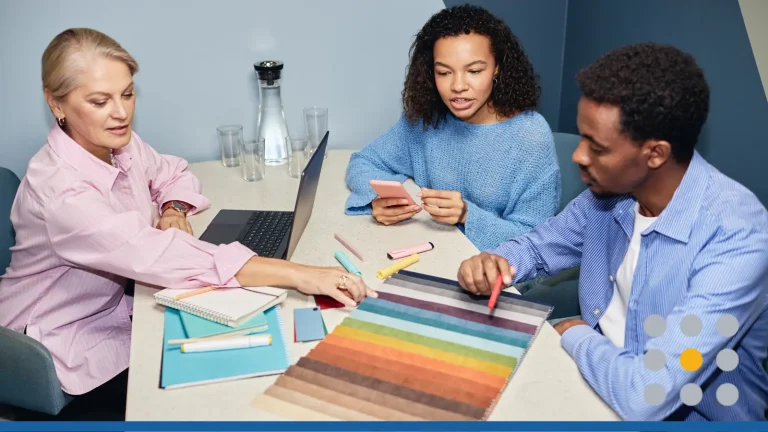
Launching merchandise for your business feels exciting and slightly nerve-wracking. You want your logo colors to feel on brand, not washed out or cheap. Those choices affect how people trust your store, remember your name, and share photos. When your website, merch, and packaging match, your brand suddenly feels real.
CONTENTS TABLE
- Why Logo Colors Look Different on Screen vs. in Real Life
- How Inks, Threads, and Glazes Change Perception
- Choosing Logo Colors for Fabric (T-shirts, Hoodies, Hats)
- Choosing Logo Colors for Paper (Business Cards, Stationery, Packaging)
- Choosing Logo Colors for Drinkware (Mugs, Tumblers, Bottles)
- Adapting Your Logo Color for Different Backgrounds
- Three Ready-Made Merch Color Systems You Can Copy
- How to Test Your Logo Colors Before Committing
Why Logo Colors Look Different on Screen vs. in Real Life
Color on your laptop seems clean and bright, like a polished mockup. Then, the first printed T-shirt or mug arrives, and something feels off. The blue is dull, the black looks soft, or the red leans orange. That gap between screen and reality comes from how light and materials behave.
The Core Screen vs. Print Difference
Screens create color with light shining straight into your eyes. Printed merch creates color with inks, threads, or glazes that absorb and reflect light. Even if the digital color codes match, the result will never look identical. Accepting that difference early makes your decisions more realistic.
“Color is not an integral, visible part of objects. Rather, it is the brain’s response to light reflected by objects. Isaac Newton understood this more than 300 years ago when he wrote that ‘the rays are not colored.’ Despite the advances made in the science of color since then, we cannot understand how colors work together without considering the contribution of artists.” [1]
Maggie Maggio & Stephen Westland, The Pocket Universal Principles of Color, 2025.
RGB vs. CMYK vs. Pantone Basics (Without the Jargon)
Think of RGB like stage lighting. Screens mix red, green, and blue light to produce bright, punchy color. This is what you see in design tools, social media, and your website.
CMYK behaves more like mixing physical paint. Printers blend cyan, magenta, yellow, and black inks into tiny dots. Because ink absorbs light, colors typically look slightly softer and sometimes darker than on screen. Pantone is a huge physical color library. Each Pantone swatch is a specific recipe that printers match directly. Many brands pick a Pantone for their main color, then record CMYK, RGB, and hex values so everything lines up.
FreeLogoServices can boost your merch sales with logo color combinations for merch that stay bold, on-brand, and human. Our intuitive AI logo maker helps you design pro-ready merch graphics, no design skills needed.
How Inks, Threads, and Glazes Change Perception
Even when the numbers match, materials still bend color. Cotton absorbs ink more deeply than glossy paper. Embroidery thread has sheen and tiny shadows. Ceramic mugs add a glassy layer between the ink and your eyes.
Picture pouring the same drink into paper, glass, and metal cups. The taste stays similar, but the experience feels different. Color works the same way across fabric, paper, and ceramics. On soft fabric it looks warmer and less sharp. On coated paper or glazed mugs, it feels brighter and more defined.
Threads can catch highlights and make dark shades appear lighter from some angles. Glazes may push colors cooler or warmer, depending on their tone. That is why sample photos on a supplier’s page can still differ from what lands on your desk. This is also why many brands create simplified production versions of their logos. These versions are tuned for embroidery, screen print, or ceramic printing so the logo reads clearly.
“When you enter a room, see someone walking toward you on the street, or look up at a billboard while stuck in a traffic jam, the first thing you notice is color.” [2]
Tina Sutton, The Complete Color Harmony, 2024.
Choosing Logo Colors for Fabric (T-shirts, Hoodies, Hats)
Fabric merch moves between real life and screens constantly. Your T-shirt may show up in selfies, conference photos, and product shots. Color choices here have to work in person and in camera.
What Makes Fabric Color Tricky
Fabric adds texture and stretch, both of which affect how ink and thread behave. Dark garments can hide details; light garments can highlight stains and shadows. Different print methods, from screen printing to DTG, also change how vivid colors appear.
High Contrast Combinations That Always Work
High contrast is your everyday safety net. It keeps your logo readable across rooms, phones, and event lighting. You want a clear gap between the logo color and the garment color.
Reliable combinations include:
- White logo on black, navy, forest green, or burgundy.
- Black logo on white, light gray, or soft pastel fabric.
- Yellow or gold logo on deep navy or charcoal.
- Bright red or orange on black or dark gray.
For creator or streetwear styles, vivid accent colors with dark neutrals work well. Think bright green on charcoal or electric blue on black.
Heavily patterned shirts and marled fabrics can swallow thin lines. On those garments, keep your logo thicker, with strong shapes that withstand noise.
Light Logos on Dark Garments vs. Dark Logos on Light Garments
Light logos on dark garments communicate boldness and confidence. They work nicely for brands that want a strong visual presence in photos. The light ink pops on the surface, which helps shapes read clearly when the print quality is sound.
Dark logos on light garments feel clean and dependable. They pair well with consulting, B2B, and service brands that want an approachable tone. Dark ink on light cotton normally prints predictably, which is helpful for word-heavy logos.
You should also think about wear and tear. Dark shirts show lint and dust more easily. Light shirts reveal stains, coffee splashes, and sweat more quickly. For staff at events, consider indoor lighting, climate, and expected activity.
Photography matters too. Dark shirts with light logos pop on bright backgrounds. Light shirts with dark logos can disappear when shot against white backdrops.
Colors and Textures That Are Hard to Print or Embroider Well
Some combinations nearly guarantee disappointment. Pale yellow on white, light gray on heather gray, or soft pastel on similar tones often vanish. They may look refined on screen but turn into where did the logo go? on actual fabric.
Extremely bright neons create another challenge. CMYK printing struggles to reproduce them faithfully, so they can arrive dull. If neon is core to your brand, run real test prints instead of trusting digital previews.
Heavy textures make fine details risky. Chunky knit beanies, thick fleece, or ribs on caps can break elegant serifs. Embroidery works more like painting with a small brush than drawing with a pen.
As a practical rule, make lines thicker for embroidery and avoid tiny letters. For stretchy garments, skip very large, solid rectangles of ink that may crack over time.
Choosing Logo Colors for Paper (Business Cards, Stationery, Packaging)
Paper touches customers in quieter but important moments. It appears during unboxing, meetings, and follow-up mail. Getting logo color right here supports your online presence and makes every touchpoint feel cohesive.
Where Paper Fits in Your Brand System
Business cards, inserts, and packaging often sit near your website and email. People may see your card and then search your brand name. When the colors match reasonably well, they instinctively trust your brand more.
Coated vs. Uncoated Paper and How They Affect Color
Coated paper has a smooth, sometimes shiny surface that resists absorption. Ink stays closer to the surface, so colors appear brighter and sharper. Many postcards, flyers, and premium business cards use coated stock.
Uncoated paper feels more natural and slightly textured. It absorbs more ink, softening edges and tones. Colors can look warmer and more muted, which pairs nicely with artisan, wellness, or minimalist brands.
Print the same logo on both stocks, and they will differ. Coated paper makes colors look cooler and more saturated. Uncoated paper produces softer, more relaxed results.
You can lean into that. For example, pair a coated mailer box with strong color and an uncoated thank you card that feels personal and tactile.
Minimal Color Palettes for Affordable Printing
Paper loves limited color palettes. Extra colors can increase costs, especially with specialty processes or spot inks. Many small businesses keep stationery to one or two colors to stay sane with budgets.
Minimal does not equal boring when contrast is strong. A black or deep charcoal logo plus a single accent color feels refined. For example, a black wordmark with one teal underline works across invoices and cards.
Monochrome systems move smoothly between paper and screen. You can maintain the same primary blue across your website, proposals, and printed materials with small tweaks between RGB and CMYK values.
Before sending files, check your printer’s technical notes. They often share details on bleed, safe zones, and file formats that reduce reprints and delays.
Using Spot Colors or Metallics Without Blowing the Budget
Spot colors are premixed inks used for precise shades, often from Pantone. They provide a consistent, punchy color that CMYK cannot always achieve. Vivid oranges, rich blues, and special brand tones often use spots.
Metallic inks and foils create shine and prestige. They look impressive on cards, certificates, and rigid packaging. However, each added spot or metallic effect can lift your print cost noticeably.
A smart compromise is to choose one special finish and keep everything else simple. For example, a gold foil logo with black text, or a single metallic icon with plain black contact details.
Ask your printer to compare pricing for full CMYK against one-color or two-color jobs. Seeing the numbers helps you decide when the extra visual impact is truly worth it.
Choosing Logo Colors for Drinkware (Mugs, Tumblers, Bottles)
Drinkware lives on desks, in meetings, and at breakfast tables. That means your logo has to perform under messy real-world conditions. Light, reflections, and daily wear all shape how people see your brand.
Why Curved Surfaces Behave Differently
Unlike flat paper, mugs and bottles curve away from your eyes. As people rotate them, some parts hit strong highlights while others fall into shadow. Fine details, small type, and subtle gradients get lost quickly.
Solid Logos vs. Detailed Gradients on Curved Surfaces
Solid logos behave better on curved objects. A simple icon or wordmark in one or two colors stays readable from many angles. Gradients, inner shadows, and delicate effects tend to break down or band.
For bottles and tall tumblers, vertical layouts often work better than wide ones. They follow the shape of the container and remain visible as someone drinks or carries it.
If your brand identity depends on gradients, create a flat version for physical products. That way, your digital visuals retain richness while your merch stays clean and practical.
Laser engraving on metal normally produces a single-tone result. Planning a solid version of your logo early keeps those items on brand, too.
Matte vs. Glossy Finishes and Legibility
Glossy finishes reflect light strongly and create hotspots. On a glossy white mug, a dark logo often holds up, but small details may vanish inside glare. Photographers often have to adjust angles carefully.
Matte finishes diffuse light more softly, which reduces harsh reflections. They tend to feel modern and premium, especially for insulated bottles. On matte surfaces, mid-tone colors and detailed logos are easier to read from different viewpoints.
Fingerprints and smudges show differently. Glossy surfaces reveal streaks; dark matte surfaces can show marks from bags or rings. Those small things change how your logo looks after a month of use.
When reviewing samples, place the item under bright light and rotate it. If you struggle to read the logo at arm’s length, you probably need more contrast.
Colors That Pop for Photo vs. Everyday Use
There is often tension between what looks good in photos and what people enjoy daily. Bright neon tumblers grab attention in product shots but may feel loud on office desks. Muted neutrals feel sophisticated in person yet may look flat in certain photos.
Balanced alternatives include:
- White mug with bold single color logo.
- Neutral tumbler with black or navy logo.
- Black bottle with white logo for a sporty look.
Props can carry extra color in lifestyle imagery. A colored notebook, plant, or keyboard near a neutral mug can add visual interest without forcing your logo to overcompensate.
If you sell drinkware through your site, test how your key colors look in real photos. Shoot them near windows, on desks, and in hand to mimic customer environments.
Adapting Your Logo Color for Different Backgrounds
Most logos need flexibility, not one rigid configuration. Building a small logo system helps you stay consistent across fabric, paper, and digital spaces. That consistency reassures customers and supports your broader visual identity.
Why One Logo Version Is Not Enough
A logo that works on white paper may fail on dark fabric. Transparent PNGs used online can become illegible when placed on photos or busy hero banners. A thoughtful system anticipates these scenarios.
Primary Color Version vs. One Color and Inverted Versions
Your primary logo is the star of your brand. It normally combines your main color and supporting tones. This is what you use on your website header, main merch, and full color materials.
Besides that, you should prepare:
- A one-color version, often black or your core color.
- An inverted version, often white for dark backgrounds.
This trio gives you room to adapt without losing recognition. It also makes briefing designers and printers much easier.
FreeLogoServices’ AI-Powered logo assistant helps you quickly explore endless logo color combinations for merch and design a logo you love. Use FreeLogoServices’ marketing tools to print your logo on business cards, promotional products, branded merchandise, and more.
When to Use White, Black, or Single-Color Logos
White logos shine on dark backgrounds and feel modern. Black logos are dependable on white or very light surfaces. Single color logos gain importance when processes like stamping, engraving, or embroidery limit you.
If your main brand color is very light, such as pale yellow or mint, it may struggle as the primary logo color. In those cases, adopt a darker companion shade for the logo itself. Keep the lighter tone for background fields or accents.
A consistent rule helps. For example, Use white logo on navy or black, black logo on other backgrounds, unless legibility suffers. That clarity keeps future decisions aligned.
Creating a Print Safe Alternate Palette
A print-safe palette brings your digital colors into a dependable production range. Think of it as a travel kit your logo uses when leaving the screen. It keeps surprises to a minimum across suppliers.
Start by choosing a main Pantone shade that matches your digital identity. From that, define CMYK, RGB, and hex values. Use those codes in your brand guidelines, print files, and website theme settings.
Then choose a tight supporting set of neutrals and one accent shade. For instance, main blue, dark navy for text, soft gray background, and one brighter accent. Restricting the palette reduces random mismatches over time.
Three Ready-Made Merch Color Systems You Can Copy
Sometimes you don’t want to build a system from scratch. These three setups give you a starting point that already balances fabric, paper, and drinkware. You can customize shades while keeping the structure.
Why Systems Help New Brands
Systems keep you from chasing random color ideas every week. When merch, website sections, and printed materials share logic, your brand feels cohesive. That sense of order builds trust faster, especially for new online businesses.
High Contrast, Bold (For Streetwear/Creators)
This system leans into attitude and visibility. It suits streamers, content creators, indie tech projects, or lifestyle brands targeting younger audiences. Think high energy, lots of photos, and strong social presence.
Core elements:
- Primary colors: Black and white as the foundation.
- Accent: One vivid color like electric blue or neon green.
- Apparel: Black hoodies, charcoal tees, dark caps with white logos.
- Paper: Matte black cards with white logo and accent details.
Drinkware may be matte black bottles with white logos and small accent highlights. The overall feel is bold without overwhelming the eye.
Soft, Minimal (For Wellness/Services)
This system favors calm and approachability. It suits coaching, therapy, wellness studios, and soft-spoken consulting brands. The idea is gentle confidence instead of loud presence.
Core elements:
- Primary: warm beige, light taupe, or soft gray.
- Accent: muted sage, dusty blue, or blush tone.
- Apparel: cream or heather gray tees, soft hoodies, neutral totes.
- Paper: uncoated stationery with sparse layouts and light typography.
Drinkware may feature off-white mugs with a small charcoal logo. Accent colors appear in small icons, inner mug glazes, or packaging fills.
Classic Corporate (For Professional Services)
This system keeps everything clean and consistent. It suits accountants, legal practices, agencies, and B2B software teams. The energy is professional yet still human.
Core elements:
- Primary: medium or deep blue.
- Secondary: gray, silver, or dark charcoal.
- Accent: subtle brighter blue or soft green.
- Apparel: white shirts with navy logo, navy polos with white logo.
Paper pieces on coated stock with strong blue logos feel polished. Stainless tumblers with single color logos slide comfortably into conference swag and client gifts. If you want help building a strong matching website, a custom website design service can help translate this system online while you focus on your business.
“To speak about color is to speak about emotions, of feelings that arise when we observe the graphic elements to which we are constantly exposed. Each color corresponds to a psychological reaction that communicates, without the need of words or shapes, a message that will ultimately grant personality to the product, material or brand that accompanies it.” [3]
Wang Shaoqiang, Color Code. Branding & Identity, 2016.
How to Test Your Logo Colors Before Committing
Treat your first merch batch like a pilot project. Testing saves money, sharpens your eye, and gives you real world feedback. Many strong brand systems started with rough samples on an office table.
Why Testing Beats Guesswork
Colors can look great on your monitor and fall flat in a mailbox. Samples reveal how inks, fabrics, and finishes behave under real lighting. They also show how your logo appears in smartphone photos, which is a deciding factor for social proof.
Simple Mockups and Printed Test Swatches
Begin with digital mockups for T-shirts, cards, and mugs. Place your logo at realistic sizes, not huge presentation mode versions. Then view these mockups on both bright and dim screen settings.
Next, print quick test sheets on a regular office printer. Even though it’s not perfect, it shows whether your logo keeps contrast on real paper. If it feels weak here, you likely need bolder color or thicker lines.
When working with print-on-demand vendors or local printers, ask for physical samples. Many offer discounted sample programs or small minimum orders. Treat those as your color rehearsal before scaling up.
Organize your logo files, color codes, and sample photos in a shared folder or simple project hub. That structure helps if multiple people manage your website and branding.
Common Red Flags When Reviewing Samples
When the samples arrive, review them deliberately, not in a rush. Lay everything out, step back, and check whether the items still feel like your brand at a glance. Your first emotional reaction often tells the truth.
Watch for these warning signs:
- The logo looks faint or low contrast from a distance.
- Text turns fuzzy on textured fabric or small items.
- Colors differ noticeably between items meant to match.
- Gradients appear banded, muddy, or patchy.
Also, pay attention to tone. Does the merch feel harsher, louder, or softer than your actual brand voice? When there is a mismatch, color and material choices normally sit at the root.
Fixing these issues may involve adjusting your logo versions, simplifying details, or switching to safer color combinations. That small cycle of testing and tweaking helps your first full run feel like a confident investment.
Follow this quick sequence to design and test your merch-ready logo:
- Generate your logo for free: Use an AI logo tool to create a distinctive wordmark with one supporting icon for your merch branding.
- Preview your logo on promotional products: Showcase it on drinkware, apparel, and pens to see how your logo color combinations for merch perform in the real world.
Bibliography
- Maggio, M & Westland, S. 2025. The Pocket Universal Principles of Color: 100 Key Concepts for Understanding, Analyzing, and Working with Color. First Edition. Gloucester, Massachusetts: Rockport Publishers.
- Sutton, T. 2024. The Complete Color Harmony: Deluxe Edition: Expert Color Information for Professional Color Results. First Edition. Gloucester, Massachusetts: Rockport Publishers.
- Shaoqiang, W. 2016. Color Code. Branding & Identity (Graphic Design Elements). First Edition. Barcelona: Promopress.