There’s a reason most logo design advice feels like it doesn’t apply to you. It’s because your business isn’t like most businesses. A solo founder sketching a side-hustle idea on a napkin and a 10-year-old company preparing to rebrand have completely different needs, budgets, and timelines. Treating them the same is a recipe for wasted time and money.
This guide breaks the logo design process into three stage-specific workflows. You’ll get a clear set of logo design steps matched to where your business actually is right now, plus realistic timelines, budget expectations, and the tools that fit each stage. No guesswork, no one-size-fits-all advice.
Your Current Business Phase Changes How You Design a Logo
The logo design process isn’t a fixed recipe. It changes shape depending on three things: how much time you have, what you can spend, and how well you know your brand’s personality.
So, in this stage, we’re addressing the obstacles that hold you back. Competitor research and market analysis are true necessities to win this battle.
Different Constraints: Time, Money & Information
When you’re idealizing your logo, you may not even have a final business name. You’re testing concepts. You need speed and flexibility. At launch, you’ve got customers, a website, and even packaging. Your logo has to work harder and look consistent across more places. At the rebrand stage, you’re carrying years of brand recognition. The stakes are higher, and so is the investment.
A startup that spends $10,000 and four months on a logo before validating a single customer is making a costly bet. Meanwhile, an established business downloading a quick logo from a free tool and calling it a rebrand is leaving equity on the table. The right logo design workflow matches the moment.
Why Perfectionism Is Dangerous at the Idea Stage
Here’s a trap many first-time business owners fall into: trying to create the perfect logo before they even know if their idea has legs. Perfection feels productive, but it’s not. It’s a delay tactic dressed up as a branding strategy.
At the idea phase, your logo is a placeholder with purpose. It needs to be clean enough to put on a landing page and a business card. That’s it. You’ll almost certainly change it later, and that’s fine. The businesses that grow the fastest treat their early logos as experiments, not monuments.
Workflow 1: Idea & Pre-Launch Stage Logo
If your business is still in the idea or pre-launch stage, your logo has one job: Make your concept look real enough to test with actual people. You don’t need a full brand system yet. You need something simple and clean to create the initial ripple in the market. Something easy to swap out later.
Inputs: What You Need Before You Start
Before opening any logo design tool, write down these four things:
- Your audience: Who are you building this for? Try to picture your ideal customer. Even a rough answer helps.
- Your product or service: What are you actually offering? What problem does your product address?
- Your business name: Even a working title is enough.
- Two to three adjectives: How should your brand feel? (For example: bold, friendly, minimal.)
That’s your creative brief. You don’t need more than this at the idea stage.
Steps: Brainstorm, Build & Shortlist
- Brainstorm visual directions: Think about what colors, shapes, and styles match your adjectives. Create a mood board, look at brands you admire, and note what draws you in. Use design websites to find inspiration and explore different logo concepts and styles.
- Try a logo maker: Our tool, FreeLogoServices, lets you generate professional-quality logos in minutes. Enter your business name, pick your industry, and customize from there. It’s free to start, and you only pay when you find something you love.
- Shortlist two to three concepts: Don’t agonize. Pick the ones that feel right, test them with a few people you trust, and move forward with the winner.
Output: A Simple, Versatile Logo
Your deliverable at this point is a single logo that works in two key places: a website header and a business card. It should be legible at small sizes and look clean on both light and dark backgrounds. That’s success. Everything else can come later.
Source: Envato AI
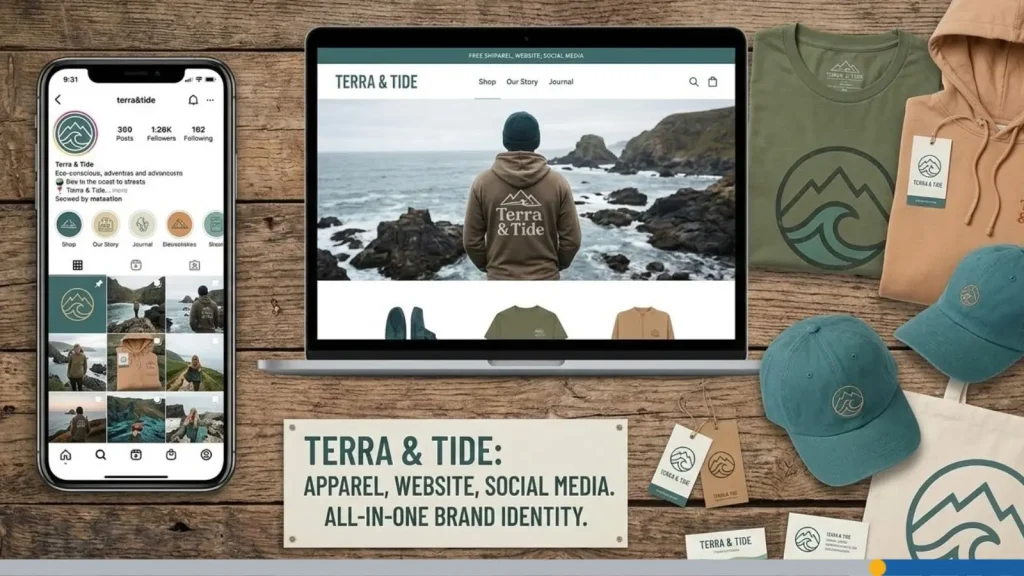
Workflow 2: Launch & Early Growth Stage Logo With Scaling in Mind
You’ve validated your idea. Customers are coming in. Your website is live, and you’ve got social media profiles, packaging, or email templates. Your goal now needs to hold up across all of these touchpoints without looking inconsistent.
You’re looking for a recognizable brand identity, making sure your logo is adaptable across media, like social media, print, and signage, so your brand stays consistent and visible at all times.
Inputs: What’s Changed Since the Idea Stage
By now, you have new information that your idea-stage self didn’t:
- Customer feedback: What do people say about your brand? What words do they use?
- Usage data: Where does your logo actually appear? Website, social media, invoices, signage?
- Basic brand positioning: You know who your competitors are and where you fit in the market.
This data is gold. Feed it into your design decisions.
Steps: Refine, Expand & Define
- Refine or redesign: Does your existing logo still work, or has your brand outgrown it? If the core concept is solid, refine it. If not, start fresh with a clearer direction.
- Create logo variations: Build a system with a primary logo, a horizontal version, a stacked version, and a standalone icon for small spaces like favicons and social media avatars. This gives you flexibility without creating brand confusion.
- Define your color palette and typography: Lock in your brand colors with specific hex codes and Pantone values.
Pick colors based on color psychology to help you focus on specific customer desires and needs. Choose a primary typeface and a secondary one for body text. Font choice here is vital as it can appear on promotional materials, from personalized mugs to hoodies in the future. This keeps everything consistent across your website, print materials, and marketing.
Output: A Full Logo System & Basic Guidelines
At the end of this workflow, you should have:
- A primary logo with at least two layout variations (horizontal and stacked).
- A standalone icon or logomark.
- A defined color palette (with hex, RGB, and Pantone codes).
- One to two brand typefaces.
- A short brand guidelines document that any designer or team member can follow.
This is the point where your logo stops being a picture and starts being a brand system.
Workflow 3: Rebrand & Establish Business Logo When Needed
Rebrands are expensive and time-consuming, and can go wrong very fast. For example, think of the GAP logo debacle. Before starting one, make sure you’re doing it for the right reasons. A rebrand makes sense if your business has shifted direction, your audience has changed (demographic, price bracket, etc.), your current logo no longer reflects who you are, or you’re entering new markets that require a different visual identity.
Legal protection for your business logo can also help secure your assets from unauthorized use of your brand’s visual identity. You can register a trademark online with the United States Patent and Trademark Office (USPTO) using the Trademark Electronic Application System (TEAS) or the newer Trademark Center portal.
Boredom with your own logo isn’t a reason to rebrand. Neither is copying a trend you saw on social media. If your current identity still works for your customers, a refresh (not a full rebrand) may be all you need.
Inputs: The Stakes Are Higher
Here, you’re working with a much larger set of inputs:
- Brand equity: How much recognition does your current logo carry? Throwing it all away has a real cost.
- Competitors: What does the competitive visual field look like? Where can you differentiate?
- Legal constraints: Trademarks, licensing agreements, and regional considerations all come into play.
- Internal teams: Leadership, marketing teams, sales teams, and sometimes even investors all have opinions. Getting alignment early is worth the effort.
Steps: Audit, Strategize, Design & Roll Out
- Audit your current brand: Document what’s working, what’s not, and what’s outdated. Gather feedback from customers, employees, and partners.
- Develop a brand strategy: Define your positioning, messaging pillars, and visual direction before anyone opens a design tool. That’s the graphic designer’s job. This step prevents expensive do-overs later.
- Run multiple rounds of concepts: When this point is reached, you’re working with professional designers or an agency. Expect two to three rounds of concepts with structured feedback sessions.
- Test with real audiences: Before committing, test your shortlisted concepts with a sample of your target audience. Look for recognition, emotional response, and clarity.
- Build a rollout plan: A rebrand isn’t done when the logo is approved. You need a phased plan to update your website, social media, packaging, signage, email templates, and marketing materials. Rolling out everything at once creates a cohesive first impression.
Output: An Evolved Logo & Full Brand System
A completed rebrand delivers:
- An updated or new logo with full variations (color, monochrome, reversed).
- A complete visual identity (colors, typography, photography style, iconography).
- Updated brand guidelines covering both visual and verbal identity.
- A comprehensive brand style guide to maintain visual consistency and provide clear instructions for logo and font usage across all platforms and materials.
- A rollout communication plan for internal teams and external audiences.
- Updated marketing collateral across all channels.
When to Use a Logo Maker vs. Hiring a Designer
The correct tool depends on where you are. Using a high-end design agency for an unvalidated idea is overkill. Using a logo maker for a Fortune 500 rebrand doesn’t always work. Once you do have your logo, here are 10 spots to use it. Below, we tackle how to match the tool to the phase.
| Business Phase | Best Tool | Budget Range | Timeline | Why It Works |
| Idea/Pre-Launch | Logo maker (like FreeLogoServices). | Free to $50 | 1 day to 1 week. | Fast, risk-free, lets you test ideas without commitment. |
| Launch/Early Growth | Freelancer or boutique studio. | $300 to $2,000 | 2 to 4 weeks. | Balances affordability with custom design and strategy. |
| Rebrand/Established | Design agency or senior freelancer. | $5,000 to $50,000+ | 2 to 6 months. | Full strategy, multiple concepts, and a rollout plan. |
Smooth sailing happens when you have the right tools, especially when they’re user-friendly and offer customizable templates you can make your own.
How to Brief a Designer at Launch vs. When Rebranding
- If you’re hiring a designer at the launch phase, keep your brief focused. Share your brand adjectives, your audience, your competitors, and two to three examples of other logos you like. That’s enough for a freelancer to deliver strong concepts.
- For a rebrand, the brief is a full document. Include your brand audit findings, your competitive analysis, your positioning statement, stakeholder requirements, and any legal or technical constraints. The more context a designer or agency has, the fewer rounds of revisions you’ll burn through.
How to Avoid Common Logo Design Mistakes at Any Stage
What makes a great logo? The most enduring logos are simple, memorable, relevant, versatile, and timeless. No matter where your business is, these three mistakes keep showing up.
1. Overcomplicated Shapes & Tiny Details
Complex logos look impressive on a large screen but fall apart everywhere else. When your logo gets shrunk down for a social media avatar, a business card, or an app icon, all those fine lines and tiny visual elements turn into a blurry mess. Simple, clean shapes are easier to recognize and far more versatile.
The fix: Design at the smallest size first. If your logo works as a 32×32 pixel favicon, it’ll work everywhere else.
2. Trend-Chasing vs. Timelessness
It’s tempting to follow whatever design trend is popular right now, but trends fade fast. A logo built entirely on a passing style (thin hairline fonts, extreme gradients, or the minimal tech look of the moment) can feel dated within a couple of years.
The fix: Stick to classic design principles. Use simple shapes, proven typefaces, and a restrained color palette. Your logo should still look good five to 10 years from now.
3. Forgetting Real-World Use (Print, Embroidery & Small Sizes)
Your logo doesn’t live only on a screen. It may end up on a business card, a pen, an embroidered polo shirt, or a trade show banner. If the design only works on a white digital background, you’ve got a problem.
The fix: Test your logo on mockups early. Print it. Put it on a dark background. Shrink it. Stretch it (don’t actually stretch it, but check that it holds up at different aspect ratios). A good logo works across every medium your business may touch.
Ready to Start? Try FreeLogoServices Now
Your business stage shapes logo development, but the first step is always the same: just start. If you’re at the idea or launch stage, you don’t need to spend thousands or wait weeks. FreeLogoServices lets you create, customize, and download a professional logo in minutes. It’s free to try, and you only pay when you find a design you love.