Your logo is the face of your brand, the visual signature that people instantly associate with your business. But even the most stunning logo design can lose its magic if it’s displayed at the wrong size. Imagine your beautifully crafted company logo stretched out of proportion on your website header or pixelated in a social media profile picture. Not exactly the impression you want to make, right?
Logo sizing is one of those sneaky little details that can make or break your brand consistency. It doesn’t matter if you’re designing for a billboard, a business card, or an Instagram profile photo; using the correct logo size ensures that your brand always looks sharp, professional, and recognizable across every platform.
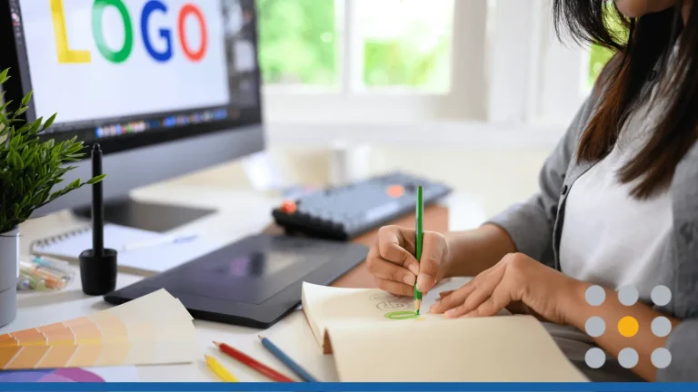
Today, creating a logo doesn’t necessarily require formal education in graphic design. Thanks to the myriad of tools and resources available online, you can create your business’s logo yourself. Unfortunately, many businesses make a few common mistakes: uploading logos that are too big (which slows down web pages), too small (causing blurry images), or the wrong aspect ratio for the space. The result? A brand that looks inconsistent and unpolished
In this article, we’ll break down everything you need to know about logo sizes—from social media logo dimensions, print logo specifications, email signature best practices, and even how to optimize your logo files without losing quality.
- Logo Guidelines: Pixels, Points & Inches
- Introducing Vectors
- File Formats Explained
- Aspect Ratios: Horizontal, Vertical & Square
- Logo Sizes for Social Media
- Website Logo Size
- Logo Sizes for Print: Dimensions & Specifications
- Email Signature Logo Best Practices
- Logo File Optimization Strategies
- Troubleshooting Common Logo Sizing Issues
- Learn More About Logo Sizes at FreeLogoServices
Logo Guidelines: Pixels, Points & Inches
When most people look at a screen, they see text and images. But designers understand that everything you see is made up of tiny dots, called pixels. Millions of pixels—over two million for a standard 1080p panel—form the basis of everything you see, from the text you read, to the images that inspire you.
The Problem With Pixels
But the problem with pixels is that they don’t scale, and 100 pixels on your cell phone is going to look a lot different than 100 pixels on your laptop. That’s because the size of any image depends on the number of pixels per inch, or PPI, of your device.
The pixel was actually invented in 1957 by computer scientist Russell Kirsch. Kirsch created a small, 2-by-2-inch black-and-white digital image of his son, Walden, as an infant using square pixels. In that moment, Kirsch made a tremendous breakthrough and a massive mistake.
The square shape of the pixels meant that image elements can look blocky, clunky, or jagged—just generally not as smooth as real life. There’s even a word for this effect: “pixelated.” This issue was not lost on Kirsch. During a 2010 interview, he reflected on his invention:
“Squares was the logical thing to do. Of course, the logical thing was not the only possibility, but we used squares. It was something very foolish that everyone in the world has been suffering from ever since.”
Points Offer a Solution
To combat the ongoing issue of consistent sizing across different screens and devices, points provide a suitable solution.
In simple terms, points help bridge the gap between the many ways our devices interpret size. Each screen has its own pixel density (how tightly pixels are packed), and without a universal measurement, designers would constantly struggle to predict how large an image will actually appear.
A point (pt) is a standardized unit that represents 1/72 of an inch. This system dates back to traditional print typography but has found new life in digital design. Why 72? Historically, most computer screens were calibrated to display 72 pixels per inch (PPI), which made one point roughly equal to one pixel. That meant what you saw on-screen would closely match what came out of your printer—at least in theory.
PPI vs. DPI
However, as screen resolutions advanced, things got more complicated. Modern displays can easily exceed 200 or even 400 pixels per inch, while print still operates around 300 dots per inch (DPI) for crisp results. The difference between PPI (pixels per inch) and DPI (dots per inch) is significant:
- PPI: Relates to screen resolution, how sharp your image looks on monitors or mobile screens.
- DPI: Applies to print, how much ink detail is placed on a physical surface.
By working in points, designers have a unit that translates more consistently between digital and physical formats. Points act as a kind of “equalizer” between pixels and inches, giving designers a predictable frame of reference when resizing or exporting logos for various uses.
In practice, this means if your logo is designed in points, it will maintain a consistent physical size, whether it’s viewed on a tablet, desktop, or printed on a business card (as long as the proper scaling rules are followed).
Introducing Vectors
Although pixels are an important building block of digital imagery, when it comes to logo design and determining the perfect logo size, one golden rule stands above the rest: Always create your logo using vectors, not pixels.
At first glance, a logo might look fine as a regular image—after all, you can open it, resize it, and drop it into a document with ease. But when you zoom in or try to print it larger, those once-crisp edges start to blur. That’s because in pixel-based images, or raster graphics, each pixel contains a single color value. Once you enlarge that image, those pixel squares become visible, turning your professional logo into a blocky, fuzzy mess.
Vectors, on the other hand, are built differently. Instead of storing color information for individual pixels, vector graphics use mathematical paths (think of them as instructions) to describe shapes, lines, and curves. These paths scale infinitely, meaning your logo can be resized from a tiny favicon on a browser tab to a massive billboard without ever losing clarity or sharpness.
Why Vectors Matter
So why does this matter so much? Because in today’s world, your logo needs to live in hundreds of different places—from email signatures and website headers to profile photos, business cards, and coffee mugs.
Each of those platforms requires a different logo dimension and file format. With a vector, you can easily export your design into multiple sizes and formats without redrawing or compromising quality.
For example:
- The same vector logo used on your website can be scaled down to a 300 × 100 px email logo or scaled up for print materials at 300 DPI, and it will still look perfect.
- You can create horizontal, stacked, or square logo variations from one master file, maintaining your brand consistency across every touchpoint.
- Vectors also make it easier to apply color variations, full color for web, black and white for print, or simplified versions for embroidery or engraving.
A raster logo (like a JPG or PNG), on the other hand, locks your design into a fixed resolution. You can scale it down to fit smaller spaces, but enlarging it will degrade its quality. That’s why trying to take a logo straight from your website and slap it on a poster often results in that dreaded pixelated look.
Here is a simple breakdown of the difference between a vector and a raster file:
- Vector files (SVG, EPS, AI): Use mathematical paths to form shapes. They’re ideal for logos because they stay crisp and high-resolution at any size—perfect for print, web, and large-format materials.
- Raster files (PNG, JPG): Are made up of pixels. They’re great for online use but lose quality when resized beyond their original dimensions.
File Formats Explained
Once you’ve designed your perfect logo, you’ll need to export it in the right file format for different uses. This part is where many people, even experienced designers, get tripped up. Each format has its strengths, weaknesses, and ideal contexts. Choosing the wrong one can lead to fuzzy logos, weird backgrounds, or files that just won’t load correctly.
Let’s break down the most common file types you’ll encounter, and when to use them to keep your logo looking consistent everywhere it appears.
PNG (Portable Network Graphics)
The PNG file format is a fan favorite among web designers. PNGs support transparent backgrounds, which means you can easily place your logo over any color, image, or website header without seeing an ugly white box around it.
This makes PNGs perfect for:
- Website headers and footers.
- Social media profile photos and cover designs.
- Email signatures and presentations.
PNGs are lossless, meaning they retain full image quality even after multiple edits or saves. However, that high quality comes at a cost. PNGs can be larger in file size, which may slow down web pages if not properly optimized. To avoid that, always compress your PNGs before uploading them online using tools like TinyPNG or ImageOptim.
JPG (Joint Photographic Experts Group)
JPGs are the workhorse of digital imagery; lightweight, widely supported, and easy to share. They’re fantastic for photographs or full-color images, where smooth gradients and complex shading matter more than sharp edges.
But for logos, JPGs have one big flaw: they don’t support transparency. That means if your logo has a non-rectangular shape or sits on a colored background, it’ll be trapped inside a solid box. Not ideal for a modern, clean design.
JPGs also use lossy compression, which slightly reduces image quality each time you save the file. Over time, this can cause visible blurring or artifacts. That said, JPGs are still useful for sharing mockups, proofs, or marketing visuals where transparency isn’t needed.
SVG (Scalable Vector Graphics)
If there’s one format that every brand should use online, it’s the SVG format. SVGs are vector files, which means they can scale to any size without losing sharpness.
SVGs are also incredibly lightweight, making them ideal for web performance. Unlike pixel-based images, SVGs are made up of mathematical paths that browsers can render smoothly at any resolution. They load fast, look perfect, and retain detail, no matter how large or small they appear.
EPS (Encapsulated PostScript)
When it comes to print, the EPS file format reigns supreme. EPS is a vector-based format beloved by professional printers and designers because it guarantees high-resolution results.
EPS files preserve all your logo’s clean lines and scalable elements, just like SVGs, but they’re specifically designed for use in programs like Adobe Illustrator, InDesign, or CorelDRAW. They also support CMYK color profiles, which are key for accurate color reproduction in print.
Because of their compatibility with professional printing software, EPS files are often the master source file that designers hand off to print shops or marketing teams.
Aspect Ratios: Horizontal, Vertical & Square
When it comes to standard logo sizes, there’s actually no universal “one-size-fits-all” dimension; however, there is one key concept that matters across every medium: aspect ratio.
Your logo’s aspect ratio is the proportional relationship between its width and height. Instead of worrying about exact pixel counts, think in terms of shape: is your logo wide, tall, or perfectly balanced?
The aspect ratio determines how your logo fits across different screens, devices, and printed materials.
What Is Aspect Ratio?
In simple terms, aspect ratio is expressed as two numbers (like 1:1 or 16:9) that describe the relationship between width (horizontal) and height (vertical).
For example:
- A 1:1 ratio means the width and height are equal (a perfect square).
- A 16:9 ratio means the logo is 16 units wide for every 9 units tall (a rectangle).
These ratios aren’t just mathematical details; they’re practical design tools that help make sure your logo looks balanced, readable, and recognizable in every context.
1:1—The Square Logo
A square logo (1:1 aspect ratio) is the most versatile format in today’s digital world. Because social platforms, app icons, and website favicons often use square or circular frames, a 1:1 logo easily fits without distortion or awkward cropping.
Square logos also scale beautifully across devices. That’s why even brands with wide wordmarks (like YouTube or Google) often have square or simplified versions for app icons and social avatars.
16:9—The Horizontal Logo
A horizontal logo (commonly a 16:9 or 4:1 aspect ratio) is what you’ll see at the top of most websites, business cards, and presentations. This layout provides plenty of space for wordmarks, slogans, and brand symbols to sit side by side without feeling cramped.
Horizontal logos work especially well when you want your brand name to read clearly at a glance, which is why they dominate web headers and email templates.
Vertical—The Tall Logo
A vertical logo (or portrait layout) is less common but incredibly effective in certain situations. Tall logos draw the eye upward, which gives them a strong visual presence on physical products or printed materials that naturally have more height than width.
Think of magazine covers, brochures, banners, or tote bags; these are all great homes for vertical logos.
Why Multiple Versions Matter
No matter how balanced or beautiful your main logo is, it’s unrealistic to expect one version to fit every scenario perfectly. That’s why the best brands create multiple logo variations:
- Primary Logo (usually horizontal)
- Secondary Logo (square or stacked)
- Submark (simplified symbol or icon)
By designing a logo system instead of a single file, you give yourself flexibility to adapt across platforms while keeping your brand identity consistent and recognizable.
Logo Sizes for Social Media
As of 2025, there are over 6 billion social media users worldwide, which represents 65% of the global population. If you want your logo to reach the largest number of eyeballs possible, social media is the way to do it. Unfortunately, there’s no single standard size that works across every social platform. Each one has its own specifications, aspect ratios, and file size limits. If you simply upload your company logo as is, chances are it’ll end up cropped, blurry, or distorted. That’s not a good look for your brand.
So, before you post that shiny new logo everywhere, let’s talk about how to get your logo sizes for social media right, platform by platform.
Why Logo Sizing Matters on Social Media
As we mentioned before, your logo is often the very first thing that customers interact with when encountering your business. When this happens on social media, your logo needs to look sharp, consistent, and professional across multiple screen sizes and contexts.
When your logo appears too small, off-centered, or pixelated, it can instantly damage your brand recognition and make your page look unpolished. On the other hand, a perfectly formatted logo:
- Builds trust and professionalism.
- Reinforces brand consistency across platforms.
- Improves engagement, since users are more likely to recognize and interact with a familiar logo.
- Looks great on both mobile and desktop views (a must-have in today’s mobile-first world).
File Types & Formatting Tips
Most social media platforms prefer logos saved as square images, usually in PNG file format with a transparent background. The PNG format supports clean edges and transparency, making it ideal for circular cropping (used by most social networks).
Here’s what you should remember before uploading:
- File Type: Use PNG for logos, it keeps quality high and supports transparency. Avoid JPG unless it’s for background images or cover photos.
- File Size: Keep it under 2MB to prevent slow loading or compression artifacts.
- Dimensions: Start with at least 500×500 pixels, then resize as needed for each platform.
- Empty Space: Leave enough padding around your logo to prevent important elements from being cropped out.
Platform-by-Platform: Optimal Logo Sizes for Social Media
Every social media site has its own layout and image ratio, which means your logo may display differently on each one. Below is a guide to the optimal logo sizes for social media across the major platforms:
| Platform | Profile Photo | Cover Photo / Header | Image Post / Thumbnail | Recommended File Type |
| 170×170 px (desktop), 128×128 px (mobile) | 820×312 px | 1200×630 px | PNG | |
| 320×320 px (displays as 110×110 px circle) | N/A | 1080×1080 px (square posts) | PNG | |
| 400×400 px (personal), 300×300 px (company) | 1128×191 px | 1200×627 px | PNG | |
| X (Twitter) | 400×400 px | 1500×500 px | 1200×675 px | PNG |
| YouTube | 800×800 px (channel icon) | 2560×1440 px | 1280×720 px (thumbnails) | PNG |
| TikTok | 200×200 px | N/A | 1080×1920 px (vertical) | PNG |
| 165×165 px | 800×450 px | 1000×1500 px | PNG |
Pro Tip: Always upload the highest resolution version of your logo that fits within the platform’s guidelines. Even if a site compresses it automatically, starting with a high-quality source ensures better results.
Circle Cropping Considerations
Here’s a sneaky design trap many brands fall into: almost all social media sites display profile photos as circles, even if you upload a square image. This means any part of your logo that sits too close to the corners might get cut off.
To avoid this, make sure your logo has ample white space (padding) around its main elements. Keep your icon or wordmark centered, and test how it looks in circular previews before finalizing it.
Maintaining Brand Consistency Across Platforms
Once you’ve nailed the correct logo dimensions, consistency is key. Using the same logo size and style (or complementary variations) across all your social media pages helps reinforce your brand identity and makes your content instantly recognizable.
To stay consistent:
- Use the same color palette and background tone everywhere.
- Stick to a single orientation (either square or horizontal) for all profile images.
- Keep your file formats uniform—ideally PNG or SVG for clarity and transparency.
- Include your logo in cover photos and content graphics for extra brand exposure.
Stay Updated on Social Media Logo Sizes
Here’s the tricky part: social media platforms frequently update their image size requirements. What fits perfectly today might get cropped or resized next month after a layout refresh.
To future-proof your logos:
- Bookmark each platform’s official image size guide.
- Recheck your dimensions at least once a year.
- Keep editable vector files (like SVG or AI) on hand so you can easily create new logo variations without losing quality.
Website Logo Size
There are few places that your logo will be more visible than at the top of your website. It sits proudly in the navigation bar, greets users on the homepage, and even appears on their browser tab as a favicon. Because of this visibility, it’s imperative to get your website logo size just right and optimize it for performance. A poorly sized logo can make your site look amateurish or slow to load, which no business wants.
Header Logo Sizes
The header logo is the main logo displayed at the top of your web page. Its size depends heavily on your website’s layout and design style, but most standard website header logos fall between 250×100 pixels and 400×100 pixels.
Here’s a closer look:
- Horizontal website header: A starting point of 250×100 px works well for most layouts, giving a wide but not overpowering presence.
- Vertical website header: For compact or stacked layouts, try 160×160 px, which keeps your logo clear without dominating the space.
- WordPress websites: Most WordPress themes handle logos between 200×75 px and 400×120 px. Always check your theme’s documentation to ensure compatibility.
If you’re using a website builder like Wix, Squarespace, or Shopify, these platforms usually recommend specific logo dimensions for optimal display. Following their guidelines ensures your logo won’t get cropped or appear blurry.
Responsive Logo Sizing for Mobile
Mobile devices present a unique challenge: smaller screens mean less real estate. If your header logo isn’t sized properly for mobile, it can dominate the screen or become unreadable.
For mobile:
- Aim for approximately 120×40 px, depending on your design.
- Consider a responsive logo that automatically adjusts its size based on the user’s screen. Many modern themes and website builders support this functionality.
- Test on multiple devices to ensure that the logo remains legible and visually balanced without crowding other elements.
Favicon Specifications & Best Practices
Your favicon is the tiny icon that appears in the browser tab, bookmarks, or mobile browser shortcuts. Though small, it plays a critical role in brand recognition—users quickly identify your site among dozens of open tabs or bookmarks.
Favicon specifications:
- Standard size: 32×32 px.
- Alternative sizes: 16×16 px for older browsers, 48×48 px for high-resolution displays.
- File format: PNG or ICO with a transparent background.
Your favicon should be a simplified version of your logo, often just a single letter, monogram, or recognizable symbol. Avoid trying to cram your full logo into a tiny square; it needs to remain legible even at a fraction of its original size.
Page Load Speed Optimization
Website speed is not just about user experience; it also impacts SEO, bounce rates, and overall conversions. Since logo files are often among the first images to load, optimizing them is incredibly important. According to a recent study, 40% of users will leave a website if it takes longer than three seconds to load.
Here’s how to keep your website logos fast-loading without sacrificing quality:
- Compress PNG files: Use tools like TinyPNG to reduce file size while maintaining sharpness.
- Use SVG files when possible: SVGs are vector-based, lightweight, and scalable without losing clarity.
- Keep file sizes under 200KB: Larger images slow down your site, especially on mobile connections.
Logo Sizes for Print: Dimensions & Specifications
Even in our digital-first world, print remains a critical part of branding. From business cards and stationery to t-shirts, tote bags, and large-scale banners, print materials give your audience a tangible connection to your brand. But getting the logo size right in print isn’t just about aesthetics; it’s about maintaining legibility, readability, and visual balance.
Below, we’ll break down the most common logo sizes for print applications and provide recommended specifications to ensure your brand always looks professional.
Business Cards & Stationery
Business cards are small but mighty tools for brand recognition. A standard business card measures 3.5 × 2 inches, so space is limited.
Business card logo sizing tips:
- Keep your logo around 1–1.5 inches wide to maintain balance with contact details and other information.
- Leave ample white space around your logo to prevent the card from looking cluttered.
- Consider using a simplified or horizontal version of your logo if your primary logo is complex or vertical.
For letterheads, envelopes, or notepads, slightly larger logos can work, but always maintain a clean, professional layout. The prime factor is consistency across all stationery; using the same logo placement and size helps reinforce brand recognition.
Apparel: T-shirts, Hats & Tote Bags
Printing your logo on apparel requires careful consideration of size and placement. Apparel surfaces vary greatly, so your logo must be legible from a distance while complementing the garment.
Recommended sizes:
- T-shirts: Chest logos are typically 8–10 inches wide, while large back designs can go up to 12 inches.
- Hats: Keep logos 3–4 inches wide, centered on the front panel for maximum visibility.
- Tote bags: Logos range from 8–12 inches wide, depending on the bag size and orientation.
Large Format: Banners, Billboards & Signage
For large-scale prints, like banners, billboards, or store signage, file resolution and format become critical. Logos must scale without losing quality, because pixelation is highly visible at these sizes.
Key recommendations:
- Minimum 300 DPI (dots per inch) for any print output to ensure sharp results.
- Always use vector files for banners and signage. Vector logos can scale to any size, from a 3-foot banner to a 50-foot billboard, without losing sharpness or clarity.
- Consider viewing distance: larger prints can tolerate more spacing and bold elements, while small details may be lost from far away.
Packaging & Product Labeling
Your logo on packaging should be prominent enough to be noticed, but not overpower the product or other design elements. Size recommendations vary based on packaging type:
- Small boxes or bottles: 1–2 inches wide.
- Medium packaging: 3–4 inches wide.
- Large packaging: 5–6 inches wide.
Remember: packaging comes in many shapes and materials, so consider curved surfaces, embossing, and printing techniques. A vector logo ensures that your design maintains sharp edges and accurate proportions on every package type.
Resolution & Color Profile
High-quality print logos rely on two technical specifications: resolution and color profile.
- Resolution: Use 300 DPI for all print materials. Lower DPI may look fine on screen, but will appear blurry or pixelated in print.
- Color Profile: Use CMYK for print. Screens display colors in RGB, but printers mix cyan, magenta, yellow, and black inks. Using RGB in print can result in colors looking dull, oversaturated, or off-brand.
Pro tip: Always proof your logo on printed material before finalizing large runs. This ensures color fidelity, proper sizing, and legibility across every printed format.
Email Signature Logo Best Practices
Adding a logo to your email signature reinforces brand recognition in every message. But the key is keeping it subtle and lightweight.
- Optimal dimensions: The best logo size for email signatures is around 300×100 px. This keeps your image visible without overwhelming the text or causing formatting issues.
- File size and optimization: Keep your logo under 100KB for fast email loading. Use PNG files with a transparent background for the cleanest look.
- Mobile email considerations: Since many people open emails on their phones, make sure your logo displays correctly on smaller screens. Test your email on mobile before sending to clients.
- Professional styling tips: Stick with your primary logo and avoid flashy animations. Ensure spacing and alignment match your brand style guide for a professional finish.
Logo File Optimization Strategies
A stunning logo is useless if it slows down your website or looks hazy online. Here’s how to optimize your logo without losing quality.
- Compression techniques: Use online tools like TinyPNG, Compressor.io, or Squoosh to reduce file size while maintaining high resolution. Avoid over-compressing—it can blur text and edges.
- Creating multiple logo variations: Always prepare a primary logo for full display, a simplified icon-only secondary logo, and a small icon for favicons or profile photos.
- Batch resizing tools: Use design software like Adobe Illustrator, Figma, or Canva to export multiple logo sizes at once. This saves time and helps maintain consistent proportions.
Quality Assurance Checklist
Before finalizing your logos:
- Check each size for pixelation or distortion.
- Test visibility against different backgrounds.
- Verify that transparency and alignment are correct.
Troubleshooting Common Logo Sizing Issues
Even experienced graphic designers run into logo sizing headaches. Here’s how to fix the most common problems.
1. Pixelated Logos
If your logo looks blurry, you’re probably using a raster image instead of a vector file. Always use SVG format for digital designs and EPS for print.
2. Aspect Ratio Distortion
Stretching or squishing your logo ruins its proportions. Maintain the original aspect ratio—if you need a different shape, create a horizontal layout or vertical layout version instead.
3. Platform-Specific Display Problems
Some platforms compress or crop logos automatically. Always refer to each platform’s logo size guidelines and test your uploads before publishing.
4. File Size & Loading Issues
If your logo slows down your web page, it’s too large. Optimize using compression tools or switch to vector files for scalable efficiency.
Advanced Logo Sizing Tips
Once you’ve mastered the basics, take your logo sizing game to the next level with these advanced strategies.
- Creating scalable logo systems: Design a logo system with multiple variations—icon-only, horizontal, and vertical. This ensures your logo adapts seamlessly across social media, websites, and print materials.
- Brand guidelines for consistent sizing: Document your standard logo dimensions, aspect ratios, and file formats in a brand style guide. This helps maintain brand consistency across teams and designers.
- Future-proofing for new platforms: As new social media platforms emerge, new image size requirements follow. Keeping your logo in SVG format ensures you can easily adapt to different aspect ratios and screen sizes.
- Accessibility considerations: Ensure your logo has enough contrast for users with visual impairments. Avoid tiny text in small icons, and test legibility in both dark and light modes.
Learn More About Logo Sizes at FreeLogoServices
If the talk of standard logo sizes—which aren’t really standardized at all—feels like a lot, FreeLogoServices can help.
Our user-friendly website allows you to easily create a logo for free and add on a Social Media package to your purchase to take the extra work out of tricky sizing details. Simply choose your design, and we will supply you with the correct file types and aspect ratio. You can even take your image offline into any professional image editor for further tweaks, like cropping or resizing.
Our easy-to-use AI-Powered logo editor means you can have a professional logo in just minutes, versus weeks of planning and discussions with a professional designer. Our website builder also allows you to make your own custom website in just a few quick clicks, or you can work with a designer to make your logo really shine.
We guarantee you’ll love your logo and will have the proper logo sizes to use in any situation.
Conclusion
Getting the correct logo size can be trick, but it’s a cornerstone of effective brand recognition. From website headers to cover photos, your logo should look intentional, balanced, and crystal clear everywhere it appears.
By understanding standard logo dimensions, file formats, and aspect ratios, you can maintain your brand’s personality across every channel and never worry about a pixelated profile photo or stretched banner again.
If you need help creating your own logo, take advantage of FreeLogoServices‘ intuitive AI-Powered logo maker and design an amazing and adaptable logo in minutes—no prior experience required!
FREQUENTLY ASKED QUESTIONS
What is the standard logo size for websites?
A typical website header logo ranges from 250×100 px to 400×100 px, depending on your layout. Responsive versions should scale down to around 120×40 px on mobile devices.
How do I choose the right logo file format?
Use SVG format for web (scalable and lightweight), PNG file format for transparent backgrounds, and EPS for high-resolution print.
What size should a logo be on a business card?
Keep your business card logo around 1–1.5 inches wide. Maintain white space to balance other information on the card.
How do I optimize a logo for faster website loading?
Compress your logo file, use SVG files, and keep the total file size under 200KB. Test your site’s loading time using Google PageSpeed Insights.
How can I maintain brand consistency across all platforms?
Your logo represents your brand, so it’s important that it looks correct. Follow a brand style guide with defined logo size guidelines, color codes, and file usage rules. Use the same core logo elements across all channels.
What resolution should my print logo be?
Always print logos at 300 DPI in CMYK color mode for maximum sharpness and color accuracy.