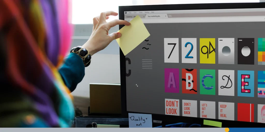
If you’re a designer, you know that picking the right font is like finding the perfect pair of shoes—get it right, and your whole look comes together. Get it wrong, and, well, let’s not go there. In 2025, the world of typography is bursting with fresh faces, modern classics, and creative twists on old favorites. Designers now have access to a wider range of font options, styles, and weights than ever before, greatly enhancing their creative flexibility.
Just like fashion, fonts are constantly coming in and out of popularity. One perfect example is the Cooper typeface. Cooper Black was a prominent advertising font in the 1920s and 1930s until it fell out of favor after overuse. It had a major comeback in the 1960s and 1970s with its use by the Beach Boys, the Doors, and Garfield comics.
More recently, Cooper Black has had yet another resurrection as more and more companies look to capitalize on nostalgia from previous decades. Graphic design is often about taking something old and repurposing it for a modern audience.
In this article, we’ll explore 50 free fonts and premium fonts that are making waves in the design community this year. We’ll cover everything from free sans serif fonts to elegant serifs, bold display types, and unique scripts.
- The Font Trends Shaping 2025
- What Elements Make a Successful Font?
- 50 Fonts Designers Love in 2025
- Why These Fonts Stand Out
The Font Trends Shaping 2025
Before we jump into the list, let’s talk about what trends are popular in 2025:
- Humanist and geometric sans serif fonts: Clean, modern, and versatile, these fonts are everywhere—from tech startups to construction companies.
- Elegant modern serifs: Designers are rediscovering the sophistication of serif fonts, now with refined, contemporary twists.
- Bold display fonts: Statement-making, uppercase fonts are dominating headlines and branding.
- Handwritten and script fonts: Authenticity is in, with handwritten styles adding warmth and personality to brands.
- Variable and experimental fonts: Flexibility is key, with variable fonts offering multiple weights and widths in a single file. These files often contain a wide range of styles, making them highly customizable for different design needs.
- Futuristic and pixelated fonts: Tech-inspired, minimalist, and retro pixel fonts are on the rise, especially in digital and gaming contexts.
Want to try out some of these font trends on your own logo design? FreeLogoServices‘ easy-to-use AI-powered logo maker streamlines the logo design process, allowing you to try out hundreds of different font choices until you’re satisfied.
What Elements Make a Successful Font?
A successful font works in tandem with other design elements to help designers communicate messages clearly, create a strong brand identity, and evoke emotion. The right font creates a unique visual appeal or emotional response in the viewer, making the design more eye-catching and memorable. One of the main aspects of a successful font is timelessness. This is a difficult thing to capture, regardless of whether you’re using sans serif fonts, free fonts, or premium fonts.
German graphic designer Paul Renner, the designer of the famous Futura font, had a poignant take on the importance of timelessness.
“The truly modern is what we hold today to be timelessly perfect.”
Certain fonts feel dated, while others stand the test of time. As a designer, it’s your job to choose which fonts fall under which category.
But what exactly makes one font stand out from another? Let’s break down some essential elements that contribute to a font’s effectiveness in both graphic and web design.
1. Typeface & Font Selection
The heart of any successful font lies in its design. The chosen typeface should match the message and medium of your project.
For instance, a bold sans serif font might convey modernity and clarity, making it ideal for tech brands or web interfaces, while an elegant serif font can add a touch of sophistication to editorial design or luxury packaging. The right font not only supports readability but also reinforces your brand’s personality and tone.
2. Legibility & Readability
A great font family is designed with clear letterforms, balanced proportions, and sufficient spacing. Legibility ensures that each character is easily distinguishable, while readability refers to how comfortably text can be read in context, whether it’s a headline, body text, or a call-to-action button. Fonts that perform well at various sizes and weights are especially valuable for both print and web design.
3. Contrast & Visual Hierarchy
Contrast is a powerful tool in typography. It helps guide the reader’s eye through content by emphasizing important elements—think bold headlines paired with lighter body text, or mixing serif and sans serif fonts for dynamic layouts. In web design and branding materials, choosing specific fonts for headers, such as website headers and headlines, is essential for creating visual hierarchy and attracting attention.
Effective visual hierarchy uses size, weight, color, and spacing to organize information logically, making it easy for users to scan and understand content at a glance.
4. Consistency
Consistency in font usage is crucial for cohesive design. Limiting the number of fonts (usually no more than two or three) and maintaining uniform styles for similar elements (like headings and body text) helps create a harmonious, professional look. Consistent typography builds trust and familiarity across all your design materials.
5. Spacing: Kerning, Leading & Tracking
Proper spacing is essential for both aesthetics and function.
Kerning adjusts the space between individual characters, ensuring even and visually pleasing gaps.
Leading (or line height) manages the vertical space between lines of text, which is vital for readability, especially in body copy.
Tracking controls the overall spacing across a range of characters or words. Balanced spacing prevents text from feeling cramped or too loose, making it more inviting to read.
6. Alignment & White Space
How text is aligned—left, right, centered, or justified—impacts the overall flow and readability of a design. Good use of white space (the empty areas around text and other elements) helps separate sections, reduce visual clutter, and make layouts feel more open and accessible.
7. Font Size & Weight
Choosing the correct font size for different elements (headings, subheadings, body text) is key to establishing hierarchy and ensuring clarity. Font sizes are often measured in points, and selecting the right point size is crucial for effective branding and typography. Varying font weights (light, regular, bold) can further differentiate between levels of information and add emphasis where needed.
8. Color Choices
The color of your type must provide enough contrast against the background to ensure readability. Poor color choices or insufficient contrast can strain the eyes and make important content easy to miss. Subtle adjustments—like using dark gray instead of pure black—can also improve reading comfort and aesthetics.
9. Versatility & Style Range
A successful font often comes with a range of styles, weights, and even variable options, making it adaptable for different uses. Whether you need italics for emphasis, bold for headlines, or light weights for elegant body text, a versatile font family is a designer’s best friend.
10. Emotional Impact & Brand Alignment
Fonts aren’t just functional—they’re expressive. The best fonts evoke the right emotions and align with the brand’s voice, whether that’s playful, authoritative, elegant, or cutting-edge. This emotional resonance is what makes a font memorable and effective in storytelling.
50 Fonts Designers Love in 2025
We’ve compiled a list of some of the best free fonts along with a few premium font options that designers are raving about in 2025.
Here’s the list:
- Bricolage Grotesque: A geometric sans serif with playful details and superb readability. Ideal for both display and body text, it’s a go-to for modern branding and editorial design. Free for commercial use.
- Gamuth Sans: This versatile sans serif brings elegant curves and humanist warmth to UI and branding projects. With 12 styles and over 500 language supports, it’s a powerhouse.
- Paramount: A modern sans serif inspired by sci-fi, featuring clean lines and bold character. Perfect for futuristic branding and web design.
- Nave: A contemporary sans serif with a unique character inspired by ancient architecture. Great for injecting life into familiar forms in both print and digital projects.
- Geist: Loved by the coding and design community, Geist is a minimalist sans serif that’s perfect for digital projects and UI design. Free for personal and commercial use.
- SK-Modernist: A clean, minimalist sans serif designed for digital media. Its simplicity makes it a staple for web and app design.
- Auge: A wedged serif font inspired by the micro world, bringing subtle sophistication to editorial and print design.
- Humane V2.0 Variable: A playful, variable font with striking style—great for creative branding and experimental layouts. Free for designers.
- Panagram Sans Rounded: This fun, geometric sans serif is inspired by classic typefaces but with a playful twist. Ideal for branding and packaging.
- Harmond Display: A modern serif that balances readability with style, making it suitable for both headlines and body text.
- Project Blackbird: A grotesk font with unique glyphs, perfect for adding personality to logos and editorial layouts.
- Elanor: A modern serif font with retro vibes and experimental touches—great for standout branding projects.
- Stanley: An elegant display font that combines rounded and rectangular forms for a unique design edge.
- Flaviotte: High contrast and sharp serifs give this font an elegant, editorial feel.
- DX Rigraf: A modern sans serif font with strong monospace influences—excellent for tech branding and web design.
- Fogtwo No5: A versatile display serif that works for everything from elegant invitations to bold, brutalist posters.
- Literata: A classic serif designed for legibility—ideal for body text in both print and web.
- Wagon Display: A serif font that combines sharp angles with soft curves, perfect for headlines and packaging. One of the best free fonts on this list.
- Fira Sans: A humanist sans serif designed for clarity and legibility, widely used in web and UI design.
- Aalto: Blending organic forms with modern lines, Aalto is suitable for both printer and digital projects.
- Rockstar Display: A bold, attitude-packed free sans serif font for making headlines pop.
- Mango Grotesque: A super-tight, condensed variable font, ideal for digital and print applications where space is at a premium.
- Larken Serif: Inspired by nature, this soft, curvy serif is great for adding warmth to editorial and branding work.
- Roboto: The ultimate workhorse free sans serif font, Roboto is everywhere—websites, apps, print, you name it.
- Noto Serif: A clean, modern serif font designed for the web, with broad language support.
- Satoshi: A geometric free sans serif font with a modernist twist, available in multiple weights and variable styles. Free for personal and commercial use.
- Figtree: Minimalist but friendly, this geometric free sans serif font is perfect for both headings and body text. Free on Google Fonts.
- Work Sans: A versatile, open-source sans serif that’s become a staple for UI and web design.
- Open Sans: A ubiquitous, humanist sans serif that’s open-source and highly readable, making it a favorite for websites and apps.
- Bion: A modern sans serif with geometric precision and humanist warmth—great for branding and UI.
- Sayke: A contemporary Didone with sparkling ball terminals and stunning italics, perfect for editorial design.
- Moucha: A geometric sans serif font with vintage and modern axes, offering broad language support for global brands.
- Antarctican: A professional font family with a standout monospaced version—excellent for branding and digital applications.
- Altesse: A classic script typeface that brings elegance and sophistication to invitations and luxury branding.
- Helvetica: The iconic sans serif font is one of the most popular fonts in the world for a reason. Its versatility and elegance are unmatched. Helvetica’s history is closely tied to monotype typesetting, which played a significant role in its widespread adoption and use in branding.
- Outfit: A clean, modern sans serif that’s ideal for both headlines and body text in digital and print.
- Space Grotesk: A geometric sans serif with a futuristic vibe, perfect for tech branding and web design.
- Anybody: A friendly, approachable, free sans serif font that works well in both display and text sizes.
- Plus Jakarta Sans: A contemporary free sans serif font with a wide range of weights and styles, suitable for everything from apps to packaging.
- Venice Blvd: A display font with a retro twist, great for branding and editorial layouts.
- DM Sans: A low-contrast sans serif optimized for readability on screens, making it a top choice for UI and mobile apps.
- Pennypacker: A variable font with five widths and nine weights—this one’s all about flexibility and consistency across media.
- Playfair Display: A classic serif with high contrast, perfect for elegant headlines and luxury branding.
- Bitter: A slab serif designed for digital reading, offering excellent legibility for body text.
- Merriweather: A serif font designed for screen readability, making it a staple for web and editorial design.
- Lora: A well-balanced serif with roots in calligraphy, suitable for both body text and headlines.
- Libre Baskerville: A web-friendly serif with a classic feel, ideal for editorial and long-form content.
- ITC Lubalin Graph: A boxy serif font with a low profile that is perfect for graphic design projects. Its monotype classification and historical roots make it a favorite for designers seeking a classic yet modern look.
- PT Serif: This versatile serif font with a modern touch is great for both print and digital projects.
- Old Standard TT: A serif font inspired by early 20th-century typography, perfect for projects needing a touch of history and elegance.
Bonus Fonts
Bodoni: A Didone typeface created by Gianbattista Bodoni, known for its unbracketed serifs, geometric styling, and historical significance. Its creator’s craftsmanship and innovation have made Bodoni a staple in modern branding, including the iconic Vogue logo.
Univers: A modern, neo-grotesque font designed by Adrian Frutiger and Aleksei Chekulaev. Univers is widely used in industrial design, signage, publishing, and notable branding such as the eBay logo.
Why These Fonts Stand Out
While all of these fonts were originally created for vastly different reasons and have a wide range of styles, there are some elements that they all share.
Versatility & Flexibility
Many of these fonts are variable, meaning you can adjust their weight, width, and sometimes even optical size within a single file. This makes them a perfect choice for designers who need a quality font family that can adapt to multiple uses: editorial design, PDFs, outlines, web, print, packaging, and more.
Personal & Commercial Use
A huge number of this year’s best free fonts for designers are available for both personal and commercial use, especially those found on reputable free font directories. Always check the license, but you’ll find plenty of options that let you create without worry.
Modern Meets Classic
Designers are blending the timeless elegance of serif fonts like Garamond and Playfair Display with the clean, modern lines of sans serif fonts like Roboto, Open Sans, and Fira Sans. This mix helps create a strong sense of continuity and keeps designs feeling fresh yet familiar.
Support for Multiple Languages
Many of these fonts support Latin, Cyrillic, Greek, and even more scripts, making them suitable for global brands and multilingual projects.
Unique Design & Features
From distinctive ligatures and glyphs to experimental outlines and bold weights, 2025’s fonts are packed with personality. Whether you need something elegant, playful, or exciting, there’s a font on this list that fits the bill.
Conclusion
Typography in 2025 is all about flexibility, creativity, and authenticity. Designers are spoiled for choice, with a mix of free sans serif fonts, elegant serifs, bold display types, and playful scripts at their fingertips.
With so many options, it can be difficult to choose. Remember: the right font doesn’t just look good—it tells a story, sets the mood, and establishes a brand identity that guides your audience. So explore, experiment, and let your typography do the talking.
FreeLogoServices‘ AI-powered logo maker makes the design process easy. Create a captivating logo and then choose from hundreds of the best free fonts available to ensure your brand is properly represented.
FREQUENTLY ASKED QUESTIONS
What are the best fonts for designers in 2025?
The best fonts in 2025 include Bricolage Grotesque, Gamuth Sans, Geist, Roboto, Playfair Display, and Pennypacker. These fonts are versatile, modern, and suitable for a wide range of design projects, from web and UI to print and branding.
Where can I find free fonts for personal and commercial use?
You can find high-quality free fonts for designers for both personal and commercial use on platforms like Google Fonts. Always double-check the license before using a free font in commercial work.
What’s the difference between serif and sans serif fonts?
Serif fonts have small decorative strokes (serifs) at the ends of their letters, giving them a classic and elegant feel, great for print and body text. Sans serif fonts lack these strokes, offering a clean, modern look that’s ideal for digital and web design.
What is a variable font, and why should I use one?
A variable font is a single font file that allows you to adjust properties like weight, width, and sometimes optical size. This flexibility helps designers create a consistent style and adapt typography to different screen sizes or print formats.
What are ligatures, and why do they matter?
Ligatures are special glyphs that combine two or more characters into a single, harmonious unit. They improve the appearance and readability of text, especially in serif and script fonts.
How do I choose the right font for my project?
Consider your project’s tone, audience, and platform. For web and UI, go for highly legible sans serifs like Roboto or Fira Sans. For editorial and print, try elegant serifs like Playfair Display or Garamond. If you are working with a limited budget, stick with free fonts; the best free fonts for designers often rival the most expensive typefaces.
Are premium fonts worth the investment?
Premium fonts often offer more styles, better kerning, and extensive language support. If you need a unique design or require advanced features, investing in a premium font can elevate your work. However, many free fonts now rival premium options in quality and versatility.