A standard business card is 3.5 inches by 2 inches; that’s not a lot of real estate to work with. With such limited space, every element of your business card is heightened. While you might think that the size, shape, and style of the letters on your business card are irrelevant, you’d be sorely mistaken. When you’re designing your business card, one of the most important decisions you’ll make is choosing the right font.
The font you choose will play a significant role in how your business is perceived. A well-chosen font will make your business card stand out, while a poor choice could result in a card that’s hard to read, uninspiring, or downright unprofessional.
In this article, we’ll dive into the best fonts for business cards and explore how different styles can work well for various business types.
- Why Font Choice Matters
- How Fonts Influence Perception
- Serif vs. Sans Serif: Understanding the Basics
- The Top 10 Best Fonts for Business Cards
- Typography Tips for Designing Business Cards

Why Font Choice Matters
Your business card is often the first impression potential clients or partners will have of your business, so making sure it looks professional and legible is essential. The right font can convey a sense of trustworthiness, creativity, or innovation, while the wrong one could make your brand feel out of place.
Whether you want a traditional look, something more modern, or even a personal touch, the font you choose is integral to setting the tone for your brand.
Choosing the perfect font involves more than just picking something that looks good. You need to consider:
- The nature of your business
- The brand you’re trying to convey
- The space you have to work with
Fonts can make your card modern, traditional, or even quirky, and knowing which fonts to use can help ensure your business card delivers the right message.
How Fonts Influence Perception
You encounter hundreds of different fonts each and every day, and for the most part, you probably don’t pay much attention to which fonts are being used for what. However, fonts can have a great deal of impact on how you perceive certain things.
For example, if you pass by a daycare using a Comic Sans font, you wouldn’t think twice because the font is fun, energetic, and geared towards children. But if you were to see that same font used for a sign at a law office, you might consider it unprofessional.
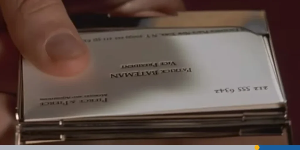
The Power of Business Card Fonts: As Told By Hollywood
When it comes to business cards, fonts carry a lot of weight. Although two fonts may seem nearly identical, there are subtle differences that can change how a card performs. Let’s look at an example of how important business cards are from Mary Harron’s 2000 satirical thriller American Psycho, which follows the life of Wall Street businessman Patrick Bateman.
In one of the movie’s most famous scenes, Bateman and his coworkers are one-upping each other, showing off their business cards. Bateman reveals his brand new business card featuring a serif font, often referred to as “Silian Rail,” which is a fictional typeface. However, the actual typeface used appears to be Garamond Classico.
While his coworkers are impressed by the card, Bateman is floored when his office rival, Paul Allen, places his card on the table. While the two cards seem nearly identical, Patrick remarks that Paul Allen’s card is superior due to slight differences when it comes to color, balance, and font selection. This goes to show that when it comes to business cards, even the tiniest details can make a huge difference.
Serif vs. Sans Serif: Understanding the Basics
When it comes to business card fonts, you’ll usually find two main categories: serif fonts and sans serif fonts. Both have distinct qualities that can affect the way your business is perceived.
Serif Fonts
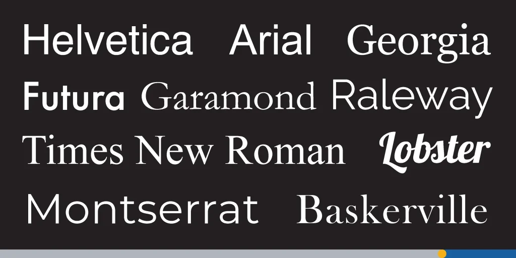
Serif fonts have small lines or decorative strokes at the ends of each letter. These tiny lines, known as serifs, give the font a more traditional and formal look. Classic examples of serif typefaces include Times New Roman and Georgia. These fonts are great if you’re aiming for a traditional feel or if your business deals with more conservative industries, like law or finance.
Sans Serif Fonts
On the other hand, sans serif fonts do not have the decorative strokes. This gives them a cleaner, more modern appearance. Sans serif fonts are often seen as more minimal and straightforward. Popular examples include Helvetica, Arial, and Futura. These fonts tend to work well for tech companies, startups, or any business that wants to appear sleek, professional, and modern.
The Top 10 Best Fonts for Business Cards
While there is definitely room for subjectivity when it comes to business card design, we’ve put together a list of the top 10 fonts we believe work best for business cards.
1. Helvetica: The Modern Classic
One of the most popular fonts and perhaps the best-known sans serif typeface is Helvetica. It’s clean, professional, and incredibly versatile. Because of its neutral design, Helvetica works well for nearly any type of business, from digital startups to more traditional industries. Its legibility at both small and large sizes makes it a great choice for business cards, ensuring your company name is easy to read.
2. Futura: A Bold, Geometric Font
Another sans serif font that works wonders on business cards is Futura. Known for its geometric shapes and crisp lines, Futura conveys a sense of modernity and precision. It’s great for brand identity, especially if you want to project a sleek, forward-thinking image. Futura is particularly well-suited for industries in design, technology, and architecture.
3. Times New Roman: The Traditional Favorite
In 1929, the Times of London hired typographer Stanley Morison to create a new text font. Morison created the now iconic Times New Roman serif font, which continues to be one of the most popular fonts in the world, even nearly 100 years later.
If you’re looking for a traditional look, Times New Roman is a safe bet. As one of the most recognizable serif fonts, it’s often associated with trustworthiness, stability, and professionalism. This classic font is perfect for industries like law, accounting, and academia. While it’s not the most eye-catching font, its readability makes it an excellent choice for businesses where clarity and professionalism are paramount.
4. Georgia: The Elegant Serif Option
For a serif font that’s both elegant and highly readable, Georgia is a fantastic choice. It was specifically designed for screens, but it translates beautifully into print as well. With its slightly rounded edges, Georgia offers a less rigid feel compared to some other serif typefaces, while still maintaining that traditional vibe. It’s perfect for businesses that want a sophisticated, yet approachable look.
5. Arial: The Simple & Clean Font
One of the most popular fonts for business cards is Arial. It’s another sans serif font, and it’s a go-to option for many businesses due to its simplicity and ease of legibility. Arial works well for industries that want a clean, no-nonsense look. It’s especially great for businesses that deal with digital products or services, as it offers a modern and polished aesthetic.
6. Baskerville: Classic with a Touch of Class
For a serif font that adds a bit more style without sacrificing readability, Baskerville is an excellent choice. It has a rich, classical appearance. Baskerville conveys sophistication and authority, making it ideal for businesses in luxury goods, law, or consulting.
7. Lobster: Fun & Friendly Script Font
If you’re looking to add a personal touch to your business card, a script font like Lobster could be the way to go. Script fonts mimic handwriting, which can create a more friendly and approachable vibe. These are great if you work in industries like fashion, events, or any other field where a bit of creativity and personality is encouraged. However, it’s essential to ensure that the script font is still legible at smaller sizes. Lobster manages to strike a balance between a playful, handwritten style and a legible typeface, making it a favorite for modern business cards.
8. Garamond: Timeless Elegance
For a classic font, Garamond is one of the best options out there. This serif typeface has been around for centuries, offering a refined and timeless look. It’s often used by businesses that want to project a sense of history, craftsmanship, or authority, such as publishers, educational institutions, or legal firms.
9. Montserrat: Bold & Contemporary
A sans serif font like Montserrat offers a bold and contemporary design. With its geometric structure and wide letterforms, it makes an immediate impact. If you’re looking for something that’s modern and eye-catching, Montserrat is a great option. It works particularly well for tech startups, creative agencies, and fashion brands.
10. Raleway: Elegant with a Touch of Modernity
If you’re looking for something sleek yet elegant, Raleway is a sans serif typeface that hits the sweet spot. Its clean lines and unique letterforms make it stand out, while still maintaining an air of sophistication. It’s ideal for businesses that want a modern, yet polished look.
Typography Tips for Designing Business Cards
Beyond simply choosing the right font, here are some other typography tips to ensure your business card stands out:
1. Font Sizes Matter
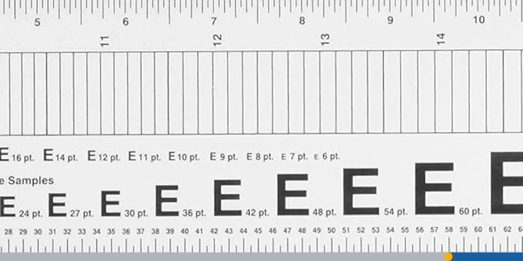
The size of the text on your business card is crucial for legibility. Ensure that your company name is prominent, usually in a larger size, so it’s the first thing people notice. Your contact information should be smaller but still easy to read. Avoid making the font sizes too tiny, as this can hinder readability.
2. Don’t Overcrowd with Different Fonts
While it’s tempting to use a variety of fonts, using too many can make your card look cluttered. Stick to one or two fonts, and make sure the text aligns with the overall design elements of the card.
3. Choose a Font That Matches Your Brand
The font you choose should match the personality of your brand. For instance, if your business is modern and sleek, choose a sans serif font like Helvetica or Arial. If your business is more traditional, a serif typeface like Georgia might be a better fit.
4. Use Space Wisely
Don’t try to fit too much text into a small area. Allow for some space around your text to give your business card a clean, professional look. Space will help guide the viewer’s eye to the most important information.
5. Play with Decorative Lines
Sometimes, adding simple decorative lines can give your business card an extra flair without overwhelming the design. Use lines to separate the company name from your contact details or to highlight specific parts of the card.
6. Be Mindful of Your Logo
Your logo will likely be the most prominent part of your business card, so make sure the font complements it. The font style should enhance the logo, not compete with it. Whether you go for a more traditional serif font or a minimal sans serif option, it should always work harmoniously with your overall design.
Conclusion
Choosing the right font for your business card is no small task, but with the right considerations, it can help set the tone for your business. Whether you choose a classic font like Baskerville, a sleek sans serif typeface like Helvetica, or a script font for a personal touch, your business card should reflect the values and personality of your brand. So go ahead, choose the font that best represents you, and create a business card that leaves a lasting impression.
Looking to create a captivating business card? FreeLogoServices is here to help! Choose from thousands of business card templates and font options, from modern sans serif fonts to historic fonts for a more traditional look. With a wide variety of finishes and printing options, you’re guaranteed to find something you love.
FREQUENTLY ASKED QUESTIONS
What is the best font for business cards?
The best font for business cards largely depends on your industry and the image you want to project. Helvetica and Arial are great sans serif fonts for a clean, modern look, while Georgia is an excellent serif font for a more traditional, professional feel.
How do I choose between a serif and a sans serif font?
If you want a more traditional feel, go for a serif font like Times New Roman. If you’re after a modern and minimal look, sans serif fonts like Arial are better suited for your card.
Can I use a script font on a business card?
Yes, script fonts can add a personal touch, but ensure that they remain legible, especially at small sizes. Fonts like Lobster can give your business card a creative flair while remaining easy to read.
What font size should I use on my business card?
For legibility, your company name should be the largest element on the card. Your contact details can be smaller, but make sure they are still easily readable, typically in a size between 8-12 pt.
How many fonts should I use on my business card?
It’s best to limit yourself to one or two fonts to avoid overcrowding. Use one for the company name and another for the contact details, but ensure the fonts complement each other.