In 2026, we see color doing far more than making things look pretty; it’s a way brands show their mood, values, and personality in a noisy digital world.
The big shift this year is going away from cold grays and stark minimalism toward grounded, nature‑inspired hues and emotionally expressive accents. Vibrant and expressive colors used in 2026 will celebrate human creativity and life, while grounding neutrals provide balance.
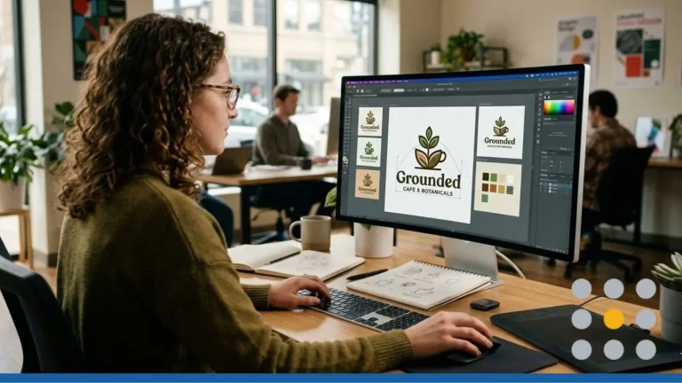
These trends are a great starting point for refreshing your look: instead of redesigning your logo from scratch, you can refine your existing colors, introduce new accents, and preview how everything works across logos, promotional products, and your website.
- How to Use Trends Without Breaking Your Brand
- Top 10 Color Trends & Palettes For 2026
- Turning 2026 Palettes Into Logos With AI
- Bringing 2026 Colors Into Promo Products & Websites
How to Use Trends Without Breaking Your Brand
We love trends, but we don’t recommend letting them trigger a full rebrand every year.
For 2026, we suggest integrating new hues in a way that supports what people already recognize about your brand rather than replacing it.
Treat your current palette as the backbone. Keep your main logo color and at least one recognizable neutral or background shade, then layer in one or two 2026‑ready tones.
Paying attention to detail in your color selection, like the subtle differences between shades or the way a color shifts in different lighting, can amplify the overall perception and emotion your palette conveys.
Start with personality: are you calm and trustworthy, energetic and disruptive, or luxurious and boutique? Choose trends that reinforce that identity so your changes feel intentional.
Step 1: Define Your Core Colors & Personality
Clarify which hues are non‑negotiable for your brand; these sit in your logo and appear across your main touchpoints, like your website, social media profiles, email marketing, and advertising. Identifying your brand’s core color family keeps your brand consistent across platforms.
- Calm, caring, or eco‑friendly brands often use greens, soft neutrals, beiges, and muted blues, aligning with nature‑inspired, regenerative palettes.
- High‑energy or disruptive brands can lean into strong contrast, saturated accents, and even neon details that echo louder digital trends.
- Luxury, boutique, and hospitality brands work well with deep plums, smoky jades, rich browns, and creamy whites, similar to the moody jewel tones in 2026 forecasts.
Once you know your personality, lock in one primary brand color and one or two supporting shades. You’ll weave trends around these anchors!
Step 2: Decide What Stays Fixed & What Can Flex
We like to think of your palette in layers: some parts stay stable for years, others rotate with campaigns and seasons.
Fixed:
- Main logo color (text and symbol)
- Core neutral/background (a specific teal, cream, or warm gray)
More flexible:
- Accent colors for buttons, icons, badges, and social backgrounds
- Seasonal or campaign‑specific tones (like a limited Persimmon or neon accent)
This approach lets you try 2026 colors, such as Cloud Dancer, Transformative Teal, Plum Noir, Wasabi, and Persimmon, without tearing down your whole system.
Top 10 Color Trends & Palettes For 2026
Trend sources agree on a few big directions: earthy neutrals, teal andjade families, soft whites, jewel tones, and focused bright accents (neons and Persimmon‑style oranges). For instance, Pinterest’s 2026 palette features Cool Blue, Jade, Plum Noir, Wasabi, and Persimmon as key shades.
These palettes are already making their mark in seasonal collections across fashion, branding, and interiors, shaping the visual language for 2026. Let’s list them out!
1. Earthy & Grounding Neutrals
Earth‑inspired palettes draw from clay, soil, stone, and natural fibers, and feel welcoming and human.
Hues: Terracotta, warm ochre, mushroom, beige, soft taupe, and chocolate brown create warmth, stability, and comfort, especially when layered tonally.
Use it for:
- Logo: Rich brown or terracotta marks on sand or bone backgrounds.
- Promo: Canvas totes, notebooks, and drinkware in warm neutrals for a premium, eco‑friendly feel.
- Web: Creamy backgrounds with brown text and muted green accents for a calm reading experience.
FreeLogoServices Tip: Prompt earthy, grounded logo for a sustainable brand in warm browns and soft neutrals. Use deep chocolate or terracotta as main colors and lighter clay or sand as accents. Keep text dark enough to stand out on pale neutrals.
2. Deep Teals & Smoky Blue‑Greens
Transformative Teal and related blue‑greens are core 2026 colors, merging aquatic greens and dependable blues to symbolize redirection and care for the planet.
Hues: Deep teal, smoky jade, eucalyptus, and cool blue‑greens feel both calming and futuristic.
Use it for:
- Logo: Deep teal primaries with jade or misty blue as supporting tones.
- Promo: Stainless bottles, tech accessories, and apparel in teal/jade for a fresh, modern look.
- Web: Teal hero sections, teal‑to‑jade gradients, and teal CTAs.
FreeLogoServices Tip: Prompt clean, modern logo in deep teal and smoky jade, tech‑forward but calming. Use teal as your hero color and lighter jade or eucalyptus as accents. Pair dark teal backgrounds with off‑white text, and light jade with charcoal.
3. Unbleached Naturals & Soft Whites
Pantone’s Cloud Dancer spotlights soft whites as structural colors that support bolder accents.
Hues: Off‑whites, chalky creams, unbleached linen, and Cloud Dancer‑style whites suggest clarity and breathing room.
Use it for:
- Logo: Soft white or cream bases with teal, plum, or chocolate accents.
- Promo: Packaging, apparel, and stationery in off‑white with small color pops.
- Web: Light layouts with generous white space for SaaS, editorial, and wellness brands.
FreeLogoServices Tip: Prompt minimal logo with a soft white background and a single bold accent color. Use soft white as the canvas and one accent for logos and main buttons. Keep text darker than your whites to avoid low‑contrast gray.
4. Decadent Chocolates & Rich Browns
Deep browns offer a softer, more characterful alternative to black and flat gray.
Hues: Dark cocoa, espresso, burnt umber, caramel, and warm khaki bring warmth and sophistication. In 2026, rich browns and burgundies are emerging as standout colors, adding character, sophistication, and drama to interiors and branding.
Use it for:
- Logo: Replace black with deep chocolate in your wordmark or symbol.
- Promo: Mugs, boxes, and apparel in rich browns for artisanal, boutique vibes.
- Web: Brown text on cream with caramel accents for a warm editorial feel.
FreeLogoServices Tip: Prompt premium, warm logo in dark chocolate brown and soft cream. Use the darkest brown on marks and headings, lighter tan for secondary shapes. Always check brown‑on‑cream contrast for body text.
5. Warm Citrus & Banana Yellows
Warm yellows and citrus tones add cheer and optimism, especially beside teals, jade, and neutrals. High-energy colors like Electric Fuchsia and Canary Yellow are being used in 2026 to express bold self-expression.
Hues: Banana yellow, goldenrod, and Persimmon‑style orange feel upbeat and social. Persimmon stands out in Pinterest’s 2026 palette as a “sweet‑heat” orange with rising interest.
Use it for:
- Logo: Yellow/orange accents rather than full backgrounds.
- Promo: Citrus touches on totes, stickers, and drinkware.
- Web: Sparing use of buttons, icons, or highlight strips.
FreeLogoServices Tip: Prompt friendly logo with warm banana yellow and a clean neutral base. Let darker colors handle most text and shapes, reserving yellow or Persimmon for smaller accents. Avoid tiny yellow text on white.
6. Bioluminescent Neons & Thermal Glow Gradients
Glow‑heavy palettes are popular with digital‑first brands that want a futuristic edge.
Hues: Electric blues, teal neons, magentas, toxic greens, and hot‑cold gradients feel cinematic on dark backgrounds. Electric chartreuse, especially the Wasabi shade, is emerging as a trending neon color for 2026, with Wasabi gaining popularity in fashion and design and seeing a major increase in search interest.
Use it for:
- Logo: Neon or gradient fills in icons, neutral wordmarks.
- Promo: Dark apparel with neon ink, holographic finishes, UV‑reactive details.
- Web: Dark interfaces with neon buttons, borders, and scroll cues.
FreeLogoServices Tip: Prompt futuristic glowing logo with neon gradients on a dark background. Choose one main glow color and a single secondary neon to avoid clutter. Keep most text near‑white for readability.
7. Soft, Sunwashed Pastels
2026 pastels are more sun‑faded than sugary, which keeps them feeling grown‑up.
Hues: Sunwashed peach, dusty lilac, faded blue, and soft mint convey nostalgia and approachability. Soft pink shades are being used to create a modern take on femininity in spring/summer 2026 collections.
Use it for:
- Logo: Pastel backgrounds or shapes with darker text (navy, plum, charcoal).
- Promo: Soft‑toned stationery, apparel, and packaging that photographs well.
- Web: Pastel gradients and card backgrounds for gentle, welcoming UIs.
FreeLogoServices Tip: Prompt soft, sunwashed logo with pastel gradients and a friendly, modern style. Choose one deeper anchor color and let pastels live in large shapes. Check that dark text remains clearly legible.
8. Retro‑futurist Tech Palettes (Teal + Neon Accents)
Retro‑futurism mixes vintage sci‑fi cues with modern UI design and continues to influence 2026 palettes.
Hues: Teal, cyan, retro blues, muted purples, neon magenta, and electric greens on dark bases feel playful and techy. The interplay of light and color on different surfaces creates depth and a futuristic feel in these palettes, transforming ordinary materials into expressive elements.
Use it for:
- Logo: Teal/cyan cores with small neon details.
- Promo: Dark hoodies, hats, and sleeves with teal and neon graphics.
- Web: Dark‑mode interfaces with grid lines, neon outlines, and teal buttons.
FreeLogoServices Tip: Prompt retro‑futurist tech logo with teal as the main color and subtle neon accents. Keep teal as primary and one neon as accent. Maintain a clear text hierarchy with white or light gray body copy.
9. Moody Jewel Tones (Plums & Smoky Jades)
Jewel tones stay strong but skew more muted and smoky in 2026. Pinterest highlights Plum Noir and jade as key shades tied to moody maximalism. Burgundy and oxblood are being recognized as strong colors in both home decor and fashion, maintaining their popularity.
Hues: Plum Noir, smoky jade, deep emerald, garnet, sapphire, and burgundy feel dramatic and premium. These jewel tones bring character and a sense of luxury to spaces like the dining room, while also supporting a casual yet elegant ambiance.
Use it for:
- Logo: One jewel tone as primary, paired with soft white or light gray.
- Promo: Luxurious packaging, candles, notebooks, and apparel in plums and jades.
- Web: Jewel‑tone backgrounds or overlays for sections and hero areas.
FreeLogoServices Tip: Prompt elegant logo using plum and smoky jade, sophisticated and modern. Let one jewel tone lead and the other act as an accent. Use light text on jewel backgrounds for contrast.
10. Tight, Adaptive Brand Palettes
A major 2026 “meta‑trend” is using fewer, more deliberate colors across all brand touchpoints.
Hues: Focused systems of three to five core colors repeated consistently across logos, web, packaging, and social. Note the importance of detail and presence in a tight, adaptive palette; small color choices and subtle marks can create a lasting impression and boost brand recognition.
Use it for:
- Logo: One primary color plus black or white.
- Promo: The same few hues across apparel, drinkware, and stationery.
- Web: Clear roles, one color for CTAs, one for backgrounds, one for accents.
FreeLogoServices Tip: Prompt simple, modern logo with a tight 3‑color palette optimized for web and print. Choose one hero, one neutral, and one accent. Test your palette in both light and dark modes.
Turning 2026 Palettes Into Logos With AI
With our AI-powered logo maker at FreeLogoServices makes exploring these palettes fast and low risk.
- Pick a palette: Choose one or two trends that match your audience, such as earthy neutrals plus deep teal, or Cloud Dancer white plus plum and jade.
- Enter your brand details: Add your name, slogan, and style prompts that reference your chosen trend.
- Choose a strong base design: Prioritize clarity, legibility at small sizes, and simple shapes.
- Apply your palette: Assign main, secondary, and accent colors, then extend them to icons, trims, and furniture elements in your branding or interior applications. Natural wood finishes and rich dark-painted cabinets are becoming popular in cabinetry and furniture designs of 2026.
- Test contrast: Preview on dark/light backgrounds and at different sizes to verify readability. Consider how your colors interact with different surfaces, both digital and physical, to guarantee optimal appearance.
- Export ready files: Download versions for light backgrounds (white or Cloud Dancer‑style) and dark backgrounds (teal or charcoal), suitable for print and web.
Bringing 2026 Colors Into Promo Products & Websites
Color trends matter most when used consistently across your brand.
- Apparel in earthy neutrals, jewel tones, or smoky teal with high‑contrast logos.
- Drinkware in deep teal, chocolate, or pastels with white or soft‑white logos.
- Stationery in soft whites and browns for a clean, modern feel.
- Packaging with your primary color on main panels and secondary hues in labels or patterns.
Web and digital:
- Hero sections using a main 2026 color (teal, chocolate, or a gradient) with clear CTAs.
- Boldest hues (Persimmon, bright teal, Wasabi‑style green) reserved for primary buttons.
- Backgrounds that set the tone, soft whites for airiness, jewel tones for drama.
- Accent colors are used sparingly in icons and illustrations for cohesion.
- Incorporating fun, vibrant colors can create a joyful and engaging brand experience, making your digital presence more memorable.
- Express your love color by choosing hues that resonate emotionally with your audience and reflect your brand’s personality.
Conclusion
Before you start swapping colors, pause for a quick brand reality check. Make sure your new palette has strong contrast, looks good in real-world print (not just on a glowing screen), stays consistent across every channel, and actually fits your brand’s personality.
And don’t forget: the strongest brands win with a focused, disciplined color system, not a rainbow free-for-all.
Ready to turn 2026’s trending palettes into a logo that actually works? Try the FreeLogoServices Online Logo Maker and start building a brand look that’s fresh and built to last.

FREQUENTLY ASKED QUESTIONS
Do I need to redesign my logo to follow the color trends of 2026?
Usually, no. Often, updating secondary and accent colors to align with 2026 palettes, such as introducing teal, earthy neutrals, or a jewel tone, keeps your brand current while preserving recognition. However, if the design conflicts with your brand’s identity, there’s no need to update it.
What are the biggest color palette trends 2026 for designers?
Designers are focusing on earthy neutrals, deep teals and jade, bioluminescent gradients, retro-futurist tech palettes, smoky jewel tones, and tight, adaptive systems with just a few well-chosen colors.
How important is accessibility when choosing a 2026 palette?
Accessibility is critical: strong contrast and legible type are becoming part of what defines good, modern color usage, especially as brands rely on color for recognition and navigation in digital interfaces.
Are neon and bioluminescent colors practical for business brands?
Yes, if used strategically. Many brands apply neon or bioluminescent hues as accents, gradients, or special campaign visuals rather than as base colors, balancing excitement with usability.
How can small businesses experiment with color trends without a big budget?
AI logo makers and online mockup tools make it easy to test new palettes, generate logo variants, and preview merch and web designs before committing to print or development costs.
What are the main logo color trends for 2026, specifically?
Logos increasingly rely on simple forms supported by deliberate color choices, including earthy bases, teal and jade accents, controlled gradients, and minimal yet powerful 3–5 color systems. Plum, a cooler-toned cousin of red, is also expected to be impactful in 2026. It can add a playful yet impactful touch to palettes, especially when paired with neutrals.
