
Logo psychology is at work all the time during our everyday lives, and we almost never notice it. Picture a pair of golden arches glowing in the distance on a long road trip. Or a red-and-white can sitting on a shelf across the room. You didn’t read a single word, yet you felt something: a pang of hunger, a flash of nostalgia, a tiny jolt of yes, please.
That’s not luck. That’s logo psychology at work. Every color, curve, and typeface in a logo design is chosen to make people feel something specific in a split second.
In this guide, we’re unpacking the psychology of logos piece by piece: color, shape, typography, and even the empty space between them. You’ll see how logos affect emotions, why some brands feel instantly trustworthy while others feel forgettable, and how to make smarter choices for your own brand.
- What Is Logo Psychology & Why It Matters More Than You Think?
- The Psychology of Color in Logos
- The Psychology of Shapes in Logo Design
- The Psychology of Fonts &Typography in Logos
- Negative Space Psychology
- How to Apply Logo Psychology to Your Own Brand
- Common Psychological Mistakes in Logo Design
- Create a Psychology-Smart Logo With FreeLogoServices
What Is Logo Psychology & Why It Matters More Than You Think?
Logo psychology is the study of how the visual elements of a logo shape the way people think, feel, and behave toward a brand. It borrows from color theory, cognitive psychology, and plain old human instinct. In short, logo design psychology asks one deceptively simple question: What will people feel when they see this?
First Impressions Happen in Milliseconds
Your logo is usually the first thing a customer sees. It lives on your website, your packaging, your invoices, and your social profiles. Think of it as your brand’s handshake, and people judge handshakes fast.
Research on visual first impressions suggests people can form an opinion about a design in as little as 50 milliseconds. That’s faster than a blink. In that sliver of time, nobody is reading your tagline or admiring your mission statement. Their brain is processing color, shape, and contrast, then handing back an instant reaction.
That gut reaction is exactly how logos affect emotions. Here’s the quick behind-the-scenes sequence:
- Recognition: The brain tags the logo as familiar or new.
- Association: Colors and shapes trigger learned meanings, like red for alert or blue for calm.
- Emotion: Those associations spark a feeling, often before conscious thought.
- Judgment: That feeling colors how credible, friendly, or expensive your brand seems.
The kicker? Your logo repeats this process every single time someone sees it. It’s a tiny, tireless emotional ambassador working around the clock.
Psychology vs. Aesthetics
A beautiful logo and an effective logo aren’t always the same thing. Aesthetics asks, does this look nice? Psychology asks, does this make the right people feel the right thing, and nudge them to act?
Imagine a delicate, swirly script logo for a heavy-equipment rental company. It might win a design award. It would also confuse customers who want to feel that the company is rugged, reliable, and ready to work. Pretty? Yes. Psychologically on target? Not even close.
Strong logo psychology means your design:
- Matches audience expectations, or breaks them on purpose and with style.
- Communicates your brand personality at a glance.
- Stays honest about the experience you actually deliver.
- Works in the real world, at tiny sizes, in black and white, on a busy screen.
A logo that looks good earns compliments. A logo built on the psychology of logos earns trust, and trust earns customers. Let’s break down the toolkit, starting with the loudest ingredient: color.
The Psychology of Color in Logos
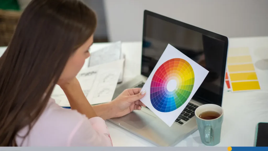
Color is the fastest-acting ingredient in any logo, and logo color psychology is where most brands start. The meanings below come from nature, culture, and decades of advertising, so treat them as strong tendencies rather than hard laws. Context, culture, and color combinations always shift the message. With that caveat, here’s how color psychology branding plays out, one hue at a time.
Red: Urgency, Energy, Appetite (Fast Food, Retail)
Red is the attention-grabber of the color wheel. It raises energy, creates urgency, and (handy for restaurants) is widely linked with appetite. That’s why Coca-Cola, KFC, and McDonald’s lean on it.
- Feels like: Excitement, passion, speed, urgency.
- Best for: Fast food, retail, entertainment, sports.
- Watch out for: Aggression or “danger” vibes when overused.
Blue: Trust, Calm, Professionalism (Banks, Tech, Healthcare)
Blue is the world’s safety blanket. It’s calm, dependable, and quietly professional, which is why banks, tech firms, and healthcare brands such as Chase, PayPal, IBM, and Pfizer lean on it.
Fun fact: Mark Zuckerberg is reportedly red-green colorblind, and blue is among the colors he sees most clearly, a story often told about Facebook’s signature shade.
- Feels like: Trust, stability, calm, intelligence.
- Best for: Finance, tech, healthcare, insurance, business-to-business (B2B).
- Watch out for: Coldness and sameness; so many brands use blue that standing out takes extra effort.
Green: Nature, Growth, Health (Organic, Wellness, Finance)
Green whispers fresh, alive, and growing. It’s nature’s default color, so it’s a natural fit for organic food, wellness, and sustainability brands like Whole Foods. Bright greens (think Spotify) feel energetic, while deeper greens signal money and stability, which is why finance brands like TD Bank wear them well.
- Feels like: Growth, health, balance, prosperity.
- Best for: Organic products, wellness, eco brands, finance.
- Watch out for: Dull olive tones that can read as stale rather than fresh.
Yellow: Optimism, Warmth, Caution
Yellow is sunshine in a swatch: cheerful, youthful, and impossible to ignore. It’s also the color of road signs and warning labels, which gives it a built-in double meaning of happiness and caution. McDonald’s golden arches, IKEA, and Snapchat all use it to project warmth and optimism.
- Feels like: Optimism, warmth, friendliness, alertness.
- Best for: Food, kids’ brands, consumer apps, anything that wants to feel upbeat.
- Watch out for: Low contrast on white backgrounds and eye strain in large doses.
Black: Luxury, Sophistication, Authority
Black is the little black dress of branding: confident, polished, and a little mysterious. It signals sophistication and authority, which explains why luxury names like Chanel and Prada keep their logos stripped down to black and white. Even sportswear giants like Nike lean on it for a sense of power and seriousness.
- Feels like: Luxury, power, elegance, exclusivity.
- Best for: Fashion, premium products, high-end services, editorial brands.
- Watch out for: Heaviness, or coming across as cold or intimidating.
Purple: Creativity, Royalty, Wisdom
Purple’s royal reputation is earned. In the ancient world, purple dye was made from sea snails and was so costly that it was reserved for emperors and kings. Today it still carries a whiff of luxury, but also creativity, imagination, and wisdom, as in Cadbury, Hallmark, and Twitch.
- Feels like: Creativity, imagination, wisdom, premium quality.
- Best for: Beauty, creative tools, education, entertainment.
- Watch out for: Feeling too whimsical for serious, no-nonsense industries.
Orange: Friendliness, Enthusiasm, Affordability
Orange is red’s friendlier cousin: all the energy, none of the aggression. It feels playful, approachable, and budget-friendly, which is why brands like Fanta, Nickelodeon, and Home Depot use it to invite people in rather than shout at them.
- Feels like: Friendliness, enthusiasm, fun, value.
- Best for: Kids’ brands, DIY and home improvement, startups, discount-minded retail.
- Watch out for: Looking cheap if the shade is too neon or the design is cluttered.
White: Simplicity, Cleanliness, Minimalism
White is rarely the star of a logo; it’s the stage. It communicates simplicity, cleanliness, and clarity, and it gives other colors room to breathe. Apple’s white logo on its products shows how restraint can feel premium, while medical and skincare brands lean on white for a pure, clean look.
- Feels like: Purity, simplicity, honesty, modernity.
- Best for: Minimalist, health, tech, and skincare brands.
- Watch out for: Sterility, plus the practical need to work on colored or dark backgrounds.
The Psychology of Shapes in Logo Design
Before anyone consciously registers your logo’s details, their brain registers its shape. Shape psychology in logo design is surprisingly intuitive: soft, round forms feel friendly and safe, while sharp, angular ones feel precise and powerful. Here’s what each shape tends to say.
Circles & Ovals: Unity, Community, Infinity
Circles have no beginning and no end, so they feel complete, inclusive, and endless. They suggest community, partnership, and protection, which is why you see them in the Olympic rings, Mastercard, Target, and BMW’s roundel. Rounded shapes also feel soft and friendly, making them a safe bet for brands that want to feel welcoming. The trade-off: circles can feel a bit passive without another element adding energy.
Squares & Rectangles: Stability, Reliability, Professionalism
Squares and rectangles are the load-bearing walls of design. Their straight lines and right angles feel stable, honest, and organized, which is why Microsoft, LEGO, and the BBC lean on blocky forms. They say we’re dependable and we have our act together. Used alone, though, they can feel rigid, so many brands soften the corners slightly.
Triangles: Direction, Power, Tension
Triangles are the most dynamic of the basic shapes, and their message depends on which way they point:
- Pointing up: Growth, ambition, and stability, like a mountain.
- Pointing sideways: Forward motion (hello, YouTube’s play button).
- Pointing down: Instability, tension, or caution.
Horizontal Lines: Calmness, Steadiness
Horizontal lines echo the horizon, and our brains read that as calm, steady, and grounded. Stacked or striped horizontal elements also give a logo a disciplined, structured feel, as in IBM’s classic striped mark. Vertical and diagonal lines, by contrast, read as more energetic or assertive.
Organic & Fluid Shapes: Creativity, Nature, Approachability
Organic shapes, such as leaves, waves, swooshes, and hand-drawn curves, feel alive. They suggest creativity, nature, and human warmth, and they’re brilliant at making a brand feel approachable rather than corporate. Think of Nike’s swoosh (motion in a single stroke), Spotify’s sound waves, or Airbnb’s looping Bélo symbol. The risk is looking vague, so keep the form distinct enough to be remembered.
Symmetry vs. Asymmetry: What Each Signals
Symmetrical logos feel balanced, formal, and trustworthy, which suits banks, law firms, and luxury marques like Mercedes-Benz and Chanel. Asymmetrical logos feel dynamic, modern, and a little rebellious. Apple’s bitten apple and Puma’s leaping cat both break perfect balance to create personality and movement.
- Symmetry says: Stability, tradition, precision.
- Asymmetry says: Energy, innovation, individuality.
The Psychology of Fonts & Typography in Logos
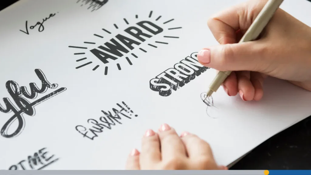
If color is the mood and shape is the body language, typography is the voice. Font psychology logo choices can make the same brand name sound like a whisper, a handshake, or a shout. Let’s meet the main typeface families.
Serif Fonts: Tradition, Authority, Trustworthiness
Serifs, those small feet at the ends of letter strokes, carry centuries of printed-book heritage. That’s why they feel traditional, authoritative, and trustworthy. Think Tiffany & Co., Vogue, Rolex, and Time. Serifs are a go-to for law firms, publishers, universities, and luxury brands that want to project history and credibility. Their weakness? On a tiny app icon, delicate serifs can get lost.
Sans-Serif Fonts: Modernity, Clarity, Friendliness
Sans-serif fonts drop the feet and keep things clean. They feel modern, clear, and friendly, and they stay legible at any size, which is why tech and startup brands love them. Google, Airbnb, and Spotify all use clean sans-serifs. There’s even a trend nicknamed blanding, where heritage fashion houses such as Balenciaga and Saint Laurent swapped serifs for plain sans-serifs.
Script & Handwritten Fonts: Creativity, Personal Touch, Elegance
Script fonts mimic penmanship, so they feel personal, creative, and elegant. Coca-Cola, Kellogg’s, and Ford have used flowing script for generations to feel warm, nostalgic, and human. Handwritten styles add a casual, artisanal vibe that’s perfect for bakeries, boutiques, and creators. Just be careful: scripts can be hard to read when small, and all-caps script is a legibility nightmare.
Display & Decorative Fonts: Personality, Uniqueness
Display fonts are the extroverts of typography. They’re built to show personality, from LEGO’s chunky, playful letters to Barbie’s bold, bubblegum energy. A custom or distinctive display font can make a logo instantly ownable. They can age quickly and rarely work for long text.. Use them for a short brand name, not for your whole identity.
All-Caps vs. Mixed Case: Authority vs. Approachability
Capital letters read as strong, formal, and confident, while lowercase reads as casual and conversational. Here’s the quick breakdown:
- All caps: Authority, stability, prestige (think IBM, HBO, Chanel).
- Mixed or title case: Approachability and balance (think Google, FedEx).
- All lowercase: Friendliness, modernity, informality (think Airbnb).
Neither is better. It just depends on whether you want to sound like a boardroom or a barbecue.
Negative Space Psychology
Negative space is the empty area around and between a logo’s elements, and clever designers make it do double duty. When someone spots the hidden image, they get a small hit of delight, and a logo gives people a reason to look twice. It’s logo design psychology at its sneakiest.
Famous Hidden-Meaning Logos
A few famous examples of meaning hiding in plain sight:
- FedEx: The white arrow between the “E” and the “x” suggests speed, precision, and forward motion. It’s one of the most-cited examples of negative space in branding.
- Amazon: The orange arrow runs from “A” to “Z,” promising everything from A to Z, while doubling as a smile that says happy customers.
- NBC: The peacock’s six feathers represented the network’s divisions when the logo debuted, and the bird itself emerges from the spaces between its colorful plumes.
The common thread is that each hidden detail reinforces the brand’s core message instead of being a gimmick.
How to Use Negative Space Intentionally
You don’t need a famous agency to pull this off. Try these moves:
- Start with your name: Look at the gaps between letters for hidden shapes like arrows, initials, or objects.
- Tie it to your story: The hidden image should reinforce what you do, not just look clever.
- Keep it simple: If it takes five minutes to explain, it’s too complicated.
- Test it small: Shrink your logo to favicon size (the tiny icon in a browser tab) to make sure the hidden element still reads.
- Don’t force it: If a hidden image feels contrived, clean and intentional empty space still adds clarity and calm.

How to Apply Logo Psychology to Your Own Brand
Now for the practical part. Here’s a simple three-step process for turning the psychology of logos into a logo you can actually use.
Step 1: Define the 3 Emotions You Want Your Logo to Trigger
Start with feelings, not fonts. Write down the three emotions you want people to feel in their first second with your brand. Be specific: “professional” is fine, but “calm, competent, and reassuring” is better. A few examples:
- Children’s dental clinic: Playful, safe, friendly.
- Boutique law firm: Trustworthy, authoritative, steady.
- Plant-based snack brand: Fresh, energetic, honest.
Pick three, no more. Five emotions make a mess; three give you a clear compass.
Step 2: Match Those Emotions to Color, Shape, & Font Choices
Next, translate each emotion into a visual choice. Use this as a starting map:
- Trust: Blue or deep green, squares or symmetrical layouts, a serif or clean sans-serif.
- Energy: Red or orange, angular or diagonal shapes, a bold sans-serif.
- Friendliness: Orange, yellow, or soft blue, circles and curves, a rounded sans-serif.
- Luxury: Black, deep purple, or gold accents, thin lines and generous space, an elegant serif or refined script.
- Freshness: Green and white, organic shapes, a light sans-serif.
Step 3: Test Your Logo on Real People Before Finalizing
Never launch on gut feeling alone. Show your logo to real people, preferably ones who resemble your customers, and run these simple tests:
- The five-second test: Show it for five seconds, hide it, then ask what they remember and feel.
- The three-word test: Ask people to describe the brand in three words. Do the answers match your three emotions?
- The squint-and-shrink test: Blur your eyes and shrink the logo. The core shape should survive.
- The grayscale test: If it loses its meaning without color, the design is leaning too heavily on hue.
- The culture check: Colors mean different things in different places, such as red for luck in China or white for mourning in some parts of Asia. Check before going global.
If the feedback doesn’t match your intended emotions, tweak and test again. It’s far cheaper than a rebrand.
Common Psychological Mistakes in Logo Design
Even well-intentioned logos can send the wrong signals. Here are the three most common slips in logo design psychology, and how to dodge them.
Color Clash: Contradictory Emotional Signals
Contradictory colors send contradictory emotions. A bright red, a calming blue, and a neon green might each be on brand alone, but together they create visual noise and an unclear personality.
The fix: choose one dominant color and one accent, and make sure both point toward the same emotion. Check contrast too, because low-contrast pairings like yellow on white hurt legibility.
Font Mismatch: Luxury Product, Wrong Font
Typography can sabotage an otherwise perfect concept. A luxury skincare line in a bubbly display font reads as a toy, and a children’s toy store in a stiff, formal serif feels like a law office.
The fix: Ask whether your font would sound right if it were a voice reading your brand name aloud. If the tone feels off, change the font.
Overcrowding: Too Many Elements Cancel Each Other’s Impact
When a logo includes an icon, a tagline, three colors, two fonts, a gradient, and a swirl for good measure, every element cancels the others out. The brain can’t decide what to feel, so it defaults to nothing. Great logos have one dominant idea. If you can’t sketch yours from memory in 30 seconds, simplify it.
The fix: Use a decluttering checklist:
- One main symbol or wordmark (a logo made of just the brand name), not both fighting for attention.
- Two fonts at most (one is usually plenty).
- One to three colors.
- Details that survive at favicon size.
Create a Psychology-Smart Logo With FreeLogoServices
Knowing the theory is half the battle. The other half is trying things out, and that’s where an online logo maker comes in handy. FreeLogoServices logo maker lets you experiment with the very elements we’ve covered and preview how each choice changes the feel of your logo, no design degree required.
Here’s how to put your new knowledge to work:
- Start with your three emotions. Keep them in front of you before you pick a single option.
- Choose your palette on purpose. Use what you learned about logo color psychology to pick one dominant color and one supporting color.
- Pick shapes and icons that match your message. Apply shape psychology in logo design: rounded for friendly, structured for dependable, angular for bold.
- Select a font that sounds like your brand. Serif for heritage, sans-serif for clarity, script for personality.
- Preview and compare. Try a few variations, run the five-second and grayscale tests, and ask friends or customers what they feel.
- Refine and simplify. Strip away anything that doesn’t support your emotional goals.
Because an online tool makes iteration quick, you can test several versions of an idea in minutes instead of waiting on rounds of revisions. Ready to turn psychology into a logo people remember? FreeLogoServices makes the logo design process simple with our AI-Powered platform. Get started today!
Frequently Asked Questions About Logo Psychology
What is logo psychology?
Logo psychology is the study of how a logo’s colors, shapes, fonts, and layout influence the emotions and perceptions of the people who see it. It helps brands choose design elements that communicate the right personality and build trust quickly.
What is the best color for a logo?
There’s no single best color. It depends on your industry, audience, and brand personality. Blue suits trust-focused businesses, green fits wellness and sustainability, red works for energy and appetite, and black signals luxury. Color psychology branding is about matching the color to the emotion you want to trigger.
How many colors and fonts should a logo have?
Most effective logos use one to three colors and one or two fonts. Fewer elements make your message clearer, your logo easier to remember, and your design simpler to reproduce on business cards, websites, and signage.
Do logo colors mean the same thing everywhere?
No. Color meanings vary across cultures. Red signals luck and celebration in China but can signal danger in many Western contexts, and white is linked with purity in some places and mourning in others. Research your target markets before you commit.