A luxury brand and a children’s toy store can both use the exact same wordmark logo; the difference is in the style. That’s what this guide covers.
With so many logo design styles available today, it’s easy to feel overwhelmed. Should you keep things simple? Embrace bold geometric shapes? Go for a nostalgic retro look? Or create something playful that immediately feels approachable? The good news is that there’s no universally “best” style. The right choice depends on your audience, your industry, and the impression you want people to remember.
In this guide, we’ll explain the most popular logo styles, show where each one works best, and help you decide which visual direction fits your brand.
- What Is a Logo Style (and Why Does It Matter)?
- The 8 Most Popular Logo Styles
- Logo Style vs. Logo Type: How They Work Together
- How to Choose the Right Logo Style for Your Brand
- Logo Style by Industry: Quick Reference
- Common Mistakes When Choosing a Logo Style
- Find the Logo Style That Fits Your Brand

What Is a Logo Style (and Why Does It Matter)?
A logo style refers to the overall visual appearance and artistic direction of your logo.
It includes elements like typography, color choices, shapes, textures, spacing, and illustration techniques that create a specific mood or personality. Think of style as the “voice” of your visual identity.
Style vs. Logo Type: An Important Distinction
Many people confuse logo styles with types of logos, but they’re actually two different concepts.
A logo type describes the structure of the logo itself. Common logo types include:
- Wordmarks
- Lettermarks (monograms)
- Symbols or icons
- Combination marks
- Emblems
Logo styles, on the other hand, describe how those logo types look.
- A wordmark can be minimalist.
- A wordmark can also be vintage.
- An emblem can have a luxury appearance.
- An icon can use a playful style.
- A combination mark can be geometric.
In other words, logo types define the construction, while styles of logos define the visual personality.
How Style Communicates Brand Personality
People process visual information quickly. Studies have consistently shown that colors, shapes, and typography influence how consumers perceive brands within seconds. Different logo design styles naturally communicate different characteristics:
- Minimalist logos suggest confidence and simplicity.
- Vintage logos evoke authenticity and tradition.
- Luxury logos communicate exclusivity and sophistication.
- Playful logos create warmth and friendliness.
- Geometric logos imply precision and innovation.
- Hand-drawn logos feel personal and creative.
The 8 Most Popular Logo Styles
While designers continue to invent fresh visual approaches, most modern logos fall into several well-established style categories. Understanding these styles makes it easier to recognize what fits your business and what doesn’t.
- Minimalist
Minimalism has become one of the most recognizable design movements of the past decade, and for good reason. Minimalist logos remove unnecessary decoration and focus only on the essentials. Every line, shape, and letter has a purpose. Think Apple’s single bitten apple or Nike’s swoosh: both are instantly recognizable because they don’t try to say everything at once.
Common characteristics
- Clean typography
- Simple color palettes
- Plenty of white space
- Few visual elements
- Limited details
- Strong scalability
Best for
- Technology companies
- Consultants
- Professional services
- SaaS businesses
- Startups
- Luxury brands
Potential downside
If pushed too far, minimalism can become generic. Without thoughtful typography or unique proportions, a logo may blend into competitors instead of standing out.
- Vintage & Retro
Vintage logos celebrate nostalgia. Rather than emphasizing what’s new, these designs create emotional connections by referencing the past. Whether inspired by classic Americana, mid-century advertising, old signage, or handcrafted packaging, vintage logos often feel authentic and trustworthy. Jack Daniel’s and Levi’s are great examples: both use heritage visual language to signal longevity and quality.
Common characteristics
- Decorative typography
- Badges and emblems
- Textured finishes
- Muted color palettes
- Classic illustrations
- Established dates
- Ribbon elements
Best for
- Coffee shops
- Breweries
- Restaurants
- Bakeries
- Outdoor brands
- Barber shops
- Artisan makers
Potential downside
Overusing distressed textures or decorative flourishes can reduce readability, especially on digital screens. Today’s vintage logos often borrow classic inspiration while maintaining modern clarity.
- Geometric
Geometric logos rely on mathematical precision. Instead of organic shapes, they use circles, squares, triangles, grids, and carefully balanced proportions to create clean visual systems. This style naturally communicates order, reliability, intelligence, and innovation. Because geometry creates consistency, these logos often appear highly professional and intentional.
Audi’s four interlocking rings and Mitsubishi’s three-diamond mark are classic examples of geometry doing a lot with very little.
Common characteristics
- Symmetry
- Sharp lines
- Repeating shapes
- Balanced proportions
- Grid-based construction
- Limited visual clutter
Best for
- Software companies
- Engineering firms
- Architecture studios
- Financial services
- AI companies
- Manufacturing
Potential downside
Pure geometry can sometimes feel cold or impersonal. Designers often soften the look with rounded corners, subtle curves, or carefully selected colors that make the brand feel more approachable.
- Hand-Drawn & Illustrated
At the opposite end of the spectrum are hand-drawn logos. Rather than emphasizing precision, these logos celebrate personality and individuality. The imperfections are intentional. Illustrated logos often feel creative, artistic, and approachable because they appear handcrafted instead of machine-generated. This style has become increasingly popular as consumers look for brands that feel authentic and human.
Common characteristics
- Custom illustrations
- Organic lines
- Brush lettering
- Sketch-style artwork
- Natural textures
- Unique iconography
Best for
- Artists
- Designers
- Cafés
- Local businesses
- Handmade products
- Craft brands
- Children’s products
Potential downside
Highly detailed illustrations may lose clarity at smaller sizes, making simplified versions necessary for social media icons and mobile applications.
- Modern & Corporate
Modern logo design focuses on clarity, professionalism, and versatility. While it shares some similarities with minimalism, it isn’t necessarily about using the fewest possible elements. Instead, the emphasis is on creating a polished, contemporary look that inspires confidence. FedEx and Microsoft are good examples: clean, flexible, and recognizable at any size.
Common characteristics
- Clean sans-serif fonts
- Simple iconography
- Balanced spacing
- Limited color palettes
- Crisp lines
- Flexible layouts that adapt well across different formats
Best for
- Professional service firms
- Corporate businesses
- Financial institutions
- Technology companies
- Healthcare organizations
- Business consultants
Potential downside
Because many businesses favor this style, it’s easy to end up with a logo that feels generic. The key is to introduce distinctive typography, custom iconography, or unique color combinations that help your brand stand apart.
- Playful & Fun
Not every brand wants to appear serious. Some businesses thrive by creating an energetic, approachable personality that immediately makes customers smile. That’s exactly where playful logo styles excel. These logos use friendly shapes, vibrant colors, rounded typography, and cheerful illustrations to create positive emotional connections. Think of M&M’s characters or the Mailchimp monkey: both are immediately warm and memorable.
Common characteristics
- Bright colors
- Rounded letterforms
- Friendly illustrations
- Animated or whimsical icons
- Soft edges
- Creative typography
Best for
- Toy companies
- Children’s brands
- Ice cream shops
- Entertainment businesses
- Creative agencies
- Educational platforms
- Pet businesses
Potential downside
A playful logo may not communicate authority if your business operates in a highly regulated industry like law, finance, or healthcare. As always, your visual style should align with customer expectations.
- Luxury & High-End
Luxury branding is built on restraint. Unlike playful logos that compete for attention with bright colors and expressive graphics, luxury logos often communicate confidence through simplicity and careful refinement. Rather than trying to impress with complexity, they allow elegant typography, generous spacing, and premium finishes to speak for themselves.
Common characteristics
- Sophisticated serif or custom typography
- Black, white, or metallic color palettes
- Gold, silver, or subtle foil effects
- Minimal decoration
- Excellent spacing
- Timeless design
Best for
- Fashion brands
- Jewelry companies
- Luxury hotels
- Beauty products
- High-end restaurants
- Interior designers
- Premium lifestyle brands
Potential downside
Luxury branding can easily become overly formal or intimidating if it lacks warmth. Businesses targeting broader audiences should balance elegance with accessibility.
- Flat Design
Flat design became increasingly popular as digital interfaces evolved. Instead of gradients, shadows, bevels, or three-dimensional effects, flat logos rely on simple shapes and bold colors. This approach improves readability across websites, mobile devices, software interfaces, and app icons.
Common characteristics
- Solid colors
- No gradients
- Minimal visual effects
- Clean geometric shapes
- Strong contrast
- Excellent digital scalability
Best for
- Apps
- SaaS businesses
- Online platforms
- Digital products
- Technology startups
- E-commerce brands
Potential downside
If over-simplified, flat logos may lose personality. Designers often add character through distinctive typography, unique icon shapes, or carefully chosen color palettes.
Logo Style vs. Logo Type: How They Work Together
By now, you’ve probably noticed that logo styles and logo types complement one another rather than compete. Think of it this way: Your logo type defines the structure. Your logo style defines the personality.
For example, you might choose:
- A minimalist wordmark
- A vintage emblem
- A geometric combination mark
- A playful mascot logo
- A luxury monogram
- A flat icon paired with modern typography
The possibilities are nearly endless because style and structure work together to create a unique identity. If you’re still deciding which structural format is right for your business, it’s helpful to explore logo design options before narrowing your preferred style. Once you’ve selected a logo type, you can experiment with different visual treatments until you find the combination that best reflects your brand.
How to Choose the Right Logo Style for Your Brand
Knowing the most popular styles of logos is only the beginning. The bigger challenge is deciding which one best represents your business. Rather than choosing a style based on current trends, focus on what communicates your brand most effectively. A thoughtful logo should still feel appropriate years from now, even as design trends evolve. Here are three practical ways to narrow your options.
Match Your Logo Style to Your Target Audience
Your logo isn’t designed for you; it’s designed for the people you want to attract.
Start by asking yourself:
- Who are my ideal customers?
- What do they value?
- What emotions should my brand evoke?
- What level of professionalism do they expect?
For example:
- Parents shopping for children’s products often respond well to colorful, playful branding.
- Business executives typically expect clean, modern visual identities.
- Luxury shoppers often associate elegant typography and restrained design with premium quality.
- Outdoor enthusiasts may gravitate toward vintage or handcrafted aesthetics that suggest authenticity and adventure.
Match Your Industry’s Visual Norms
Every industry develops certain visual conventions over time.
- Healthcare brands often favor calming colors and minimalist design.
- Technology companies frequently embrace geometric shapes and modern typography.
- Restaurants commonly use vintage illustrations or playful graphics.
- Fashion brands often rely on elegant wordmarks.
These visual patterns exist because they’ve proven effective at communicating trust within specific markets. That doesn’t mean you have to copy your competitors. Instead, study what customers already expect and decide how far you want to differentiate yourself. Sometimes fitting in builds credibility. Other times, standing apart creates stronger memorability.
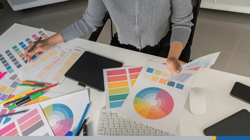
Match Your Brand Personality Adjectives
One of the easiest ways to identify your ideal logo style is to describe your brand as if it were a person. Choose three to five adjectives that define your business.
Professional
- Modern
- Minimalist
- Geometric
Friendly
- Playful
- Illustrated
- Rounded typography
Creative
- Hand-drawn
- Artistic
- Bold
Luxury
- Elegant
- Sophisticated
- Refined
Traditional
- Vintage
- Classic
- Heritage-inspired
Once you’ve identified your personality traits, compare them with the visual characteristics of different logo styles. The stronger the match, the more authentic your branding will feel.
Don’t Forget Practicality
An attractive logo is only successful if it works everywhere your business appears. As you evaluate different logo categories, ask yourself:
- Will it still be recognizable as a tiny social media profile picture?
- Does it work in black and white?
- Can it be embroidered on uniforms?
- Will it look good on product packaging?
- Is it readable on mobile devices?
- Can it scale up for signage without losing detail?
The best logos combine personality with versatility. If a style only looks good in one context, it may create problems as your business grows.
Explore Multiple Directions Before Deciding
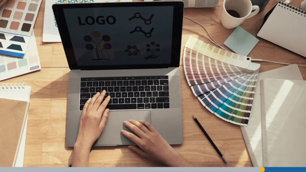
One of the biggest mistakes business owners make is falling in love with the very first design they see. Instead, compare several visual directions before making your final decision. Many logo makers, including Free Logo Services, allow you to browse templates by style, making it easy to compare minimalist, vintage, geometric, luxury, and playful designs side by side. Exploring multiple concepts helps you discover what truly reflects your brand instead of settling too quickly.
If you’re looking for inspiration, reviewing successful branding examples can also be incredibly helpful. Our guides to famous company logos and clothing brand logos show how well-known businesses use different visual approaches to create memorable identities across a wide range of industries.
Logo Style by Industry: Quick Reference
While every brand is unique, certain logo design styles tend to perform particularly well in specific industries because they align with customer expectations. Understanding these patterns doesn’t mean you have to follow them exactly, but they provide a useful starting point when exploring design ideas. Think of these recommendations as guidelines rather than rules.
Food and Beverage: Vintage, Playful, & Illustrated
Food is emotional. Whether you’re running a neighborhood coffee shop, a gourmet bakery, a food truck, or a craft brewery, customers often respond to branding that feels inviting and authentic.
Vintage-inspired logos can evoke tradition, quality, and handcrafted expertise, making them a popular choice for businesses that emphasize heritage or small-batch production. Illustrated logos, on the other hand, add warmth and personality by incorporating custom drawings of ingredients, utensils, or mascots. For family-friendly restaurants, dessert shops, or snack brands, playful styles can create an immediate sense of fun.
Popular characteristics include:
- Hand-lettered typography
- Vintage badges or seals
- Warm, earthy color palettes
- Food-inspired illustrations
- Friendly icons
- Organic shapes
Tech & SaaS: Modern, Geometric, & Flat
Technology companies often need to communicate innovation, efficiency, and reliability. Modern logo styles excel in this space because they’re clean, adaptable, and easy to recognize across websites, apps, software dashboards, and mobile devices. Geometric elements reinforce ideas like precision and logic, while flat design ensures logos remain crisp across digital platforms.
Common design elements include:
- Sans-serif typography
- Geometric icons
- Limited color palettes
- Flat design principles
- Simple layouts
- Strong scalability
Health & Wellness: Minimalist, Organic, & Soft
Trust is everything in health and wellness. Whether you’re building a yoga studio, skincare company, nutrition practice, or mental health service, your logo should create a sense of calm and confidence. Minimalist designs communicate clarity and simplicity, while soft curves and organic shapes make brands feel approachable rather than clinical.
Popular features include:
- Minimal typography
- Gentle color palettes
- Leaf or nature-inspired imagery
- Rounded shapes
- Plenty of white space
- Soft visual balance
Fashion & Apparel: Luxury, Minimalist, & Wordmark-Focused
Fashion branding often relies on typography more than illustration. Many successful apparel companies use elegant wordmarks that allow the brand name to become the primary visual element. Luxury fashion labels frequently embrace black-and-white color schemes, sophisticated serif or custom fonts, and restrained layouts that let quality speak for itself.
Popular characteristics include:
- Elegant typography
- Black-and-white palettes
- Minimal embellishments
- Strong spacing
- Clean layouts
- Premium visual hierarchy
Trades & Services: Bold, Clean, & Trust-Building
Service-based businesses often depend on credibility above all else. Whether you’re a plumber, electrician, contractor, landscaper, or cleaning company, customers want reassurance that you’re dependable and professional. That’s why bold typography, simple icons, and straightforward layouts tend to perform well in these industries.
Effective design elements include:
- Bold fonts
- High-contrast colors
- Simple symbols
- Minimal clutter
- Strong visibility from a distance
Common Mistakes When Choosing a Logo Style
Choosing among the many different logo styles can be exciting, but it’s also easy to make decisions that don’t serve your brand over the long term. Here are the three most common mistakes, and how to avoid them.
Chasing Trends Instead of Building Something Timeless
Design trends come and go. What feels fresh today may look outdated in just a few years. While it’s perfectly fine to draw inspiration from current aesthetics, your logo should have enough longevity that it doesn’t require frequent redesigns.
Instead of asking, “What’s popular right now?” ask yourself:
- Will this still represent my business five years from now?
- Does it reflect my brand values?
- Is it memorable because it’s unique, not because it’s trendy?
Choosing a Style That Doesn’t Match Customer Expectations
Imagine hiring a law firm with a cartoon logo. Or trusting a luxury jewelry company whose branding looks like a children’s toy store. Even beautifully designed logos can fail if they send the wrong message. Your visual identity should reinforce the experience customers expect to have with your business.
Mixing Too Many Styles Into One Logo
Sometimes businesses try to combine every idea they like into a single design.
- A little vintage typography
- A geometric icon
- A playful mascot
- Luxury colors
- Hand-drawn textures
The result is often a logo that lacks focus. The strongest logos have a clear visual direction. They may borrow subtle influences from multiple styles, but they maintain one consistent personality. When in doubt, simplify. A focused design is usually more memorable than one trying to communicate everything at once.
Find the Logo Style That Fits Your Brand
As you explore different logo design styles, remember that there’s no one-size-fits-all solution. Your industry, audience, values, and long-term goals should all influence your decision. Taking the time to compare different visual directions now can help you build a stronger, more memorable brand for years to come.
Ready to bring your vision to life? Browse Free Logo Services logo maker and logo templates, filter designs by style, and discover the look that best reflects your brand. Whether you’re starting from scratch or refreshing an existing identity, you’ll find inspiration and customizable templates to help you create a logo with confidence.
FREQUENTLY ASKED QUESTIONS
What are the most popular logo styles?
Some of the most popular logo styles include minimalist, vintage, retro, geometric, hand-drawn, modern, playful, luxury, and flat design. Each style creates a different emotional impression and works best for different audiences, industries, and brand personalities.
How do I choose the right logo style for my business?
Start by considering your target audience, your industry, and the personality you want your brand to communicate. Your logo should feel authentic to your business while meeting customer expectations. Comparing multiple design directions before making a decision can also help you identify the style that fits best.
What’s the difference between logo styles and logo types?
Logo types refer to a logo’s structure, such as a wordmark, lettermark, emblem, or combination mark. Logo styles describe the visual appearance of that structure, such as minimalist, vintage, or geometric. A single logo type can be designed in many different styles.
Can I combine different logo styles?
Yes, but do so thoughtfully. Many successful logos borrow elements from multiple styles, such as a modern logo with subtle geometric influences or a vintage-inspired design with clean typography. The key is maintaining a cohesive visual identity rather than combining conflicting ideas.
Which logo style is best for a startup?
There’s no single best option, but modern, minimalist, and flat designs are popular choices because they’re versatile, scalable, and work well across digital platforms. The right style ultimately depends on your audience, industry, and long-term brand strategy.
Do logo styles change over time?
Yes. As businesses evolve, many refresh their logos to better reflect changing markets, technologies, or customer expectations. However, the strongest brands usually update their visual identities gradually, preserving recognizable elements while modernizing the overall look.