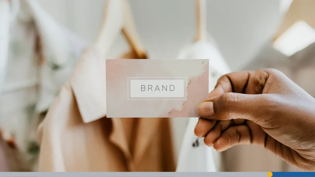
Walk down any shopping district, and you’ll notice something interesting: before you recognize the clothing itself, you often recognize the logo. Some of the world’s most successful fashion companies have built billion-dollar brands around logos that are surprisingly simple.
Clothing brand logos do much more than identify a company. They communicate style, quality, personality, and even lifestyle before someone ever tries on a garment. A logo is a promise, a visual shorthand that tells customers what kind of experience they can expect before they’ve ever touched a product.
The challenge comes in designing a logo that looks just as good embroidered on a hoodie as it does printed on a business card or displayed as a tiny profile picture online. Fashion branding exists at a strange intersection of art and utility.
In this article, we’ll go over what makes fashion logos successful, how to choose the right style for your audience, and how to design with versatility in mind.
- What Makes a Great Clothing Brand Logo?
- Types of Logos Used by Clothing Brands
- Clothing Brand Logo Ideas by Style
- Real Examples From Famous Clothing Brands
- How to Design a Clothing Brand Logo Step-By-Step
What Makes a Great Clothing Brand Logo?
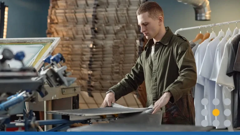
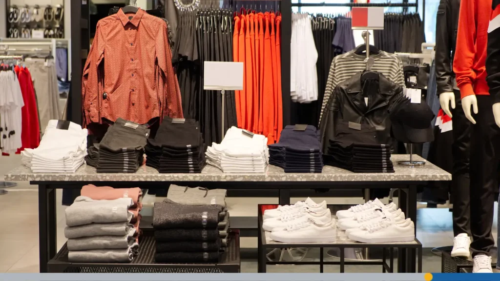
Fashion is visual by nature, so your logo has to work harder than logos in many other industries. Customers wear your logo, literally. It gets sewn into collars, printed across chests, embossed onto leather patches, and stamped onto shopping bags. It appears at microscopic scale on care labels and at monumental scale on trade show banners.
The best brand logo for clothes combines simplicity, versatility, and personality into a design that feels timeless rather than trendy. Here’s what each of those qualities really means in practice.
Simplicity: It Has to Work On a Tag, Embroidered & On-Screen
Many new clothing companies make the same mistake: they create a logo full of intricate details because it looks impressive on a computer screen. Then reality hits when the logo goes to an embroidery machine and half the detail disappears.
Clothing doesn’t work that way. Your logo will appear in places that actively fight against complexity:
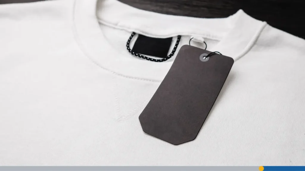
- A woven neck label (often just 1—2 inches wide).
- A tiny hem tag the size of a postage stamp.
- Embroidery on a baseball cap, where stitching requires minimum line thicknesses.
- Screen printing on a hoodie, where fine details bleed into the fabric.
- Die-stamped leather patches, where only simple shapes reproduce cleanly.
- Social media icons, displayed at 32×32 pixels on some devices.
- Website favicons, shrunk to a single centimeter in a browser tab.
Every one of these applications has different constraints. Tiny details disappear. Thin lines break apart during embroidery. Small text becomes unreadable. That’s why the world’s biggest apparel companies rely on remarkably simple logos. Simplicity makes a logo easier to reproduce consistently and easier for customers to remember and recognize.
A useful test: Can someone sketch your logo from memory after seeing it only a few times? If the answer is yes, you’re on the right track.

Scalability: From Full Chest Print to 0.5-Inch Hem Label
Closely related to simplicity is scalability, the ability of a logo to remain recognizable and functional across wildly different sizes and contexts.
Consider the range a single clothing brand logo may need to cover:
- A 12-inch wide back print on a hoodie.
- A 4-inch chest placement on a T-shirt.
- A 2-inch woven neck label.
- A 1-inch sleeve patch.
- A half-inch hang tag emboss.
- A digital favicon.
That’s a size range of roughly 24 to 1. A logo that works brilliantly as a full-chest print but becomes illegible on a neck label is only doing half its job. When designing, it’s critical to test your logo across all these contexts before committing to a final version.
Many professional clothing brands maintain multiple versions of their logo system: a primary full-color version, a simplified version for small applications, a single-color version for embroidery and screen printing, and an icon-only version for profile pictures and tiny placements. Building this system from the start saves enormous headaches later.
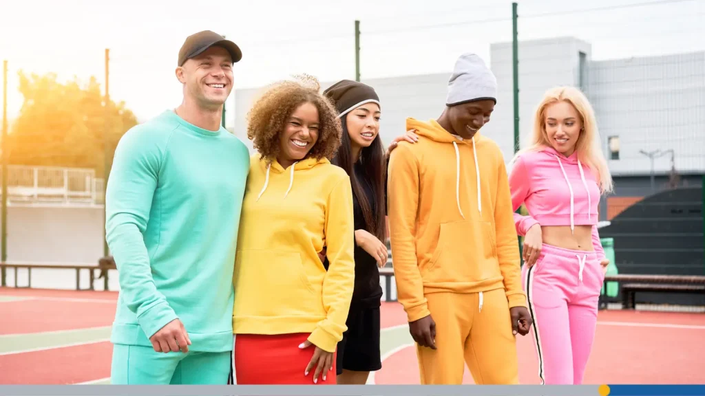
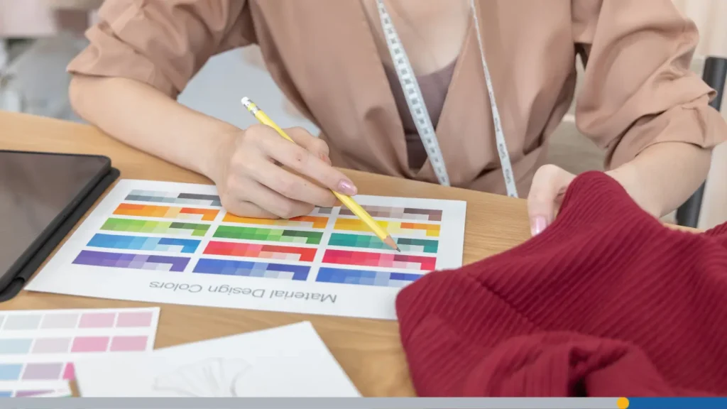
Personality: Luxury vs. Streetwear vs. Activewear Signals
Humans are remarkably attuned to visual language, and a logo communicates volumes about price point, attitude, and target audience within the first fraction of a second.
Even before someone reads your company name, they’ll begin forming assumptions based purely on font choice, shape language, spacing, and color.
Luxury brands tend to communicate exclusivity through restraint:
- Elegant, high-contrast serif or refined sans-serif typography.
- Generous letter spacing that conveys breathing room and confidence.
- Black, white, and neutral color palettes.
- Thin lines and delicate proportions.
- No decorative elements that would cheapen the appearance.
Streetwear brands lean into boldness and cultural confidence:
- Heavy, assertive sans-serif fonts.
- Graphic-heavy visuals and strong geometric shapes.
- High contrast, often pure black and white, or bold primaries.
- Youthful, irreverent energy.
- Logos that work as statement pieces on their own.
Activewear companies communicate performance and movement:
- Dynamic shapes with implied forward motion.
- Angled lines and pointed edges.
- Performance-inspired colors, electric blues, neons, high-contrast combos.
- Athletic silhouettes or abstract symbols that suggest speed or strength.
Eco-conscious clothing labels signal environmental values:
- Organic, flowing shapes inspired by nature.
- Earth-toned palettes, greens, browns, creams, muted blues.
- Handcrafted or hand-lettered aesthetics.
- Natural textures and botanical references.
- Circular motifs that suggest sustainability and cycles.
Types of Logos Used by Clothing Brands
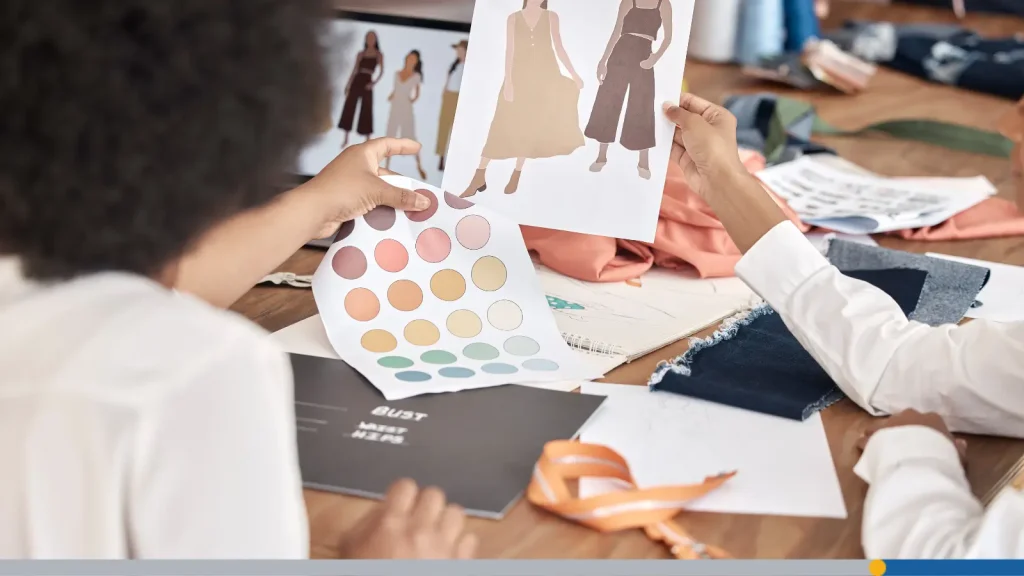
Fashion companies generally fall into a handful of proven logo styles. Understanding these categories makes choosing your own direction much easier, and helps you understand which approach is best suited for your brand’s specific name, personality, and ambitions.
Wordmarks (Just the Name: Calvin Klein, Supreme, Everlane)
Wordmarks rely entirely on typography. Instead of creating a separate icon, the company name itself becomes the logo.
This approach works particularly well when:
- Your brand name is short and memorable (two syllables is ideal).
- The name has strong phonetic qualities that deserve visual emphasis.
- You want name recognition to build as fast as possible.
The font choice carries enormous weight in a wordmark. Everything from the thickness of letter strokes to the shape of a lowercase a communicates personality. Fashion brands often invest in custom lettering because the specific typography becomes part of their identity.
- A clean geometric sans-serif (like Futura or a custom equivalent) communicates modernity and confidence.
- A classical high-contrast serif conveys heritage and luxury.
- A humanist sans-serif feels approachable and contemporary.
- A handwritten or brush script reads as personal, artisanal, or youthful.
Wordmarks are especially valuable for brands that want to build maximum name recognition in their early years, and they’re often the easiest logo style to reproduce consistently across embroidery, screen printing, and woven labels.
Lettermarks & Monograms (LV, Gucci, YSL)
If your company has a longer name, or if your brand name works better as initials, a monogram or lettermark can become a recognizable shortcut.
Monograms have a long history in fashion because they translate beautifully to the kinds of decorative applications high-end brands care about: embossed leather goods, engraved buttons, jacquard woven fabric, and intricate embroidery.
Advantages of lettermarks and monograms include:
- A smaller visual footprint, fitting naturally into tight placements.
- Strong suitability for embroidery and jacquard weaving.
- An immediate luxury or heritage association in many markets.
- Versatility as a repeating pattern for linings, prints, and hardware.
The main challenge: Initials only work if they’re distinctive enough to stand out from other brands using the same letters. An LB monogram may belong to dozens of companies. The solution is often in the specific way the letters are drawn, spaced, or combined, making the typography itself so ownable that the initials become uniquely yours.
Pictorial Marks & Icons (Nike Swoosh, Lacoste Crocodile, Polo Ralph Lauren)
Some companies eventually become iconic enough that they are recognizable through symbols alone. A shape, animal, object, or abstract mark becomes so strongly associated with the brand that words become unnecessary.
The obvious appeal is immediacy: A strong icon communicates in an instant, transcends language barriers, and works beautifully in small placements like sock embroidery, hat pins, or sleeve patches.
Icons work particularly well for:
- Athletic and footwear brands where small placements on products are common.
- Heritage brands with a strong story linked to a symbol (an animal, a country, a founding myth).
- Brands targeting international markets where language barriers matter.
- Companies willing to invest in the long-term recognition-building that icon-only logos require.
The honest challenge is that icon-only logos take time, consistent usage, and often marketing investment before customers make the connection between symbol and brand.
Combination Marks (The Starting Point for Most New Brands)
A combination logo merges typography with a symbol, and for many new clothing brands, this is the smartest strategic starting point.
Here’s why: Combination marks give you two identifiable elements from day one. When used consistently, customers gradually learn to associate both the icon and the wordmark with your brand, so over time the icon alone begins to carry recognition.
Practical benefits include:
- Immediate name recognition (the wordmark does its job while the icon builds familiarity).
- Flexible layout options: horizontal, stacked, icon-only for appropriate contexts.
- Easier early marketing, because you don’t have to teach customers what your symbol means.
- A natural upgrade path: as your brand grows, the icon can eventually stand alone.
Clothing Brand Logo Ideas by Style
Different fashion markets attract different audiences, and those audiences have visual expectations. Your logo should feel like it belongs alongside the brands your customers already love, while still being distinctive enough to claim its own space.
Streetwear & Urban Brands
Streetwear thrives on confidence, self-expression, and cultural authenticity. A logo in this space has to hold its own as a piece of graphic design, not just an identifier, because streetwear customers often choose brands partly based on how the logo looks as a design element on the garment.
Characteristics that work well:
- Heavy, bold sans-serif typography with strong geometric structure.
- High contrast, particularly black and white.
- Graphic symbols that have cultural resonance or street art energy.
- Oversized applications where the logo becomes the statement.
- Intentional imperfection, distressed textures, hand-drawn elements, raw edges, used strategically.
- Limited but impactful color palettes.
Luxury & Boutique Brands
Luxury fashion rarely shouts. In fact, loud branding in the high-end space is often seen as a sign of insecurity, as if the brand needs to work too hard to announce itself. The most successful luxury logos communicate through what they leave out as much as what they include.
Key characteristics:
- Carefully chosen typography.
- Generous letter-spacing (tracking) that gives the wordmark room to breathe.
- Strict neutral palette: black, white, ivory, champagne, navy.
- Absolute consistency in every application, with tight brand standards.
- Delicate proportions and elegant hierarchy if multiple text elements are used.
- Nothing extraneous, every element earns its place or gets removed.
The paradox of luxury branding is that simplicity is expensive-looking. Customers associate restraint with exclusivity because premium brands don’t need to try too hard. If you’re building a boutique label, resist the temptation to add complexity. Ask instead: What can I remove?
Activewear Brands
Fitness apparel operates in a highly competitive market where customers make quick decisions based on whether a brand feels as athletic as they aspire to be. Your logo needs to communicate performance, energy, and movement.
Effective approaches:
- Forward-leaning diagonals and angled typography that imply momentum.
- Abstract symbols inspired by motion, speed lines, wing shapes, lightning forms.
- Athletic silhouettes, running figures, geometric representations of the human body in motion.
- Strong, bold letterforms that feel powerful rather than delicate.
- Color choices that signal energy: neons, electric blues, stark black-and-white.
- Minimal ornamentation, activewear customers value function, and logos that look functional reinforce that.
One useful question: Does your logo feel like it belongs on a shoe? If it would look at home on a running shoe’s midsole, it likely has the performance energy activewear branding demands.
Sustainable & Eco-Conscious Brands
Sustainability has moved from niche positioning to mainstream consumer expectation, but that also means eco-friendly branding has become crowded, and generic green design no longer differentiates a brand. The most powerful sustainable fashion logos feel genuinely authentic rather than algorithmically natural.
What works:
- Organic, irregular shapes that feel grown rather than engineered.
- Botanical elements, leaves, roots, branches, seeds, used with specificity rather than genericness.
- Handcrafted visual qualities, lightly irregular letterforms, illustrated icons, texture.
- Earth-toned palettes (greens, terracotta, cream, brown, muted indigo) that feel considered rather than defaulted to.
- Circular or cyclical forms that reference sustainability as a system.
- Transparency in what the symbol represents, avoiding vague eco visuals that feel like greenwashing.
Authenticity matters more here than in any other fashion category. Sustainable customers are often skeptical of branding that looks like it was designed to perform sustainability rather than embody it.
Real Examples From Famous Clothing Brands
Studying successful logos isn’t about copying them; it’s about understanding why they continue working decade after decade, and what principles are transferable to your own brand.
Nike: The Power of an Abstract Symbol Done Right
The Nike Swoosh is widely considered one of the greatest logos ever created, and it was designed in 1971 by a graphic design student named Carolyn Davidson for a fee of $35.
Its genius lies in several overlapping qualities:
- Simplicity at the extreme: A single curved line with no additional elements.
- Implied motion: The shape suggests movement, speed, and the energetic quality of athletic performance.
- Infinite scalability: It works identically at three millimeters and 30 feet.
- Cultural flexibility: It carries no text, meaning it works identically across every language and market.
Nike didn’t build recognition with the Swoosh overnight; for several years, they paired it with their wordmark. It was only after significant investment in marketing and product that the Swoosh earned the right to stand alone.
Supreme: Why Consistency Is a Brand Strategy
Supreme’s logo is, objectively, extremely simple: white Futura Heavy text inside a red rectangle. It’s not a sophisticated piece of design. The typeface is a standard commercial font. The box is a shape anyone may draw.
So, why has it become one of the most recognized logos in fashion?
What Supreme understood from the very beginning is that the logo isn’t the brand; the brand is the brand. The logo is just the flag. Supreme built a cultural cachet through scarcity, authenticity, and community, and the bold simplicity of the logo made it the perfect vehicle for that meaning.
Patagonia: Environmental Commitment Made Visual
Patagonia’s logo has evolved over time, but has always featured the distinctive mountain silhouette, a direct visual reference to the Patagonia region in South America, specifically the jagged peaks of the Fitz Roy massif.
This mountain mark does several things simultaneously:
- It grounds the brand in a specific, real place, reinforcing authenticity.
- It communicates the outdoor, adventure-oriented product category clearly.
- Its organic, irregular silhouette feels genuinely natural rather than generic.
- It scales effectively, from full-back prints to label embossing.
Patagonia has built one of fashion’s strongest sustainability brands, and that identity is reinforced visually at every touchpoint, from the mountain logo to the earth-toned palette to the deliberately understated packaging. Every visual choice coheres around a single, genuine brand story.
How to Design a Clothing Brand Logo Step-By-Step
Understanding what makes great logos work is one thing. Actually designing one is another. Here’s a practical process that takes you from blank page to finished identity.
Step 1: Define Your Brand Before Opening Any Design Tool
This sounds obvious, but it’s the step most skipped, and the one that most directly determines whether your logo ends up feeling generic or genuinely ownable.
Before choosing a font or color, do this work:
- Write a brand character statement. In two or three sentences, describe your brand as if it were a person. What does that person wear? What music do they listen to? What do they value? How do they speak?
- Identify your five brand adjectives. These guide every visual decision.
- Define your customer specifically. The more specifically you can picture one real person, the sharper your visual direction will become.
- Research your competitive landscape. Collect logos from ten competitors. Identify what visual conventions dominate your space, and where genuine differentiation may be possible.
Only after completing this work should you open a design application.
Step 2: Explore Typography First
Typography is the foundation of most clothing logos. Even if you ultimately want an icon-led design, understanding which typographic voice fits your brand will inform every other choice.
Gather 15—20 different typefaces that feel roughly appropriate for your brand. Then test your brand name in each one, looking for:
- Does the overall feeling match your five adjectives?
- Do the individual letterforms have distinctive qualities that may make the wordmark ownable?
- Does the weight feel right for your application contexts?
- Does it feel fresh, or does it look like every other brand in your category?
Avoid overused safe choices; if you find yourself gravitating toward the same fonts you’ve seen on a hundred competitor logos, push further. Custom lettering or thoughtful modification of an existing font can increase distinctiveness.
Step 3: Develop Your Icon or Symbol (If Using One)
If your design direction calls for an icon, this is where research and sketching converge.
Begin by generating a large number of rough thumbnail sketches; aim for at least 20—30 ideas before evaluating any of them. Quantity first, quality later. You’re looking for unexpected directions rather than the first good enough idea.
For each direction that shows potential, ask:
- Does this connect to a real story about my brand?
- Is there anything similar already being used in my category?
- Can it be simplified to its essential form?
- How would it look in one flat color, at one inch wide?
Step 4: Test Color With Intention
Color is often where clothing brand logos go wrong, because designers choose what looks good on screen without considering production realities.
- Start in black and white. If your logo doesn’t work in a single flat color, it won’t work on garments. Solve the black-and-white version first, completely.
- Consider fabric behavior. Colors shift on different substrates. A rich navy on screen looks different when screen-printed onto a heavyweight cotton versus a polyester blend. Some colors are prohibitively expensive to reproduce in embroidery thread. Bright neons fade quickly on fabric.
- Think in systems. Most clothing brands need multiple color versions: a primary (often black or one spot color), a reversed version (white on dark), and sometimes a secondary color accent. Your palette needs to work across all of them.
Step 5: Build Your Production File Package
A finished logo isn’t a single file; it’s a complete package that prepares you for every application you’ll encounter.
Standard deliverables should include:
- Vector source files (AI, EPS, or SVG) essential for print, embroidery, and any size reproduction.
- PNG files with transparent backgrounds at multiple resolutions, for digital use.
- A black version on white and a white version on black.
- Color specifications, Pantone (for screen printing), CMYK (for print), and HEX/RGB (for digital).
- Multiple layout versions, horizontal, stacked, and icon-only where applicable.
- Minimum size guidelines: define the smallest size at which each version remains legible.
Without a proper file package, you’ll face production problems with every vendor, printer, and embroidery shop you work with.
Step 6: Create Application Mockups Before Finalizing
Before committing to a final design, test it in realistic production contexts.
At minimum, mock your logo onto:
- A T-shirt chest placement.
- A hoodie left chest and full-back version.
- A baseball cap.
- A neck label at actual size.
- A hangtag.
- An Instagram profile picture at 32px.
- A website header.
Pay special attention to how the logo reads at actual neck label size; this is often where details fall apart. Print the mockups out and hold them at arm’s length. Does it read clearly? Does it feel like it belongs with the brands you admire?
This testing step is what separates logos that look good in a presentation from logos that work in the real world.
Conclusion
Great clothing brands aren’t remembered because they have the most complicated logos; they’re remembered because they have the most consistent ones.
Keep your design simple, enlargeable, and true to your personality. Focus on creating a visual identity that customers can recognize instantly, and support it with thoughtful packaging, cohesive branding, and consistent use across every customer touchpoint.
Most importantly, remember that the best clothing brand logos don’t become iconic overnight. Recognition is built through quality products, consistent branding, and repeated exposure. Invest the time to create a logo you’ll still be proud to use years from now, and it can become one of your brand’s most valuable assets.
Need help designing your iconic clothing brand logo? FreeLogoServices has a suite of AI-Powered logo design tools that you can use to create an eye-catching logo in just minutes. Get started today!
FREQUENTLY ASKED QUESTIONS
What makes a good clothing brand logo?
A good clothing brand logo is simple, memorable, and versatile. It should be easy to recognize whether it’s embroidered on a hat, printed on a T-shirt, woven into a neck label, or displayed online.
Which type of logo is best for a clothing brand?
There isn’t a single best option for every business. Wordmarks work well for memorable brand names, monograms create a premium feel, pictorial marks can become highly recognizable over time, and combination marks offer the greatest flexibility for startups. Many new apparel businesses begin with a combination logo before simplifying their identity as their brand develops.
How do I come up with a clothing brand name?
Start by identifying your target audience, your style, and the story behind your brand. Brainstorm words related to your products, values, and aesthetic. You can also use a fashion line name generator to spark ideas or browse collections of business name ideas for clothing. Once you’ve narrowed down your favorites, check domain availability, social media handles, and trademark databases before making your final decision.
What file formats should I save my clothing logo in?
For the best results, save your logo in several formats. Vector files such as AI, EPS, or SVG are indispensable for printing, embroidery, and resizing without losing quality. PNG files work well for transparent digital graphics, while JPGs are useful for everyday sharing. Keeping multiple versions will ensure your logo is ready for every application.