Designing a logo for a T-shirt is one thing. Designing a logo for a hat? That’s a whole different animal. You’ve got a curved surface, a tiny window of usable space, and a finished product that sits about six inches from someone’s face all day long. No pressure.
In this article, we’ll walk you through everything you need to know about hat logo design, from why hats behave so differently from other merch, to placement options, and how to actually prep your file so your embroiderer doesn’t send it back with questions.
- Why Hat Logos Are Different From Other Merch
- Hat Types & How They Affect Your Logo Design
- Logo Placement Options for Hats
- Designing a Logo That Works for Hat Embroidery
- Hat Logo Ideas by Brand Style
- Preparing Your Logo File for Hat Production
Why Hat Logos Are Different From Other Merch
A T-shirt is basically a flat, forgiving canvas. A hoodie, a tote bag, a poster, the same story. A hat is not that. Hat logo design comes with its own set of physical constraints that flat merch simply doesn’t have to deal with, and understanding those constraints early saves you from a lot of back-and-forth later.
Curved Surface Challenges
Hats are curved. That sounds obvious, but it has real design consequences. When a design is stitched onto a curved front panel, straight lines can appear to bow, symmetrical elements can look slightly off-kilter, and text that runs edge to edge may pucker or distort at the outer corners where the curve is sharpest.
Logo printing methods like screen printing and DTG printing lay ink flat onto fabric that’s been stretched taut on a platen. Embroidery, on the other hand, is a needle and thread physically building up a design stitch by stitch on a surface that’s naturally domed. That means:
- Digitizing (the process of converting your logo into a stitch file) has to account for the curve, not just the flat artwork.
- Wide, horizontal designs are riskier than compact, centered ones.
- Fine details near the edges of the design are more likely to distort.
This is why a hat embroidery logo almost always needs its own digitized version; you can’t just take your flat print file and expect it to translate perfectly onto a cap.
Small Canvas Size
The front panel on a hat is small. Really small. On a typical structured cap, you’re working with roughly 2 to 2.5 inches of usable height and around 4.5 to 5 inches of width.
That tiny canvas means:
- Fine line work under about 1mm thick tends to disappear or merge together.
- Small text (especially anything under 0.25 inches tall) often turns into an unreadable blob of thread.
- Gradients and photographic detail simply don’t translate; embroidery works in solid blocks of thread color, not blended pixels.
- There’s a practical minimum stitch count for any element to register cleanly, which is why just shrinking the logo down rarely works as a strategy.
High Visibility
Hats are one of the most clearly visible pieces of marketing apparel at your disposal. Over 68% of US consumers own at least one baseball cap, while 41% own three or more. The ubiquity of hats makes them an ideal marketing platform.
Moreover, a hat logo gets an incredible amount of visual real estate relative to its size. Unlike a logo on the back of a T-shirt that people glance at from a distance, a cap logo design sits right at eye level, framing someone’s face, in nearly every interaction they have while wearing it.
Because of that visibility, it’s worth treating hat logo design as its own creative project rather than an afterthought tacked onto your main branding package.
Hat Types & How They Affect Your Logo Design
Not all hats are built the same, and the hat style you choose has a direct impact on how your logo will look once it’s produced. Here’s how the most common styles affect your design decisions.
Structured Snapbacks & Fitted Caps
The history of the snapback cap can be traced back to the late 1850s when the Brooklyn Excelsiors wore an early round-crowned cap with a short brim. Over the next 100 years, the cap’s design would be refined, ultimately culminating in the modern-day snapback cap.
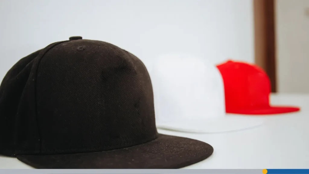
Structured caps have a buckram lining inside the front panels that keeps their shape rigid and upright. This is actually great news for a snapback logo; the flat, stable front panel gives embroidery a consistent, even surface to work with, minimizing puckering and distortion.
- You get the most usable, symmetrical space of any hat style.
- The rigidity helps bold shapes and lettering hold their form.
- This structure is the go-to choice for brand-forward logos.
Trucker Hats
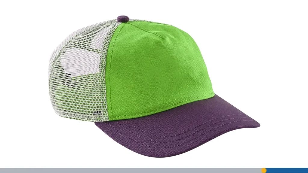
Trucker hats pair a foam front panel with a mesh back, and that foam front changes the embroidery equation. Foam is thicker and slightly spongier than a standard structured panel, which means:
- Stitch density needs to be dialed in carefully; too dense, and the foam can pucker; too light and the design looks thin.
- The foam panel is often a bit shorter in height than a fully structured cap, so your usable vertical space shrinks slightly.
- A trucker hat logo tends to work best when it’s bold and graphic rather than delicate or text-heavy, since foam doesn’t hold fine detail as cleanly as a firmer surface.
Trucker hats also lean casual and outdoorsy by association, so a lot of brands intentionally pair simpler, punchier logos with this hat style.
Dad Hats & Unstructured Hats
Unstructured dad hats ditch the buckram lining entirely, giving you a soft, low-profile silhouette that curves and creases naturally with wear. That relaxed structure means:
- The panel isn’t perfectly flat even before embroidery is added, so the finished logo will always have a slightly worn, lived-in look.
- Because the surface flexes more, extremely rigid geometric designs can look slightly different from their flat mockup.
- This softness is actually a feature for a lot of brands; dad hats read as casual and approachable, and a simple embroidered logo suits that vibe perfectly.
Beanies
Beanies flip the constraints entirely. There’s no curved bill to worry about, and depending on the fold, you can actually get a wider flat-ish surface to work with. But knit fabric brings its own challenge: The texture is uneven, ribbed, or looped, which affects how cleanly thread sits on top of it.
- Small, delicate details can get lost in the texture of the knit.
- Bold, simple marks tend to perform best.
- Placement is often centered on the cuff (the folded-up brim), since that’s the flattest, most visible section.
Beanies are a great canvas when your logo is already minimal, since the knit texture does a lot of the personality work on its own.

Logo Placement Options for Hats
Once you understand your hat style, the next big decision is where the logo actually goes. Logo placement on hat products isn’t just aesthetic; it affects readability, production cost, and how the design interacts with the hat’s structure.
Front-Center: Most Common
This is the classic, and for good reason; it’s the first place anyone’s eyes go. Front-and-center placement on a structured cap typically works within these general guidelines:
- Width: Roughly 3.5 to 4.5 inches, depending on hat size and design.
- Height: Roughly 2 to 2.5 inches.
This is the placement most people picture when they think “logo on cap,” and it’s the safest choice if you only get one shot at branding the hat.
Side Logo
A side placement is a popular secondary or standalone alternative. It works well when:
- You want a smaller, subtler mark rather than a bold front statement.
- You’re already using the front panel for something else.
- You’re going for a more minimal, understated brand aesthetic.
Side logos are often scaled down significantly from front-center placements, often just an icon or initials rather than a full wordmark, simply because the side panel offers much less usable space.
Back Logo or Tagline
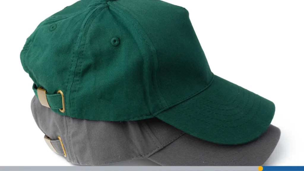
The back panel, right above the adjustable strap or snapback closure, is prime real estate for a tagline, a URL, a founding year, or a secondary mark. It’s a nice way to add a little extra brand storytelling without cluttering the front.
- Great for taglines, or a small repeated icon.
- Keep it short; this space is narrow and often interrupted by the strap hardware.
- Works especially well on structured and trucker styles where the back panel is more visible.
Under the Brim
This one’s become a favorite among streetwear and lifestyle brands: a logo, pattern, or message stitched or printed on the underside of the brim, invisible unless someone flips the hat up or looks closely.
- It’s a fun easter egg that rewards close attention and builds a sense of insider brand loyalty.
- Because it’s hidden, this space has more design freedom.
- It’s a nice way to add value to a hat without touching the primary visible placements.
Designing a Logo That Works for Hat Embroidery
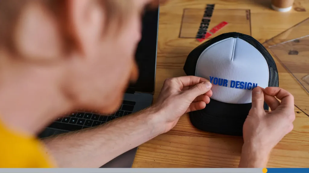
So you know your hat style and your placement; now let’s talk about actually designing the logo itself so it survives the embroidery process looking sharp.
Simplify
This is the golden rule of hat logo design: simplify, simplify, simplify. Embroidery is a physical, thread-based medium, and it just can’t replicate what a high-resolution digital file can.
- Remove gradients and photographic elements, and convert them to solid color blocks.
- Thicken any line roughly under 1mm so it registers as a clean stitch rather than disappearing.
- Cut unnecessary text; if your logo has a tagline or fine print, save it for a different placement.
- Reduce your color count.
A logo that reads perfectly on a business card or website may need real editing before it works as a hat embroidery logo, and that’s completely normal.
Go With Bold Outlines
Thread has weight and dimension that flat ink doesn’t. A bold outline around your main shapes does a few useful things:
- It helps define the edges of your logo clearly against the hat fabric.
- It hides small inconsistencies in stitch placement that are inevitable with any embroidery run.
- It gives your design a sense of structure, even at small sizes.
If your logo currently relies on thin, delicate linework for its outline, consider a bolder version specifically for embroidered applications.
Maximum Stitch Area: Standard Front Panel Dimensions
Embroidery machines and hat manufacturers generally work within a standard maximum stitch area for front panels, commonly around 4.5 inches wide by 2.5 inches tall, though this varies slightly by supplier and hat style.
Always ask your supplier for their specific maximum dimensions before finalizing your design, since this can shift depending on the hat style and machine setup.

Hat Logo Ideas by Brand Style
Different brand personalities call for different approaches to hat logo design. Here’s how it tends to break down across common categories.
Streetwear
Streetwear brands often break the keep it small rule on purpose, going with oversized front graphics that dominate the whole panel for a bold, statement-making look.
- Bold, chunky lettering or graphic marks.
- Tonal or monochrome color schemes for a premium, understated feel.
- Willingness to break from safe sizing conventions for visual impact.
Outdoor & Workwear
Outdoor and workwear brands frequently lean on patch logos, separately made embroidered or leather patches that are then sewn or heat-applied onto the hat, instead of direct embroidery. Woven labels (flat, tightly woven fabric tags) are another popular choice.
- Patches allow for more intricate detail than direct embroidery permits.
- They give a rugged, durable, built-to-last aesthetic that fits the workwear identity.
- Woven labels work well for smaller, more detailed logos.
Sports Teams
Sports and athletic brands are built around bold, instantly recognizable marks like mascots, initials, and chunky number fonts designed to read clearly from a distance.
- High contrast and bold shapes are non-negotiable.
- Mascot logos often need simplification for embroidery; reduce fine detail in fur, feathers, or facial features.
- Number fonts should be chunky and evenly weighted, so they hold up at small embroidered sizes.
Corporate & Promo
For corporate gifting and promotional hats, restraint is often the winning move. A clean wordmark in one or two colors reads as professional, versatile, and safe across a wide range of hat colors and styles.
- Stick to one or two thread colors to keep costs predictable across large orders.
- Simple, legible wordmarks age better than trendy graphic treatments.
- Front-center placement is almost always the default for corporate and promo runs, since it’s the most universally recognizable format.
Preparing Your Logo File for Hat Production
You’ve nailed the design; now it’s time to get the file itself production-ready. This step trips up a lot of people, so here’s what your embroiderer actually needs from you.
Vector Format Requirements (AI, EPS, SVG)
Embroidery digitizers need vector files, not flat images like JPGs or PNGs. Vector formats (AI, EPS, or SVG) store your logo as scalable paths and shapes rather than pixels, which means:
- The design can be resized without any loss of quality or clarity.
- Digitizers can clearly separate each color and shape into its own stitch layer.
- There’s no blurring or pixelation at the edges, which matters a lot on a small canvas like a hat.
Thread Color Selection
Thread doesn’t come in infinite custom colors the way ink does, it comes in a defined range of thread color numbers, and your embroiderer will match your brand’s Pantone (PMS) colors to the closest available thread.
- Provide your exact Pantone values up front.
- Ask your supplier for their thread color chart so you (or your designer) can pick the closest match yourself, rather than leaving it to guesswork.
- Request a physical or digital thread swatch before full production if color accuracy really matters to your brand; screens can be misleading.
Conclusion
Hat logo design isn’t just a smaller version of your regular branding; it’s its own discipline, with its own rules around curvature, stitch limits, and visibility. The good news is that once you understand those rules, designing (or adapting) a logo for hats becomes a lot less trial-and-error.
Pick a hat style that matches your brand personality, choose a placement that fits your message, simplify your design for embroidery, and always double-check your file specs before production.
FreeLogoServices has made the hat logo design process simple with our AI-Powered logo design tool and our streamlined custom apparel order process. Create your own custom hat logo and order as many as you need, no minimum order required. Get started today!
FREQUENTLY ASKED QUESTIONS
What size should a hat logo be?
Most front-center hat logos fall somewhere between 3.5 to 4.5 inches wide and 2 to 2.5 inches tall, though this depends on the hat style and your supplier’s maximum stitch area. Side and back placements are typically much smaller.
Is embroidery or printing better for hat logos?
Embroidery is the most common and durable method for structured caps, snapbacks, and trucker hats, and it holds up well to washing and wear. Printing (like screen printing) is sometimes used on flatter, unstructured styles, but it’s less common on curved cap surfaces and can crack or fade faster than stitched thread.
How many colors can a hat logo have?
There’s no strict limit, but most embroidered hat logos use somewhere between one and five thread colors. Keeping the color count low helps control cost and ensures the design stays clean and readable at a small size.
What file format do I need for hat embroidery?
Vector formats like AI, EPS, or SVG are ideal, since they let your embroiderer or digitizer scale and separate the design cleanly. A digitized stitch file (often a DST format) will ultimately be created from your vector art for the embroidery machine itself.