Creating a brand starts with clarity, not a fancy logo. We’ll map the process from strategy to visuals, voice, and real-world use.
Most people jump straight to design because it feels productive. Colors and fonts are fun to pick, and a new logo feels like real progress. But a brand built on visuals alone tends to wobble the moment it meets a real customer. The stronger approach is to slow down at the start, get the thinking right, and let the visuals follow naturally.
CONTENTS TABLE
- What Does It Mean to Create a Brand?
- Step 1: Define Your Brand Strategy
- Step 2: Choose Your Brand Name
- Step 3: Design Your Visual Identity
- Step 4: Define Your Brand Voice & Messaging
- Step 5: Apply Your Brand in the Real World
- Step 6: Keep It Consistent & Evolve Smart
- Reminders

What Does It Mean to Create a Brand?
A brand is the feeling people attach to your business. It includes your name, logo, message, and customer experience.
That feeling forms whether you plan for it or not. Every interaction, from a support email to a shipping box, adds a little to how someone sees you. Creating a brand on purpose means shaping that feeling rather than leaving it to chance. It’s less about inventing something new and more about deciding what you want people to notice first.
Brand vs. Logo: Understanding the Difference
A logo is one piece of the puzzle. Your brand is the whole picture, from promise to presentation.
Think of the logo as a handshake. The brand is the conversation that follows. If the handshake feels solid, people stay curious. If the full experience matches, trust grows faster.
A lot of business owners spend months tweaking a logo and barely think about the conversation that follows. A great logo attached to a confusing website or an inconsistent tone can still lose someone’s trust. Treat the logo as an entry point, not the destination. The real work is making sure everything beyond that first glance upholds the promise the logo makes.
Why Every Business Needs a Brand
Small businesses need brands, too. A clear brand helps people remember you and understand your value.
Without that clarity, you blend in. With it, even a small shop feels focused, steady, and easier to choose.
This matters just as much for a solo freelancer as it does for an expanding company. People are busy, and they tend to pick the option that feels easiest to understand. A defined brand does that explaining for you. It also helps with pricing. A clear, confident brand can charge a fair rate, because the value is obvious rather than something you have to argue for every time.

Step 1: Define Your Brand Strategy
Brand strategy gives your business direction. It helps every later choice feel easier and less random.
Think of strategy as the set of decisions you make once for every new project. Without it, each new flyer, post, or product page becomes its own debate. With it, you have a reference point to check ideas against. The questions below aren’t just for the launch phase either. Revisit them every year or two, since your answers can shift as your business and customers change.
Who Is Your Target Audience?
Start with one clear person. Think about age, goals, habits, pain points, and spending style.
A logo for teens can feel very different from one for contractors.
Try writing a short profile of one person, even if your real customer base is broader. Give them a name, a job, and a reason they’d search for what you offer. It sounds simple, but it forces specific choices instead of vague ones. Designers and writers work faster and better when they have a real person to picture, rather than a generic phrase like everyone who may need this.
What Problem Do You Solve & How?
Your brand should answer one simple question: Why should someone care about you?
It helps to write this down as a single sentence you may say out loud to a stranger. If it takes more than one breath, it’s probably too complicated. Test it on someone outside your industry, since they’ll react the way most customers will. If they nod along and understand right away, you’ve found the right words.
What Adjectives Describe Your Brand?
Pick three to five words that feel true. Words like calm, bold, warm, modern, or trusted can guide design and writing.
Those words work like a filter. If a choice clashes with them, skip it.
Keep this short list somewhere visible, on a board or at the top of a shared document. When picking a font, writing a caption, or choosing a photo, run it past these words first. If calm is one of your words, a loud neon color scheme probably isn’t the right fit. The adjectives aren’t meant to limit creativity. They’re about keeping every decision pointed in the same direction.
What Makes You Different?
Look at competitors honestly. Then name the gap you fill.
Are you faster, friendlier, more specialized, or easier to work with? Then, your difference does not need drama. It needs proof.
Look at three or four competitors and write down what each one seems to promise. If everyone claims to be the best quality, that word has lost its meaning, and you need something sharper. Real differentiation often comes from a narrower focus. Serving one type of customer can beat trying to serve everyone reasonably well, especially for a small business building its reputation.

Step 2: Choose Your Brand Name
A good name is memorable, readable, and easy to say. It should also fit future growth.
Naming often takes longer than people expect, and that’s fine. It’s one of the few brand decisions that’s genuinely hard to change once it sticks. Give yourself a list of at least 20 options before narrowing down, and say each one out loud. Names that look fine written down sometimes sound awkward spoken, and spoken is how most referrals actually happen.
Types of Brand Names
Descriptive names explain what you do. Invented names sound fresh. Personal names feel direct. Place-based names can add local flavor.
Each type has tradeoffs. A descriptive name is clear, but can feel narrow. An invented name can scale better, but needs more explanation.
There’s also a hybrid option, where you pair an invented word with a descriptive one, like combining a made-up name with a short tagline underneath it in your logo. This gives you the flexibility of an invented name while still telling people what you do at first glance. It’s a common middle ground for businesses that want personality without sacrificing clarity in the early days.
How to Check Availability
Check trademarks first. Then check the domain name, social handles, and search results.
This step saves pain later. Nothing hurts like building momentum, then finding the name is taken.
A quick search engine check can also tell you a lot. If your ideal name already belongs to a well-known brand in an unrelated field, customers may end up confused about who they’re actually dealing with. It’s worth checking a few spelling variations too, since a name that’s easy to mishear can send potential customers to the wrong website.
Tips for a Name That Scales
Choose a name that still works when you develop. Leave room for new services, products, or locations.
A name that is too narrow can box you in. A name with room to move feels like a bigger jacket. It still fits later.
A useful test is to imagine your business five years from now, offering two or three more products or services than it does today. Say your current name alongside that imagined future. If it still makes sense, you’re likely in good shape. If it suddenly feels limiting, it may be worth widening the name before you build too much around it.
Step 3: Design Your Visual Identity
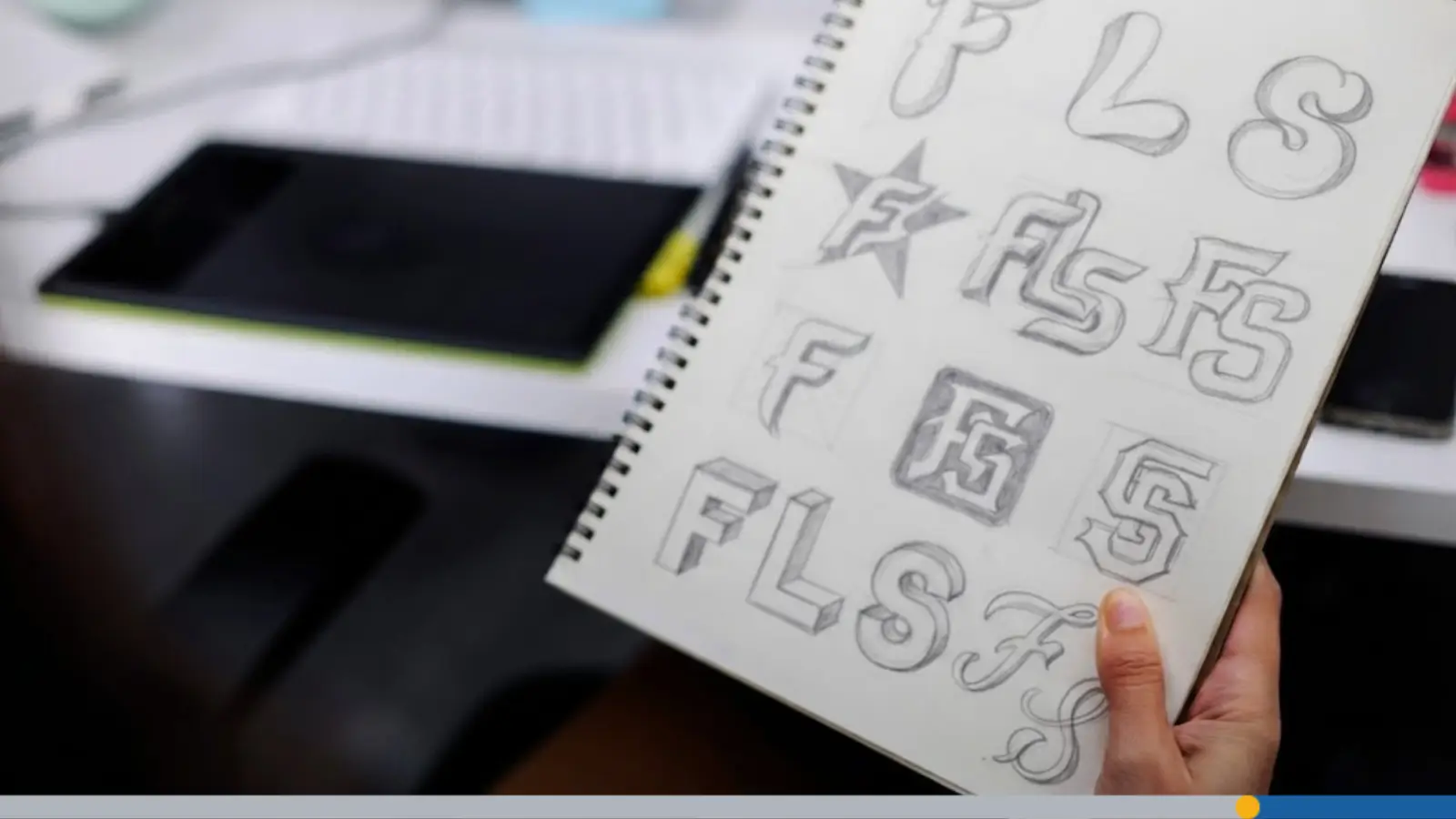
Your visual identity turns strategy into something people can see. It includes your logo, colors, fonts, and layouts.
This is the stage where all that earlier thinking finally pays off. Instead of starting from a blank page, you already have adjectives, an audience, and a sense of what makes you different. Visual identity is really just translating those decisions into shapes, colors, and type. Designers who skip strategy often end up guessing at this stage, which is why so many logos feel generic.
Start With Your Logo
Start with the logo before the website. Your logo sets the tone for the rest of the visual system.
A good logo often works in black and white before color is ever added. If the shape and layout still read clearly without color, the design has a strong foundation. It’s also worth testing your logo at a very small size, since it will often appear as a tiny icon on a phone screen or social profile long before anyone sees it full size on a sign or a business card.
Choose Brand Colors
Keep your palette small. Two or three colors are often enough.
Too many colors can feel messy. A tight palette feels cleaner, like a desk with room to work.
Colors also carry meaning, even if that meaning is subtle. Blue often reads as trustworthy and calm, which is why so many banks and tech companies use it. Green can suggest health or growth, while red tends to feel urgent or bold. Choosing a palette that matches both your industry’s expectations and your own personality tends to work best.
Choose Brand Typography
Fonts carry mood. Serif fonts can feel classic, while sans-serif fonts can feel modern and clean.
Pick one heading font and one body font. That gives you variety without visual noise.
Define Logo Variations
You need more than one version. Most brands use a primary logo, a secondary logo, and an icon.
That helps your logo work on a website, a social profile, or a product label. The logo should flex without losing its identity.

Step 4: Define Your Brand Voice & Messaging
Your voice is how your brand sounds. Your messaging is what it keeps saying, again and again.
Voice is often the most overlooked part of branding, mainly because it doesn’t feel as visible as a logo or a color palette. A consistent voice makes a business feel like it has a personality rather than a collection of disconnected messages. Getting it right doesn’t require a professional copywriter. It just takes a bit of intention and a willingness to write the same way every time.
Tone of Voice Options
Ask how your brand should feel. Formal, casual, bold, or reassuring?
A law firm may sound calm and precise. A skate shop may sound sharper and more playful. The tone should match the audience, not the designer’s mood.
It helps to pick a few reference brands whose tone you admire. Read a few of their posts or emails out loud and notice what makes the tone work, whether that’s short sentences, humor, or a certain warmth. You’re not copying their words, just noticing the mechanics. Then try writing a post in your own brand’s voice and see how close it feels to the tone you’re aiming for.
Write Your Tagline
A tagline is a short line that supports your position. It should explain the value, not try too hard.
Keep it simple. If people have to decode it, it’s missing the mark.
Write 10 to 15 versions before settling on one. The first few attempts tend to be obvious or generic, and the more interesting options often show up after you’ve pushed past the easy answers. Read your favorites out loud, and notice which one is easiest to remember a few minutes later without looking at it again. That’s often a strong sign you’ve found the right line.
Stay Consistent Across Channels
Your email, website, and social posts should sound related. They don’t need to sound identical.
Think of it like the same person wearing different clothes. The style changes, but the person stays recognizable.
A simple way to check consistency is to read a handful of your recent posts, emails, and website copy back-to-back. Do they sound like they came from the same business? If one post is casual and full of jokes while another is stiff and formal, that gap can quietly confuse readers, even if they can’t decide why something feels off.
Keeping a short list of words you use and words you avoid can help everyone writing for the brand stay aligned.

Step 5: Apply Your Brand in the Real World
A brand only matters when people see it in use. That means print, digital, packaging, and everyday materials.
It’s easy to treat this step as an afterthought once the logo and colors are locked in, but application is where a brand either earns trust or quietly loses it.
A beautiful logo means little if the invoice that follows looks thrown together. Every touchpoint is a small opportunity to reinforce the same impression, and consistency across dozens of small details adds up to something that feels much bigger than any single item.
Business Cards & Stationery
Business cards still matter. So do letterheads, invoices, and thank-you cards.
These small items can carry a big impression. A neat card says you pay attention.
Website & Social Profiles
Your website should quickly match your brand. The logo, colors, and voice should feel joined up.
Use the same profile image and handle style across social channels. Repetition helps people remember you faster.
Your website is often the first place a curious customer lands after hearing about you elsewhere, so it needs to confirm what they already expect. If your social posts feel playful but your website feels cold and corporate, visitors may wonder if they’ve found the right business at all.
Keep an eye on load times too, since a slow website can undercut even the best-looking brand before a visitor reads a single word.
Packaging, Merch & Printed Materials
If you sell physical products, packaging becomes part of the brand story. Even a sticker can make a basic box feel deliberate.
Merch can also help. A good shirt or mug works like a walking ad, without shouting.

Step 6: Keep It Consistent & Evolve Smart
Brands stay strong through repetition. They also stay healthy by changing at the right time.
Consistency and evolution can sound like opposites, but they actually work together.
Consistency is what makes a brand recognizable in the first place, while smart evolution keeps it from feeling stuck in the past. The goal isn’t to freeze your brand forever, but to change it deliberately, in small controlled steps, rather than letting it drift without anyone noticing or approving the shift.
Build a One-Page Brand Guide
A simple brand guide can fit on one page. Include logo rules, colors, fonts, voice, and example uses.
This guide saves time later. It also keeps freelancers and team members from guessing.
Think of this document as a reference rather than a rulebook. It should be easy to open, easy to understand, and easy to update as your brand expands. Many small businesses keep this as a simple shared document or slide, rather than a lengthy formal manual, since the goal is that people actually use it, not that it looks impressive sitting unopened in a folder.
Brief Printers & Designers Clearly
Give people exact files, sizes, and usage notes. Tell them where the logo will appear and what format you need.
Clear briefs prevent bad surprises. They also save back-and-forth, which nobody enjoys.
Know When It’s Time to Rebrand
A rebrand may make sense if your audience has changed. It may also help if your name feels dated or your look feels off.
Sometimes a brand just stops fitting. That’s normal. Businesses increase in size, and brands need to grow with them.
A full rebrand is a big undertaking, so it’s worth considering a lighter refresh first. Updating colors, tightening the logo, or adjusting the tone of your writing can solve a lot of the same problems without the cost and disruption of starting over.
Save the full rebrand for moments when the core of the business itself has genuinely changed, like a shift in audience, a new business model, or a name that no longer represents what you do.
Reminders
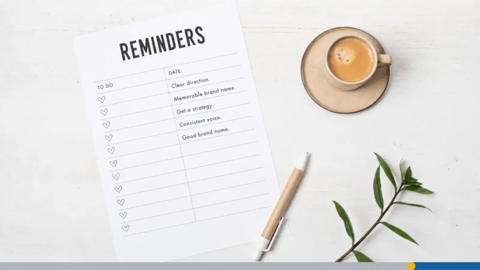
- A brand is the feeling people attach to your business and its experience. That feeling forms whether you plan for it or leave it entirely to chance.
- Brand strategy gives your business a clear direction and helps every choice feel easier. Think of strategy as the decisions you make once for each new project.
- Start with one clear target person, including their age, goals, habits, and pain points. Designers work faster when they have a real person to picture clearly.
- A good brand name is memorable, readable, easy to say, and fits future growth. Give yourself at least 20 name options before narrowing it down to your favorite.
- Your visual identity includes your logo, colors, fonts, and layouts that turn strategy visible. Start with the logo before building your website since it sets the tone.
- Keep your color palette small with two or three colors that feel clean together. Colors carry meaning, like blue for trustworthy or green for health and growth.
- Your voice is how your brand sounds, while messaging is what it keeps repeating. A consistent voice makes a business feel like it has personality rather than confusion.
- A tagline is a short line supporting your position that explains value simply. Write 10 to 15 versions before settling on one that is easiest to remember.
- Your website, email, and social posts should sound related but not necessarily identical. Think of it like the same person wearing different clothes for different occasions.
- Brands stay strong through repetition but also stay healthy by changing at the right time. A simple one-page brand guide saves time and keeps team members from guessing.

FREQUENTLY ASKED QUESTIONS
How do I start a brand from scratch?
Start with your audience, problem, and personality. Then choose a name, logo, and voice. Write down a few words that describe how you want people to feel when they interact with your brand, and let that guide every decision that follows.
What comes first, logo or website?
The logo often comes first. It helps guide the website’s look. Once you have a logo, it’s easier to pick fonts, colors, and imagery that feel consistent across every page.
How many brand colors should I use?
Two or three colors are enough for most small brands. Stick to one primary color, one secondary, and an accent for buttons or highlights so your site doesn’t feel cluttered.
What makes a brand name good?
It should be easy to say, remember, and grow with. Avoid names that box you into one product or service, since your business may expand in ways you don’t expect.
Do I need a brand guide?
Yes. A simple one-page guide keeps your brand consistent. Include your logo variations, color codes, fonts, and a few example dos and don’ts so anyone working on your brand can follow it easily.
When should I rebrand?
Rebrand when your look, name, or message no longer fits your business. This often happens after a major shift in your audience, offerings, or values, and a refresh can help you reconnect with the people you’re trying to reach.