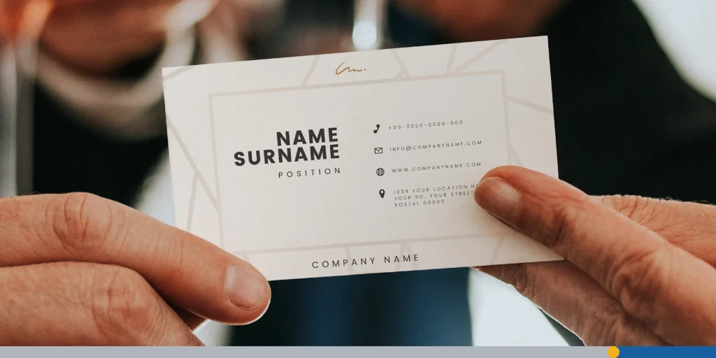
A professional business card should look clean, feel intentional, and make it easy for someone to remember you. A professional business card is a standard-sized printed card, typically 3.5 × 2 inches, that presents your name, role, and contact details in a clean, brand-consistent format.
The best cards don’t try to say everything, everywhere, all at once. They focus on the right details, clear design, and a polished finish that fits your brand.
That matters because a business card still does one simple job really well. It gives people a fast, tangible way to remember who you are, what you do, and how to reach you. If your card looks cluttered, outdated, or hard to read, it can make your business feel the same way.
What Makes a Business Card Look Professional?
Professional business cards look organized at a glance. People should be able to find your name, your role, and your contact details in seconds. If they have to search for the basics, the design is doing too much.
Professional cards also look consistent with the rest of your brand. Your logo, colors, font choices, and tone should feel like they belong to the same business. A card that looks disconnected from your website, social profiles, or signage can feel forgettable.
Print quality matters, too. Even a simple design can feel polished if the cardstock feels solid and the finish suits the brand. On the other hand, a busy design printed poorly can make a strong business look careless.
In most cases, professional means restrained, not plain. You don’t need a flashy layout to stand out. You need a card that feels clear, credible, and easy to keep.
Info to Put On Professional Business Cards
A business card should include the information people need to contact you without making the layout feel crowded.
Start with the essentials:
- Your full name.
- Your job title or role.
- Your company name.
- Your phone number.
- Your email address.
- Your website or primary landing page.
You may also want to include a few optional details if they help the card do its job:
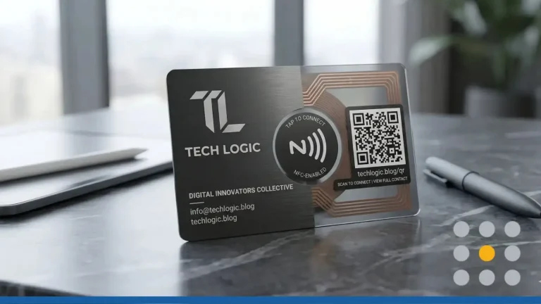
- A QR code that leads to your website, booking page, portfolio, or digital contact card.
- Your LinkedIn profile, if networking is part of your work.
- Your business address, if customers visit your location.
- A short service line, if your business name doesn’t explain what you do.
What you leave off is just as important. If the card includes too many phone numbers, multiple email addresses, long taglines, or every social platform you use, it becomes harder to scan. Professional cards make choices. They highlight the most useful next step.
Keep this section focused on follow-up, not autobiography. A business card isn’t a brochure. It’s a quick introduction.
For a deeper checklist of fields and formatting ideas, read our article on what business card info you need.
Source: Envato
Professional Business Card Design Tips
Use Clear Typography
Typography does way more than set a mood. It creates hierarchy. Your name should stand out first, your title and company should come next, and your contact information should remain readable without competing for attention.
In most cases, one or two fonts are enough. More than that can make the card feel scattered. If you want contrast, pair a stronger display font for the name or logo with a clean, easy-to-read font for details.
Size matters as much as style. Tiny type can make a card look refined on screen, then unreadable in print. If someone has to squint, the design isn’t helping you.
Give the Layout Room to Breathe
White space makes business cards feel more expensive and professional. It helps each element stand on its own and keeps the design from looking cramped.
That doesn’t mean your card should look empty. It means every element should have a reason to be there. If you can remove something and the card still works better, remove it.
A strong layout often starts with alignment. Left-aligned text often feels clean and easy to read. Centered layouts can work, too, but they need tighter discipline to avoid looking uneven.
Keep Branding Consistent
Your business card should look like it belongs to your brand. That means using the same logo treatment, color family, and visual tone people see elsewhere.
If your brand is modern and minimal, the card should reflect that. If your business is more personal or creative, the card can show more personality. The key is consistency. Professional design isn’t about copying trends. It’s about looking like yourself on purpose.
Logo Placement: Top-Left, Centered, or Back of Card
Where your logo sits shapes how the whole card reads. Top-left placement feels natural and familiar, since that’s where the eye starts. Centered placement works well for brands built around a single strong mark, like a monogram or icon. If the front feels crowded, placing the logo on the back gives it room to breathe and lets your name and contact details lead.
There’s no single correct answer, but pick one approach and stick with it. Mixing logo placements across different card variants for the same brand creates inconsistency that’s easy to spot.
Use Color With Restraint
Color can make a card memorable, but too much color can make it noisy. A limited palette often looks more polished than a card with several unrelated shades fighting for attention.
A simple rule works well here. Use one primary brand color, one support color if needed, and a neutral base. That keeps the design focused and helps important details stand out.
If your logo already carries a strong color, let it lead. The rest of the card can stay quiet.
Think About Front & Back Placement
You don’t have to force every element onto one side. Using the back of the card can make the front feel cleaner and more premium.
A common approach is to place your logo on one side and your name and contact details on the other. Another option is to reserve the back for a QR code, a short tagline, or a simple brand pattern. This gives the card more visual balance without making it feel crowded.
Be Careful With Shape & Orientation
Standard sizes are popular for a reason. They’re easy to store, easy to scan, and expected in most business settings. Unusual sizes or shapes can look creative, but they can also feel inconvenient if they don’t fit wallets, holders, or card organizers.
Landscape and portrait layouts can both work. Pick the orientation that best supports your content and logo. If your layout only looks different but not clearer, the change probably isn’t worth it.
For exact dimensions and format options, see our logo size guide for all platforms that can help you make professional business cards that truly stand out.

Source: Envato
Professional Business Cards: Examples by Industry
Different industries can carry professionalism in different ways. The common thread is still clarity, trust, and brand fit.
Consultants & Agencies
Consultants, coaches, and agencies often benefit from a clean, type-led approach. A simple layout, generous white space, and one brand accent color often feel more credible than a design packed with effects.
This kind of card works because the message is confidence. It says you’re established, focused, and easy to work with.
Real Estate Agents
Real estate cards often need a little more visibility. High contrast, strong contact details, and a clear brand mark can help the card stand out in a crowded local market.
A photo can work in this category if it’s professional, current, and consistent with the rest of the brand. If the photo feels low quality or overly promotional, it can cheapen the whole design.
Creative Professionals
Designers, photographers, illustrators, and other creative professionals have more room to show style. A bolder color choice, an unusual layout, or a strong textured finish can all work if the card still feels readable and intentional.
The mistake to avoid is turning the card into a design experiment. Creative doesn’t mean confusing.
Trades & Home Services
Electricians, plumbers, cleaners, landscapers, and repair professionals often need cards that feel direct and dependable. Clear service labels, strong phone visibility, and durable stock matter more than decorative detail.
In this category, professionalism comes from usefulness. People should know right away who you are, what you do, and how to contact you fast.
Paper Stock & Finish: Why It Matters for Professionalism
Material changes how your business card feels before anyone reads a word. A thin, flimsy card can make even a decent design feel temporary. A thicker stock often feels more deliberate and more trustworthy.
Standard vs. Premium Card Stock: Weight in Points
Card stock is measured in points (pt), where higher numbers mean a thicker, more rigid card. Standard cards often get printed on 14pt stock, which feels solid for everyday use. Upgrading to 16pt adds noticeable heft, and it’s a popular choice for professional and corporate cards. Premium options at 32pt feel almost board-like, best suited for luxury brands or design-led businesses where the physical impression matters as much as the content.
As a baseline: 14pt works for most budgets, 16pt is the most common professional choice, and anything above 18pt is a deliberate premium signal.
Matte vs. Gloss vs. Soft-Touch Finishes
Matte finishes are a popular choice for professional cards because they reduce glare and keep the look understated. Gloss works well for image-heavy cards or colorful designs, but it can feel too shiny for some industries. Soft-touch finishes feel more premium and tactile, which can be a good fit for luxury or design-led brands.
Specialty Options: Foil, Spot UV & Rounded Corners
Special finishes can add personality, but they need restraint. Foil, spot UV (a high-gloss coating applied to specific areas only, like a logo or headline), and rounded corners can all work when they support the brand. If several effects appear at once, the card starts to feel more flashy than professional.
A simple question helps here: Does the finish support the impression you want to leave? If not, stick with clean stock and strong design.
Mistakes That Make Business Cards Look Unprofessional
Many professional business cards look rushed and underthought for the same few reasons.
Too Many Fonts or Colors
Using more than two fonts or three colors on a single card is one of the fastest ways to make it feel cluttered. Each addition competes for attention instead of supporting the message.
Clip Art & Generic Stock Icons
Generic icons and low-quality clip art signal that the design wasn’t taken seriously. If a logo or graphic looks like it came from a free template with no customization, it undercuts the credibility the card is supposed to build.
Low-Resolution Logo Files
A blurry or pixelated logo is one of the most common print mistakes. Always use a vector file (.svg or .ai) or a high-resolution .png at 300 dpi or above. What looks fine on a screen can print poorly at card size.
Proofreading Errors
One typo, broken URL, or wrong phone number can ruin a whole print run and make the business look careless. Proof everything twice before sending to print, and have at least one other person check it too.
Another common mistake is copying a style that doesn’t fit the business. A card for a law office, a wedding photographer, and a roofing company shouldn’t all look the same. Professional design is context-aware.

Source: Envato
Final Thoughts: How to Design & Order Professional Business Cards
A professional card gets better when you build it step-by-step.
- Decide what the card needs to do. Are you networking, booking appointments, driving people to a website, or helping local customers call you fast?
- Choose the information that supports that goal. Start with the essentials, then add only the extras that earn their place.
- Build a clean layout with clear hierarchy. Your name, role, company, and contact details should be easy to find in that order.
- Match the design to your brand. Use your real logo, your brand colors, and type choices that fit your business.
- Pick a stock and finish that suit your audience. Clean matte works for many brands, while premium finishes can help if your business sells a higher-end service.
- Review every detail before ordering. Check spelling, spacing, alignment, image quality, and scannability.
- Order a small test batch if possible. It’s easier to catch print issues on a short run than after ordering hundreds.
If you want a fuller step-by-step walkthrough, read our guide on business card design with examples, tips, and inspiration.
A professional business card doesn’t need to be complicated. It needs to look intentional, feel aligned with your brand, and make follow-up easy. If your design is clear, your information is focused, and your print choices fit your business, your card will do its job well.
Ready to put it all together? Design professional business cards in minutes; start free at FreeLogoServices.
Frequently Asked Questions
What is the most professional layout for a business card?
The most professional layout is often the one that’s easiest to read. Clear hierarchy, good spacing, and limited visual clutter matter more than unusual shapes or effects.
Should I put a QR code on my business card?
Yes, if it leads to something useful. A QR code works well when it takes people to your website, portfolio, booking page, or digital contact card. It shouldn’t replace your core contact details, though.
Is a photo professional on a business card?
It can be, especially in fields where trust and personal recognition matter, such as real estate or personal services. The photo needs to be high quality and used with restraint.
What finish looks most professional?
Matte is often the safest choice because it feels polished and easy to read. Soft-touch can feel more premium. Gloss is better when image impact matters more than a subtle look.
What’s the standard size for a professional business?
The standard size in North America is 3.5 × 2 inches (88.9 × 50.8 mm). This size fits standard cardholders and wallets, which is one reason it remains the most common choice. Square (2.5 × 2.5 inches) and European sizes (85 × 55 mm) are alternatives, but they may not fit standard card organizers.