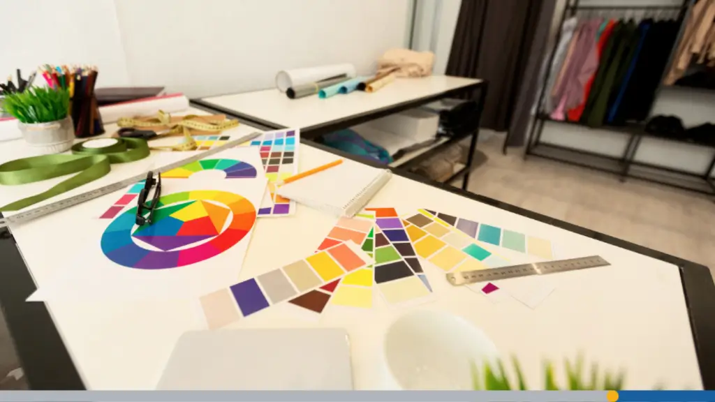
You’ve got your brand looking sharp. Your logo is ready, your colors are locked in. Now it’s time to put it all on paper. Ordering business cards online sounds simple enough. But there are a surprising number of small decisions that can make or break how your cards turn out.
From file setup to paper finish, this guide walks you through every step. Let’s make sure your next order comes out right, whether you’re a first-timer or someone who’s had a bad print run before. Think of this as your pre-flight checklist. Print shops can’t fix problems they can’t see, so the work you do before uploading your file matters more than most people realize.
CONTENTS TABLE
- What to Decide Before You Upload Your File
- File Setup: How to Prepare Your Design for Print
- Choosing the Right Paper Stock & Finish Online
- Turnaround Time & Shipping: What to Expect
- How to Review Your Order Before Approving Print
- Getting the Most Value From Your Order

What to Decide Before You Upload Your File
Before you touch any design software, there are a few decisions to make. These choices affect your cost, your timeline, and how your cards will actually feel in someone’s hand.
It’s like ordering a custom suit. You pick the cut before you pick the fabric. Same idea here. Getting these decisions made early saves you from redesigning at the last second.
Quantity: How Many Cards Do You Actually Need?
Most first-time orders fall into two camps. People order too few cards and run out fast, or they order thousands and waste half of them.
- A realistic starting point for most professionals is 250 to 500 cards; this covers several months of active networking without locking you into a huge stack.
- The jump from 250 to 500 cards often costs only a few dollars more because setup costs are fixed, while paper and ink are relatively cheap.
- If your information is stable, order more cards; if you’re still tweaking details like your title or phone number, keep the quantity smaller for now.
Size & Orientation: Standard, Square, Mini
The standard business card size in the US is 3.5 x 2 inches. It fits every wallet slot and cardholder on the market, which matters more than people admit.
- Square cards (2.5 x 2.5 inches) look distinctive and photograph well for social media, but they don’t fit traditional cardholders, which can create friction.
- Mini cards (3.5 x 1.75 inches) are sleek and modern; they suit creative fields but can feel restrictive if you have a lot of contact information to include.
Choose based on your audience. A real estate agent benefits from standard sizing. A photographer or graphic designer may earn bonus points with something unexpected.
Single-Sided vs. Double-Sided
Single-sided cards are cheaper and faster to produce. They’re perfectly fine for most situations, especially if your design is bold and clean.
- Double-sided cards give you a second canvas; you can place your contact details on the front and use the back for a tagline, services list, or QR code.
- The back of a card is a valuable space that many people leave blank; adding a short list of services or a website URL can turn it into a mini sales tool.
Just don’t cram the back full of text. White space is your friend; it makes the card easier to read and feel more professional.
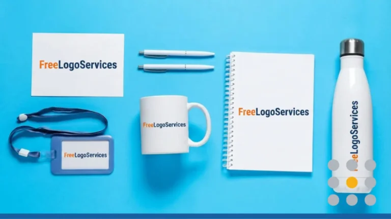
You may want to explore FreeLogoServices to refine your logo before applying it to merchandise, as a clean, scalable design can elevate even low-cost products with a more professional finish.
File Setup: How to Prepare Your Design for Print
This is where most online print orders go sideways. A design that looks perfect on screen can print blurry, color-shifted, or cut off if the file isn’t prepared correctly.
Every major print shop has a spec sheet for a reason. These aren’t arbitrary rules. They exist because the offset printing process has real physical constraints.
If you’re using a tool like Adobe Illustrator, Photoshop, or Canva Pro, you can often meet all these specs without much trouble. Let’s go through them one by one.
Resolution: Minimum 300 DPI for Print
DPI stands for dots per inch. It describes how much detail is packed into an image.
- Screen images are typically 72 DPI, while print images need to be at least 300 DPI.
- Uploading a 72 DPI image for business card printing will result in pixelation; the issue is not the printer, but the lack of image data.
- Always export your design at 300 DPI or higher; if starting from a logo, use a vector file (AI or SVG) or a high-resolution raster file (PSD or PNG at 300 DPI).
A quick rule of thumb: If you zoom into your design file at 100% and it looks blurry on screen, it will look blurry in print too.
Color Mode: CMYK, Not RGB
RGB is the color mode for screens. CMYK is the color mode for print. These two systems produce different color ranges, and mixing them up causes real problems.
When you design in RGB and send it to a printer, the software auto-converts the colors. That conversion can shift bright blues and vibrant reds in ways you didn’t intend.
- Set your document color mode to CMYK from the start. In Illustrator, it’s under File > Document Color Mode. In Photoshop, it’s under Image > Mode.
If your brand colors are defined in HEX or RGB, convert them to CMYK equivalents before you finalize your design. Small shifts are normal; large ones are a sign something’s off.
Bleed & Safe Zone: What These Mean & Why They Matter
When cards are cut from a printed sheet, the cutter isn’t perfectly precise. It can shift slightly, leaving a thin white sliver at the edge of your card if the design stops at the cut line.
- Bleed prevents unwanted white edges by extending your background color or design elements 0.125 inches beyond the card’s edge, allowing the cutter to trim through that buffer zone.
- The safe zone is the opposite concept; keep important elements like your name, phone number, and logo at least 0.125 inches inside the card’s edge to avoid them being trimmed off.
Most templates from print providers include guides for both. If you’re building your own file, add those margins manually before you start laying out your design.
Accepted File Formats: PDF, PNG, AI, PSD
Most print services accept PDF, PNG, AI (Adobe Illustrator), and PSD (Photoshop). PDF is generally the safest choice for final output.
- A press-ready PDF embeds all fonts, includes bleed, and uses CMYK color mode, giving the printer minimal room for interpretation errors.
- PNG files are acceptable if they are high resolution (300 DPI), but they don’t embed fonts; if using custom fonts, convert the text to outlines or paths before saving.
When in doubt, export as a PDF with bleed marks and crop marks turned on. That gives your printer all the context they need.
FreeLogoServices delivers logo files in multiple formats, helping you easily meet the specifications of embroidery or engraving vendors that require precise file types.
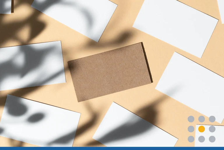
Choosing the Right Paper Stock & Finish Online
Paper is where business cards become physical objects. The weight, texture, and finish you choose shape how someone perceives your brand when they hold the card.
A thick, matte card feels considered and premium. A thin, glossy card can feel cheap, even if the design is sharp. Don’t underestimate the tactile impression.
This section is worth slowing down on. Most people pick the default paper and move on. The people whose cards get kept are often the ones who gave this some thought.
Paper Weight Explained (14pt vs. 16pt vs. 18pt)
Paper weight for business cards is often measured in points (pt). Higher numbers mean thicker, heavier cards. The most common options are 14pt, 16pt, and 18pt.
- 14pt is the industry standard. It’s sturdy without feeling heavy. Most business cards you’ve received in your life are probably 14pt.
- 16pt feels noticeably more substantial. It’s a small upgrade that makes a real difference in perceived quality.
- 18pt is thick. Cards at this weight feel deliberate and serious. They cost more to produce and ship, but they make a strong impression.
Unless you have a specific reason to go lighter, 16pt is a great default. It’s available from most online printers at a reasonable price premium over 14pt.
Matte vs. Gloss vs. Soft-Touch
The finish you choose affects how your card looks and feels. Each has a different personality, and none is universally better than the others.
- Gloss finish makes colors pop and photographs well. It’s shiny, reflects light, and gives cards a polished, slick feel. It’s common in real estate and sales.
- Matte finish absorbs light rather than reflecting it. Colors look rich and flat. The card feels smooth and clean. It’s popular in creative fields and tech.
- Soft-touch (sometimes called velvet) is the premium tier. It has a fine texture that makes cards feel almost velvety. It’s expensive, but it’s genuinely hard to forget.
Eco-Friendly & Specialty Options
Sustainability is a real factor for many business owners now. Several print services offer recycled paper stocks, soy-based inks, and FSC-certified materials.
Specialty alternatives include kraft paper (that raw, natural brown look), cotton stock, and plastic or frosted cards. These work well for specific brand identities.
- Kraft stock, for example, suits organic brands, coffee shops, and artisan businesses. A plastic card suits spas, salons, and luxury services that want something durable.
Think about what your card says about your brand before you default to white gloss. The materials you choose are part of your brand story, not just a background choice.
If you’re finalizing your brand identity ahead of a swag order, FreeLogoServices offers a dependable way to create your logo and prepare production-ready files.
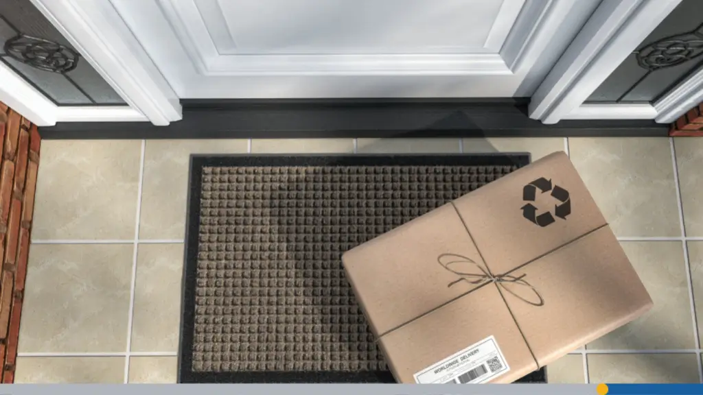
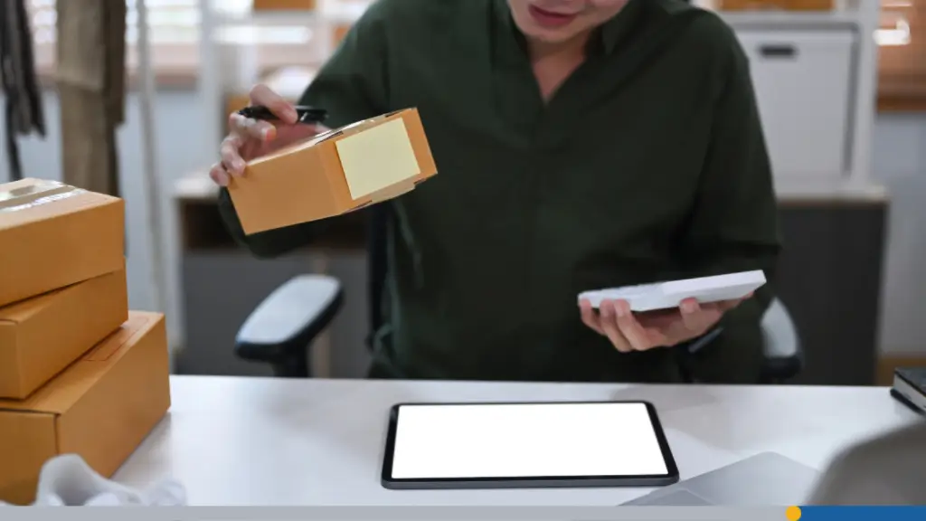
Turnaround Time & Shipping: What to Expect
Online print orders take time. Understanding timelines before you place an order prevents a lot of stress, especially if you have an event or meeting coming up.
- Production time and shipping time are separate. A 3-day production window plus 5-day standard shipping means your cards arrive in 8 business days, not 3.
- Most online printers are transparent about this, but it’s easy to miss the distinction at checkout. Read the timeline before you confirm.
Standard vs. Rush Production Timelines
Standard production typically runs 3 to 5 business days. Rush production can get you cards in 1 to 2 business days, often at a 25 to 50% cost premium.
- Rush orders are worth it when you genuinely need them. For a conference next week or a pitch meeting on Thursday, pay the fee and remove the anxiety.
- For everyday orders with no deadline, standard is fine. The cards will be identical in quality. You’re just paying for scheduling priority, not better printing.
Order a week or two ahead of when you actually need the cards. Build in a buffer. Shipping delays happen, and a single lost day can change your course of action.
Proofing: Digital Proof vs. Physical Proof
Most online print orders include a digital proof, which is a PDF version of your card exactly as it will be sent to the printer. Review this carefully before approving.
- A physical proof (also called a press proof) is an actual printed sample mailed to you before the full run. It costs more and adds a few days, but it’s the most accurate preview.
- For large orders (500 or more cards), a physical proof is worth considering. Colors shift slightly from screen to print, and catching that before 1,000 cards are produced is smart.
- For smaller or repeat orders where you’ve already seen the results before, a digital proof is generally sufficient. Use your judgment based on the stakes.
Shipping Speed & Packaging
Standard shipping is often USPS First Class or UPS Ground, depending on the printer. Expedited preferences through FedEx or UPS 2-Day are available for a markup.
- Cards are typically shipped in a small box or rigid mailer. Most printers wrap the cards in tissue paper or a protective sleeve to prevent corner damage in transit.
If you’re ordering for a high-stakes event, ship to your home or office, not to the event venue. Package routing at hotels and convention centers is notoriously unreliable.
Track your order. Most print services provide a tracking number as soon as your order ships. Set a reminder to check it two days before you need the cards.
How to Review Your Order Before Approving Print
The proof stage is your last real chance to catch mistakes. Once you approve, the printer moves forward, and most shops have strict no-refund policies on approved orders.
This is not the moment to skim. Take ten minutes and go through the proof methodically. Think of it as proofreading a contract, because in a way, that’s what it is.
Checking Text, Bleed & Color Accuracy
- Start with your contact information. Read every phone number, email address, and URL character by character. Transposed digits are incredibly easy to miss at a glance.
- Check your social media handles and website URLs specifically. These are the most frequently wrong pieces of information on business cards, and the most embarrassing to get wrong.
- Zoom in on the bleed area. Is the background color or texture extending fully to the edge? If there’s a white gap anywhere along the border, flag it before approving.
- Color accuracy is harder to assess from a digital proof. Calibrated monitors help, but colors can still shift slightly. If you’re matching a brand standard, request a physical proof.
Common Errors to Catch At Proof Stage
Here are the most frequent mistakes people catch (or miss) at the proof stage:
- Wrong phone number format (missing area code or wrong digits).
- Typos in job title (Managr instead of Manager).
- Logo version (accidentally used an old or low-res version).
- Font substitution (custom font replaced with a default because it wasn’t embedded).
- Cut-off elements (logo or text too close to the edge).
Have someone else review the proof, if possible. Fresh eyes catch things your brain autocorrects after hours of staring at the design.
It’s also worth printing the PDF proof at home or at a local copy shop before approving. Seeing it at actual size reveals issues that are invisible on screen.
Getting the Most Value From Your Order
Business cards are a low-cost, high-impact marketing tool when ordered smartly. A little planning around quantity and storage stretches your investment a long way.
This section is less about avoiding mistakes and more about making the most of what you’ve already done right. You’ve made good decisions; now let’s protect that investment.
Bulk Pricing & When to Order More
Print shops use tiered pricing. The cost per card drops as your order size increases. A run of 500 cards may cost three times as much as 250, but gives you four times as many.
- The math often favors ordering more if your design and contact info are stable. Calculate your cost per card at each tier and compare. The difference is often striking.
- One situation where bulk ordering backfires: if you’re likely to change your title, company, phone number, or email in the next year. In that case, smaller runs protect you from waste.
- Consider ordering a core batch with your stable info (name, logo, personal email) and leaving off details that may change. Some people even leave the company name off on purpose.
Storing Cards So They Stay Flat & Clean
- Business cards are surprisingly vulnerable to humidity, heat, and pressure. Improper storage warps them, scuffs soft-touch coatings, and ruins gloss finishes.
- Store cards flat in their original box or a rigid cardholder. Avoid leaving the box in your car, near a window, or in a bag where it’ll get bent under the weight of other items.
For long-term storage, a cool, dry drawer or a dedicated card storage box works well. Keep the original packaging if possible; it’s designed for this purpose.
If you carry cards daily, use a metal or hard-plastic card holder. Cards in a wallet or loose in a pocket wear down quickly, which undermines the impression you’re trying to make.
- One last thought: Reorder before you run out, not after. Running low is the right trigger to place your next order, not running out entirely.
Looking to finalize your brand identity before your next swag order? FreeLogoServices is a great starting point for getting your logo production-ready. You can also explore our AI-Powered logo maker.
Frequently Asked Questions
What’s the best file format for cards?
PDF (press-ready) is the safest choice. It embeds fonts, locks colors in CMYK, and includes bleed guides so the printer has everything needed.
How long does an online order take?
Standard production is 3 to 5 business days, plus shipping. Plan for 8 to 10 business days total unless you select a rush production solution.
Is 14pt or 16pt paper better?
16pt feels more substantial and is worth the small price increase. 14pt is the industry standard and still perfectly professional for most uses.
What does CMYK mean for printing?
CMYK is the color mode used by print presses, using cyan, magenta, yellow, and black inks. Design in CMYK to prevent unexpected color shifts at print time.
Do I need a bleed on my card file?
Yes. Add 0.125 inch bleed on all sides to prevent white edges after cutting. Keep important content 0.125 inch inside the card border as a safe zone.
Can I proof my card before full print?
Yes. Most shops provide a free digital proof. Physical proofs cost extra but are worth it for large orders or when color accuracy is critical to your brand.
What paper finish should I choose?
Matte suits most professional industries. Gloss works well for vibrant designs and photos. Soft-touch is premium and memorable but costs more per card.
How many cards should I order first?
250 to 500 is a solid first order. The cost per card drops at higher quantities, so order more if your contact details and branding are stable.
How do I store cards to keep them clean?
Store them flat in a rigid box, away from heat and humidity. Use a hard cardholder for daily carry to prevent scuffed corners and bent edges.
Can I use RGB files for print orders?
Technically, yes. But RGB files get auto-converted to CMYK, which can shift colors unexpectedly. Always convert to CMYK yourself before uploading your design.