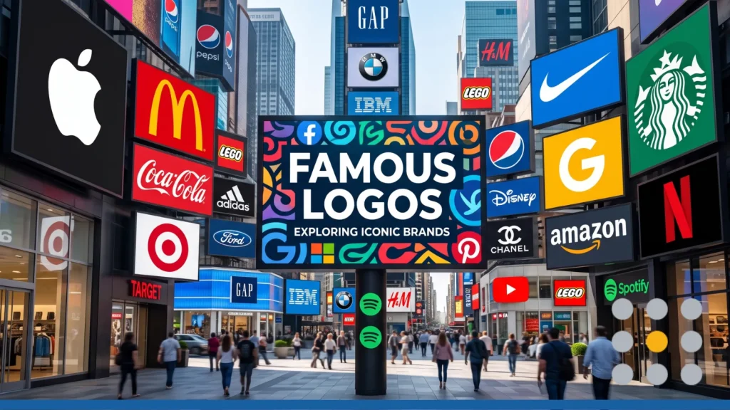
Some logos are genuinely everywhere, and they work on every surface. You see them on billboards, phone screens, coffee cups, and sneakers, and you recognize them instantly, without even reading the name. But what actually makes a logo stick?
The world’s most famous company logos don’t succeed by accident. They’re built on a handful of clear design decisions that work together to create lasting recognition.
If you’re building a brand or thinking about creating a logo, understanding what makes these iconic examples tick gives you a real head start, and tools like FreeLogoServices’s Free Logo Maker make it easy to put these lessons into practice right away.
Why Some Logos Become Truly Iconic
Not every logo becomes famous. Most fade into the background. The ones that break through share something in common: they make an immediate, lasting impression, and they keep making it consistently over time.
Simplicity: The Rule Nearly Every Famous Logo Follows
The most famous logos in the world are, almost without exception, simple. A bitten apple. A swoosh. A pair of golden arches. You don’t need to study them to understand them. Your brain processes them in a fraction of a second.
That’s not a coincidence. Simple shapes are easier to remember, easier to reproduce, and easier to recognize at a glance, whether on a 40-foot billboard or a 1-inch favicon. When a design gets stripped down to only what’s essential, there’s nothing to forget.
Distinctiveness: Standing Out in Your Category
Simplicity alone isn’t enough. A logo also needs to stand out from everything around it. Think about how different the Target bullseye looks compared to every other retail brand, or how the FedEx wordmark hides something no other delivery logo has tried.
Distinctive logos don’t try to look like the category leader. They carve out their own visual territory. And once they do, that territory becomes their brand.
Timelessness: Resisting the Urge to Redesign Too Often
Iconic logos don’t chase design trends. The Coca-Cola script hasn’t changed its core shape in over 130 years. The Nike Swoosh is the same today as it was in 1971. That kind of consistency is what turns a logo into a cultural symbol.
Every time a company redesigns its logo without a good reason, it spends years rebuilding the recognition it already had. The best logos are made to last.
Already picturing your own logo? You don’t need a design degree to apply these same principles. Try our FreeLogoServices Free Logo Maker and build a simple, distinctive mark in minutes.
10 Famous Company Logos & Why They Work
Apple: The Power of the Bitten Apple
The Apple logo is a masterclass in restraint. It’s a simple silhouette of an apple, with a single bite taken out of the right side. Designed by graphic designer Rob Janoff in 1977, the bite was added for a very practical reason; without it, the shape may be mistaken for a cherry. That functional choice ended up giving the logo personality and scale that a plain apple shape never would’ve had.
Apple has cycled the logo through rainbow stripes, chrome, and glass effects over the decades, but always returned to the same simple silhouette. Today it sits in dark monochrome on every device, and it’s one of the most recognized shapes on planet Earth.
What makes it work: Extreme simplicity, consistent shape across decades, and just enough asymmetry to feel human.
Nike: The Swoosh as Motion & Confidence
Carolyn Davidson was a graphic design student at Portland State University in 1971 when she created the Nike Swoosh. Nike co-founder Phil Knight reportedly said he didn’t love it at first, but that it would “grow on him.” He was right. Davidson was paid $35. The Swoosh went on to appear on billions of products for more than 40 years.
The shape does something genuinely clever: it suggests movement and speed without depicting anything literal. It points forward and upward. Combined with Nike’s Just Do It positioning, it tells the brand’s story without a single word.
What makes it work: A single fluid line that communicates motion, confidence, and momentum.
McDonald’s: Golden Arches & Color Psychology
The McDonald’s M started as architecture. In the 1950s, architect Stanley Meston designed McDonald’s restaurants with two golden arches flanking the building. Designer Jim Schindler merged those two arches into the iconic M in 1962. The current version, introduced in 1968, became one of the most recognized logos in the world.
The red and yellow color combination isn’t arbitrary. Yellow triggers feelings of happiness and warmth. Red stimulates appetite and creates a sense of urgency. Together, they’re specifically calibrated to work for a fast-food environment, and they’ve been doing exactly that for over 60 years.
What makes it work: A geometric shape with architectural roots, combined with colors that work on a psychological level.
Did you know? Color is one of the most underused tools in logo psychology. Red raises heart rate and signals urgency, which is why McDonald’s and Coca-Cola both use it. Blue signals trust and stability, which is why banks and tech companies (Google, Facebook, PayPal) lean on it heavily. Green signals growth or nature, which is why Starbucks and Whole Foods use it.
Before you lock in a color palette, ask what emotion you want people to feel in the half-second before they even read your brand name!
Amazon: The Smile & the A-To-Z Arrow
At first glance, the Amazon logo is just a wordmark with an orange curved line beneath it. Look closer, and that line does two things at once. It’s shaped like a smile, suggesting warmth and customer satisfaction. And it runs from the letter A to the letter Z, communicating Amazon’s core value proposition: they sell everything, from A to Z.
Two meanings packed into a single curved stroke. That’s the kind of efficiency that makes a logo genuinely brilliant.
What makes it work: A deceptively simple design that carries two distinct brand messages at the same time.
FedEx: The Hidden Arrow as Negative Space Masterclass
The FedEx logo looks like a clean purple and orange wordmark. But nestled between the capital E and the lowercase x is a perfect arrow, formed entirely from negative space. Once you see it, you can’t unsee it.
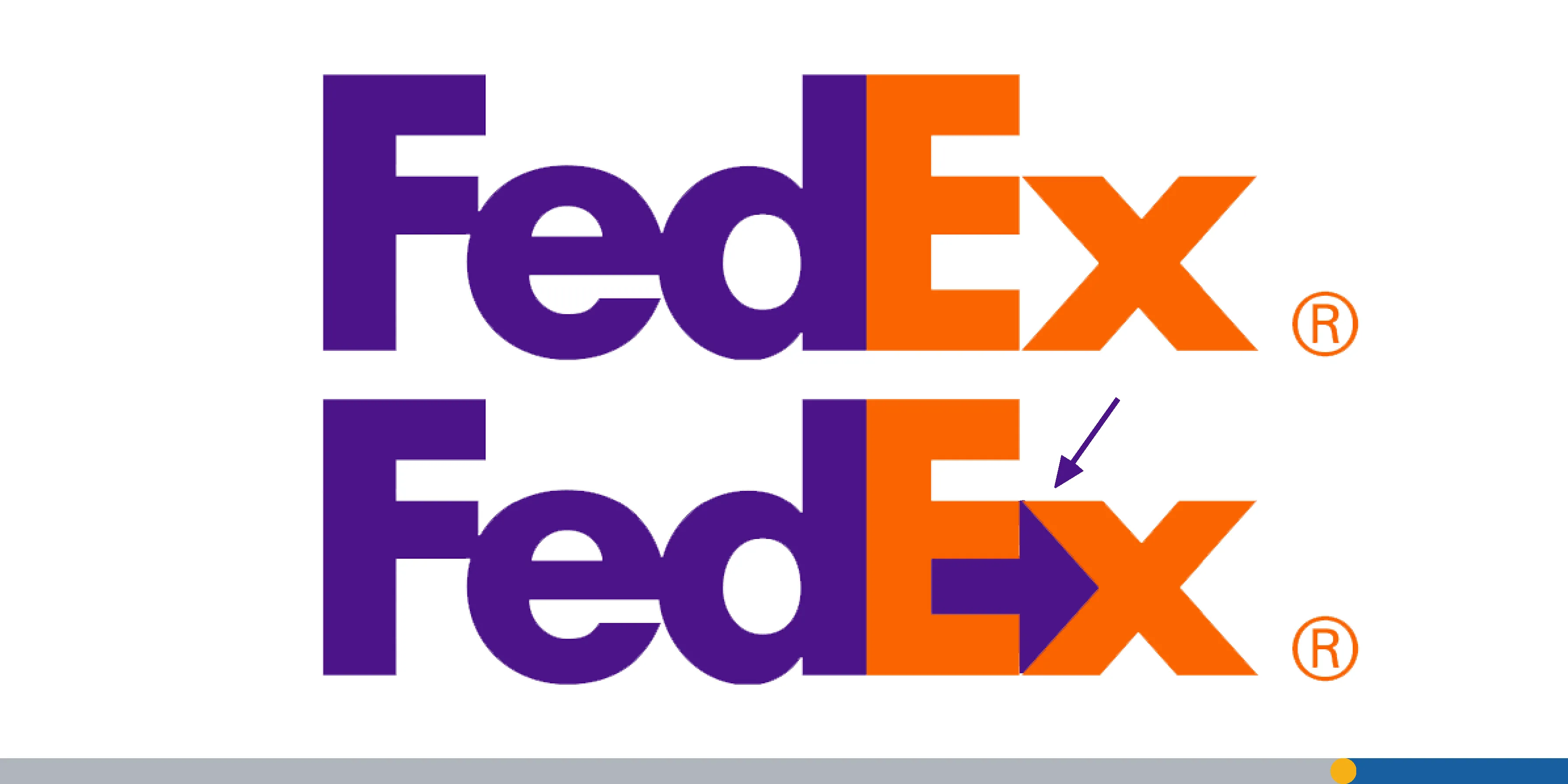
Designed by Lindon Leader, the hidden arrow has won over 40 design awards and is widely considered one of the cleverest logos ever made. It subtly reinforces exactly what FedEx does: it moves things forward, fast and accurately.
What makes it work: A hidden visual that rewards attention and perfectly mirrors the brand’s core function.
Notice how much thought went into just one small design detail in each of these logos. That’s the same level of intention that FreeLogoServices’s Free Logo Maker helps you bring to your own brand, without needing a design team to get there.
Coca-Cola: Script as Brand Heritage
The Coca-Cola logo was created in 1886 by Frank Mason Robinson using Spencerian script, a popular handwriting style of the era. That choice, made over 130 years ago, turned out to be one of the most durable branding decisions in history. While competitors have updated their wordmarks again and again, Coca-Cola has kept its signature script essentially unchanged.
That continuity is the strategy. The script doesn’t just say Coca-Cola; it says “we’ve been here forever, and you know us.” No other beverage brand can credibly claim that visual heritage.
What makes it work: Unbroken continuity since 1886 turns the script itself into proof of legacy.
Twitter/X: What Changed (& What Was Lost)
For 17 years, Twitter’s blue bird was one of the most recognized social media symbols in the world. It was simple, friendly, and immediately associated with public conversation. In July 2023, owner Elon Musk replaced it with a stylized white X on a black background, as part of a broader rebrand to X Corp.
The X is bold and graphic. But it abandoned something rare: a logo that had genuine emotional equity built over more than a decade. The rebrand is a useful reminder that recognition isn’t just a visual asset. It’s a relationship between a brand and its audience. Change the logo, and you reset that relationship, which is exactly why sound logo design principles favor evolution over reinvention.
What makes it work (the original): Distinctive character and consistent color built global recognition fast. What the rebrand shows: Brand equity is hard to transfer to a new symbol.
Google: Wordmark Simplicity at Massive Scale
Google’s logo is just the word Google, written in a custom rounded sans-serif typeface with its six letters colored in blue, red, yellow, blue, green, and red. The 2015 redesign moved to Product Sans for a cleaner look. The intentional use of a wrong color (green on the second l) subtly signals that Google doesn’t follow rules.
For a company operating at Google’s scale, across hundreds of products and billions of screens, a simple wordmark is actually the right call. It reproduces perfectly at any size and in any context, from a 4K monitor to a mobile tab. Simplicity at scale is one of the hardest things to get right.
What makes it work: A wordmark that scales perfectly in any environment, with a color palette that signals playful confidence.
Starbucks: From Detailed to Confident Abstraction
Starbucks launched in 1971 with a detailed, brown illustration of a twin-tailed siren inspired by 16th-century Norse woodcuts, chosen to reflect the maritime history of coffee trading. Over four decades, that original illustration was progressively simplified: the brown became green, the detail was reduced, text was stripped away, and by 2011 the siren stood alone, without even the company name.
That’s a bold move. You only drop your company name from your logo when you’re confident enough that the symbol alone does the work. And for Starbucks, it does.
What makes it work: A gradual evolution toward confident abstraction. The logo now communicates authority, not just recognition.
Target: One Shape, Total Clarity
Target’s bullseye is about as direct as branding gets. The name is Target. The logo is a target. There’s no metaphor to decode, no hidden meaning to discover. Just a red bullseye that perfectly reflects the brand name every single time you see it.
The current version uses just two colors, one outer red ring and a central red dot, separated by white. By 2004, studies showed that 96% of American shoppers recognized the bullseye and associated it immediately with Target, without ever needing the wordmark.
What makes it work: Literal, immediate, and impossible to misread. A logo that does exactly what it’s supposed to do.
Brand Logo Recap
| Brand | Year | Core Technique |
| Apple | 1977 | Silhouette with functional asymmetry |
| Nike | 1971 | Motion suggested through pure line |
| McDonald’s | 1962/1968 | Architectural shape + color psychology |
| Amazon | 2000 | Dual-meaning negative space |
| FedEx | 1994 | Hidden arrow in negative space |
| Coca-Cola | 1886 | Unbroken script heritage |
| Twitter/X | 2023 rebrand | Lost emotional equity via abrupt change |
| 2015 | Wordmark simplicity at scale | |
| Starbucks | 1971 to 2011 | Gradual abstraction toward confidence |
| Target | 1962 | Literal, one-shape clarity |
What the Best Logos Have In Common (& What You Can Learn from Them)
Looking across these 10 examples, a few clear patterns emerge. And every single one is directly useful if you’re building your full brand identity.
You Don’t Need Complexity. You Need Clarity.
Every logo on this list is simple. Not because the companies lacked resources to create something more elaborate, but because simple logos do the job better. They’re faster to recognize, easier to remember, and more flexible across different surfaces and sizes.
If your logo needs to be explained, it’s not working. A good logo communicates instantly.
Color Does More Heavy Lifting Than You Think
McDonald’s uses red and yellow to trigger appetite and happiness. FedEx uses orange and purple to stand out in the delivery category. Google uses primary colors to suggest playfulness. Starbucks uses green to signal something premium and natural. This is logo psychology in action, and it’s one of the most strategic tools available to any brand.
Color isn’t decoration. It’s a strategic tool. Before you choose your brand colors, think about what feelings you want people to associate with your brand, and whether your color palette actually communicates that. If you want to dig into this further, our guide to logo colors breaks down the psychology behind every major palette.
Consistency Builds Recognition Over Time
The logos in this article didn’t become iconic overnight. They built recognition through years, sometimes decades, of consistent use. Coca-Cola’s script has held since 1886. The Nike Swoosh has looked the same since 1971. Apple has always used the same silhouette, regardless of finish.
Every time you change your logo without a strong reason, you chip away at the recognition you’ve already built. Pick a mark you can live with for the long term, then show up with it everywhere, consistently.
How to Apply These Logo Design Principles to Your Own Logo
- Strip it down. If you can’t describe your logo in one sentence, simplify it.
- Pick one distinctive shape or mark, not a collection of design trends.
- Choose colors on purpose. Match your palette to the emotion you want your audience to feel.
- Design for every size. Test your logo at favicon size and billboard size before finalizing it.
- Commit to it. Give your logo years to build recognition instead of redesigning every time you get bored with it.
Put this checklist to work. Open FreeLogoServices and start building a logo around one clear idea, the same way every brand on this list did.
Frequently Asked Questions About Famous Logos
What makes a logo famous?
Famous logos combine simplicity, distinctiveness, and consistent long-term use. They’re easy to recognize at any size, clearly different from competitors, and seen repeatedly across many years. Recognition builds gradually, which is why consistency matters more than any single design choice.
Do logos need to be simple to be successful?
Not necessarily, but nearly all famous logos are simpler than their first designs. Most iconic logos have been simplified over time, including Starbucks, Apple, and Target. Simplicity helps logos scale well, reproduce clearly, and get remembered quickly.
How often should a company redesign its logo?
There’s no fixed rule, but the most iconic brands redesign infrequently and incrementally. Small refinements work better than full rebrands (like Google’s 2015 rebrand), which risk resetting years of built-up recognition.
Can a small business build an iconic logo?
Yes. The principles behind the world’s most famous logos: simplicity, clarity, a distinctive shape, and consistent use, don’t require a big budget. They require good decisions. Start with a clear idea of what your brand stands for, pick colors and shapes that reflect it, and then use your logo consistently across everything.