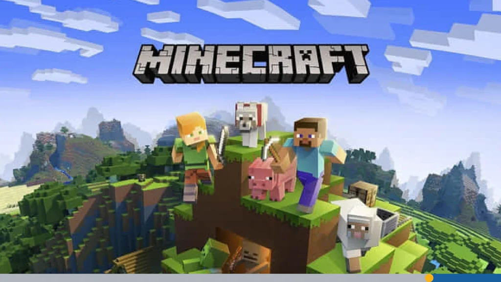
From punching trees to battling Ender Dragons, Minecraft has become a cultural juggernaut in gaming. As of 2025, Minecraft is the best-selling video game of all time, having sold over 350 million copies worldwide. But it’s not just the pixelated worlds and creeper explosions that have captured our imaginations; it’s also the unmistakable Minecraft logo. That chunky, stone-carved wordmark has become an icon in itself, appearing on everything from T-shirts to toys, game files to the homepage of Minecraft.net.
Since the 3D sandbox game was released in 2011, the logo has been remarkably consistent. Other video games take several iterations to find a polished logo that fits their brand’s unique flavor. Yet, Minecraft has managed to craft a nearly perfect logo from the jump. This is unsurprising as nothing about the Minecraft story fits the regular narrative of video game development.
In this article, we’ll explore Minecraft’s rise to global video game supremacy and highlight the subtle logo evolution that has made the brand a beacon for creativity and exploration around the world.
- Minecraft’s Humble Origin Story
- How the Minecraft Logo Came to Be
- Why the Logo Works So Well
- The Creeper Face: Marketing Gold
- Graphic Design Lessons from the Minecraft Logo
- The Fan Perspective
- Logo Design Mistakes Minecraft Avoided
Minecraft’s Humble Origin Story
The mastermind behind Minecraft is Swedish video game designer Markus Persson, also known by the pseudonym Notch. Persson had worked on a series of browser-based games during his time at the video game developer and publisher, King. Taking inspiration from other block-based open-ended mining games that he had worked on, Notch started creating Minecraft with the intention of incorporating role-playing game (RPG) elements.
The first public alpha build of Minecraft was released on May 17, 2009, on TIGSource. Over the years, Persson regularly released test builds that added new features, including tools, mobs, and entire new dimensions. Around this same time, Persson founded Mojang Studios, an independent game development company. Due to the rising popularity of Minecraft, Persson decided to release a full 1.0 version of the game in 2011.
A Game Unlike Any Other
Minecraft’s immediate popularity was due to its unique philosophy and endless possibilities. The game has no required goals. The player has total freedom to play the game how they like. You can build massive cathedrals, explore precarious caves and cliffs, or set up in a small hut and mine for diamonds all day long; the choice is yours. The game is also procedurally generated, making the world virtually infinite.
While there are no objectives, Minecraft definitely has plenty of obstacles that you need to conquer. The main enemies in the game are zombies, skeletons, spiders, and creepers, which come out at night. While each of these creatures has become iconic, the Creeper has become the unofficial mascot of Minecraft. We’ll get into the creeper’s cultural significance later on in this article.
Microsoft Acquires Minecraft
On September 15, 2014, Microsoft announced a $2.5 billion acquisition of Mojang, which included the Minecraft intellectual property. Markus Persson had already left the company several years earlier.
After 2014, Minecraft’s primary versions received annual major updates. While the core gameplay mechanics have remained relatively unchanged, there have been additions of new biomes as well as several graphical upgrades.
How the Minecraft Logo Came to Be
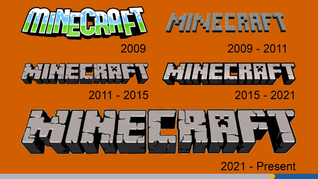
Back in May 2009, when Minecraft was still in its infancy, the logo wasn’t exactly what you’d call “polished.” It was a basic, gray, pixelated wordmark with a rugged charm. The blocky letters screamed “indie game,” fitting the aesthetic perfectly. It looked like something straight out of a fan-made title screen. But, just like the game itself, it had potential.
Entering Beta: Slightly Edited but Still Familiar
As Minecraft matured, so did its branding. By the time we reached the Beta stage in late 2010, the logo had been slightly modified. The letters were cleaned up a bit, and the design gained a touch of depth and shape, though still sticking to its 8-bit roots. There were minor changes, but the spirit remained: a tribute to the blocky, build-it-yourself experience Minecraft promised.
This was also when the Creeper face made its first appearance within the logo, a subtle but important shift. The Creeper quickly became one of the most iconic mobs in the game, and adding it to the “A” in “Minecraft” was a genius branding move.
The Modern Minecraft Logo Emerges
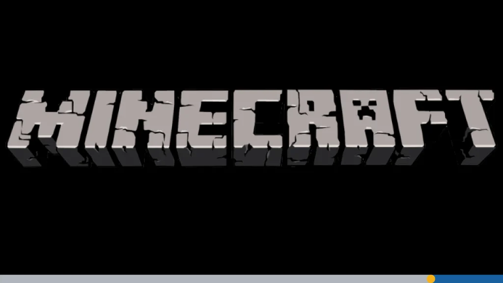
By 2011, when Minecraft officially launched its 1.0 version, the first logo had received a serious upgrade. The original logo had been replaced with a more detailed one. It still featured the same stone-textured letters, but with cleaner lines, sharper shadows, and a bit more polish. The Creeper face remained embedded in the “A,” but now it popped thanks to better contrast and shading.
This version of the logo became the foundation for all future versions. It struck the perfect balance: nostalgic and playful, yet professional enough to represent a growing media and merchandise empire.
Java Edition Logo: Distinct but Familiar
When Mojang introduced the Java Edition label, the Java Edition logo was added underneath the main wordmark to differentiate it from other versions like Bedrock Edition. The design remained largely the same, but this new label helped segment the franchise.
Bedrock Edition: Same Logo, Different World
With the launch of Bedrock, the cross-platform version of the game, the Minecraft logo stayed consistent in style but was often paired with platform names or version identifiers. Unlike Java, Bedrock ran across consoles, mobile devices, and Windows, so its branding needed to be versatile. Though the logo shape and design stayed mostly the same, there were minor adjustments for clarity on different devices.
Minecraft Dungeons: A Stylish Spin
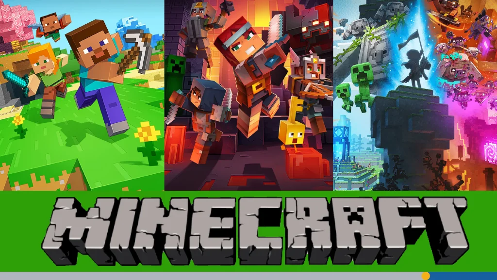
When Minecraft Dungeons launched in 2020, it introduced a new logo, one that was clearly inspired by the original but had its own personality. Instead of a gray, chiseled stone look, this version went full dungeon crawler: orange-red gradients, hard shadows, and a glowy, almost lava-like appearance.
Minecraft Legends: A Logo Fit for Strategy
In 2023, Mojang revealed Minecraft Legends, a new spin-off with real-time strategy elements. Once again, the design took creative liberties from previous logos. The base word “Minecraft” remained visually similar to the lead game’s branding, but the “Legends” part introduced a sleeker font and glowing blue tones, suggesting fantasy and heroism.
Logo in Game & Merchandise
The Minecraft logo isn’t just for splash screens or websites. It’s everywhere, in menus, file headers, merchandise, toys, clothing, books, and even theme park attractions.
If you’ve ever picked up a Minecraft page-turning guide, downloaded a skin file, or bought a Creeper plushie, you’ve likely seen that iconic wordmark staring back at you. The consistency of the logo across media, business, and franchise extensions has helped build brand trust and familiarity.
Why the Logo Works So Well
So, what makes the Minecraft logo so effective? The logo is instantly recognizable and truly articulates what makes the game so special. Here is an overview of some logo elements that make the Minecraft logo outstanding:
- Recognizable shape: The chunky, blocky letters mirror the in-game world perfectly.
- Creeper face: A small but iconic touch that adds personality.
- Consistency: Across all editions and merchandise, the core design rarely changes.
- Adaptability: Whether it’s a spin-off or a minimalist flat version, the logo adjusts without losing identity.
It’s a masterclass in brand design and proof that you don’t need to go ultra-futuristic or overly polished to create something memorable.
A Closer Look at the Lettering
Typography is a key element of any good logo design. What makes the Minecraft logo stand out so much? It’s not just the texture, it’s the letter design itself. The font is completely custom, created specifically for the game, and mimics the cubic nature of Minecraft blocks.
Having the logo be stone is a stroke of genius. It immediately connects the logo with the experience of playing the game. In fact, you can actually make the logo in the game using stone blocks. That’s how iconic it is.
The Power of Subtle Evolution
You might think the Minecraft logo has barely changed, but the minor changes over time tell a story of refinement. For example:
- 2009–2010: Pure pixel charm, very flat and grayscale.
- 2011: Shading, texture, and the Creeper face are added, giving the logo dimension and uniqueness.
- 2015–2017: Slight polishing with cleaner outlines, better contrast, and visual tweaks for clarity on screens.
- 2019 onwards: Introduction of simpler logo variations for modern design aesthetics. Cleaner, vectorized versions were used for app icons and responsive web layouts.
Each of these adjustments reflects how the brand matures with its audience, embracing cleaner, more modern design standards without losing its soul. Unlike other franchises that completely ditch their old logos (looking at you, Instagram), Mojang plays it smart with gradual evolution, not revolution.
The Creeper Face: Marketing Gold
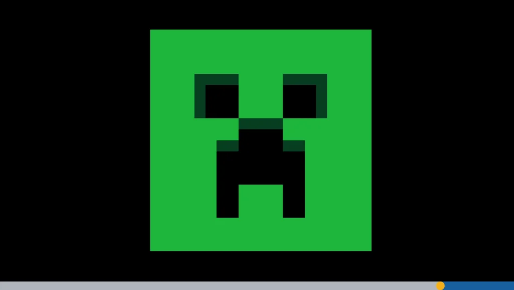
Let’s talk more about that famous Creeper face inside the “A.” For those unfamiliar, the Creeper is an infamous enemy in Minecraft. It silently approaches players and… BOOM. It explodes. Love it or hate it, the Creeper is one of the most recognized mobs in gaming history.
Placing its pixelated frown in the logo accomplishes several things:
- Memorability: It’s quirky and unique. You won’t forget it.
- Emotional connection: Players either fear or adore Creepers. That emotional response ties them to the logo.
- Symbolism: The Creeper represents danger, challenge, and unpredictability, all essential elements of the Minecraft experience.
The Creeper’s face isn’t just decoration. It’s part of Minecraft’s brand identity. When you have a game with endless opportunities and an ever-generating open world, it’s difficult to ground the branding in something constant. The Creeper is a tangible representation of the Minecraft gaming experience that each player can relate to.
Logo in the Wild: Real-World Uses
Think the Minecraft logo only lives inside your game folder? Think again. It’s everywhere:
- Events: Minecon (now Minecraft Live) features stage banners and promotional materials emblazoned with the logo.
- Books: Guides, comics, novels, if it’s official Minecraft media, the logo’s front and center.
- LEGO sets: Yup, even on LEGO boxes and instruction manuals, the Minecraft branding holds strong.
- Web and media: The official Minecraft homepage, launcher apps, and social media posts always include the logo.
The Logo as a Business Tool
Behind every great brand is great branding. And the Minecraft logo has played a massive role in Minecraft’s business success.
Consistency across all platforms, physical, digital, and promotional, has created a unified experience. Whether you’re a YouTuber doing Let’s Plays, a developer creating custom mods, or a kid unboxing Minecraft toys, the logo reinforces your trust in the product.
Graphic Design Lessons from the Minecraft Logo
Whether you’re a beginner dipping your toes into design or a seasoned creative professional, there’s a lot to learn from the iconic Minecraft logo. Let’s break down some valuable design takeaways that this iconic logo offers.
1. Match Your Product’s Vibe
The number one rule of logo design? Know your product. The Minecraft logo is a perfect reflection of the game itself. The chunky, pixel-inspired letterforms mimic the in-game environment where everything is made of blocks, from dirt and stone to monsters and castles.
The logo doesn’t try to be sleek or futuristic. It embraces the game’s retro, 8-bit charm, and in doing so, it connects instantly with the experience Minecraft offers. That alignment between the visual identity and the core mechanic makes the logo incredibly effective.
Design tip: Always ensure your logo mirrors the tone and mechanics of your product. A modern, minimalist logo might work for a fintech app, but it would be totally wrong for a creative sandbox game like Minecraft.
2. Add a Unique, Ownable Feature
What sets the Minecraft logo apart from generic wordmarks? The Creeper carved into the “A.” It’s subtle, clever, and instantly recognizable.
This small graphic element serves several functions reinforces brand recognition, connects emotionally with players, and gives the logo personality without overwhelming it. Most importantly, it’s unique to Minecraft. No other logo in gaming has a design detail quite like it.
3. Stay Consistent, But Allow for Evolution
One of the greatest strengths of the Minecraft logo is its consistency. Since the game’s public debut in 2009, the core design has remained intact: same blocky font, same general layout, and that trusty Creeper eye.
Yet, Mojang hasn’t been afraid to make small changes like updating the shading or adapting the logo slightly for spin-offs. Consistency builds brand trust. Avoid drastic changes unless you’re rebranding entirely. Subtle improvements over time are often more powerful than complete reinvention.
4. Simplicity With Personality Wins
In a world of overly complex, trend-chasing logos, Minecraft’s is refreshingly honest. It doesn’t rely on gradients, 10 fonts, or hyperrealistic visuals. It’s simple, bold, and memorable, with just the right amount of character.
The choice to keep it grounded in block textures and pixelated aesthetics isn’t just a visual decision; it’s a brand statement. Minecraft invites players to start with simple elements and build something extraordinary. The logo does the same.
The Fan Perspective
The Minecraft community is infamously creative, and they’ve turned the logo into their own playground. Over the years, we’ve seen thousands of fan interpretations, some hilarious, some awe-inspiring, and all proof of the logo’s cultural reach.
Here’s how fans have made the logo their own:
- Fan-made remixes: From swapping the Creeper with an Enderman to spelling “Minecraft” with swords and pickaxes, fans love putting their personal spin on the logo. These remixes are often shared on forums, in texture packs, or even printed on custom merch.
- Animated intros: Many Minecraft YouTubers create animated intros featuring modified versions of the logo. These often include 3D renders, motion effects, or even animated mobs bursting through the screen. It’s become a rite of passage in the Minecraft content creator world.
- Texture packs: Texture packs frequently alter the in-game title screen, giving players a new visual vibe. Whether it’s holiday-themed logos (hello, Santa Creeper!) or HD remasters, these tweaks showcase just how modifiable and beloved the logo is.
- Custom fonts and icon packs: The logo’s font has inspired countless downloadable fonts, letting creators use Minecraft-style letters in their own projects. While Mojang has never officially released the typeface, fan replicas like “Minecrafter” help the aesthetic live on.
Logo Design Mistakes Minecraft Avoided
The world of video game logos is littered with bad decisions. We’ve seen logos with over-the-top gradients, metallic chrome effects, illegible sci-fi fonts, and bizarre color schemes that age faster than a stone shovel. Mojang skillfully avoided these common pitfalls by sticking to timeless graphic principles:
- No excessive effects: You won’t find lens flares, motion blur, or unnecessary bevels here. The Minecraft logo keeps it clean and grounded.
- No clutter: Even with texture and a Creeper face, the design never feels busy or overdone. It communicates its message clearly.
- Simple color palette: Gray stone with shadows. That’s it. No neon purples, no rainbow gradients. Just colors that reflect the core materials of the game.
- Readability at every size: Whether you see the logo on a tiny app icon or a massive convention banner, it’s easy to read. That’s a result of smart letter spacing, bold shapes, and deliberate contrast.
- Relevance to game mechanics: The design connects to what Minecraft actually is: a block-building sandbox. Every design choice reinforces that concept.
Conclusion
The Minecraft logo is a symbol of imagination, exploration, and endless creation. It’s the first thing players see when they launch the game. From its humble beginnings in 2009 to its current status as a globally recognized icon, the Minecraft logo has evolved beautifully without ever losing its identity. Whether you’re mining alone in Survival or leading armies in Legends, that logo is your gateway to another world.
Want to create your own iconic logo? FreeLogoServices‘ AI-powered logo maker allows you to craft professional logos in just minutes. Get started today!
FREQUENTLY ASKED QUESTIONS
What does the Minecraft logo represent?
The Minecraft logo symbolizes the game’s blocky aesthetic, creativity, and adventure. Its bold, stone-like letters reflect the core gameplay of building and mining. The logo connects perfectly to the gaming experience, reminding gamers that they are free to do whatever they want in their virtual realms.
Has the Minecraft logo changed much over time?
Not dramatically. Most changes have been minor, such as improved shading, slight edits, or new labels (like for spin-offs). The iconic shape and Creeper “A” have remained consistent.
Why is the Creeper in the logo?
It’s a fun Easter egg and branding move that connects the logo to one of Minecraft’s most famous in-game creatures. It adds personality and memorability to the wordmark.
What are some discontinued logos?
Logos from editions like Minecraft: Story Mode or console exclusives (like Xbox 360 or PS3 versions) are no longer used, but had their own unique flair while active.
Will Mojang redesign the logo in the future?
Probably not in a big way. Minor changes and themed versions may appear, but the core logo is too iconic to fully replace.
Can I use the Minecraft logo in my own projects or merchandise?
Not unless you’re licensed. Mojang and Microsoft have strict guidelines for brand use. Fan art is usually tolerated, but official use requires permission.
Is there an official Minecraft font I can download?
There are fan-made versions like “MineCrafter” that mimic the logo, but Mojang hasn’t released the official typeface used in the logo for public use.
Why did Mojang add the flat logo version?
Flat logos work better on mobile devices, apps, and websites. They’re more readable at smaller sizes and align with modern minimalist design trends.
Are there color variations of the Minecraft logo?
Yes! While gray stone is the most common, spin-offs and special events often feature colorful versions—red for Dungeons, blue for Legends, green for Earth, etc.
