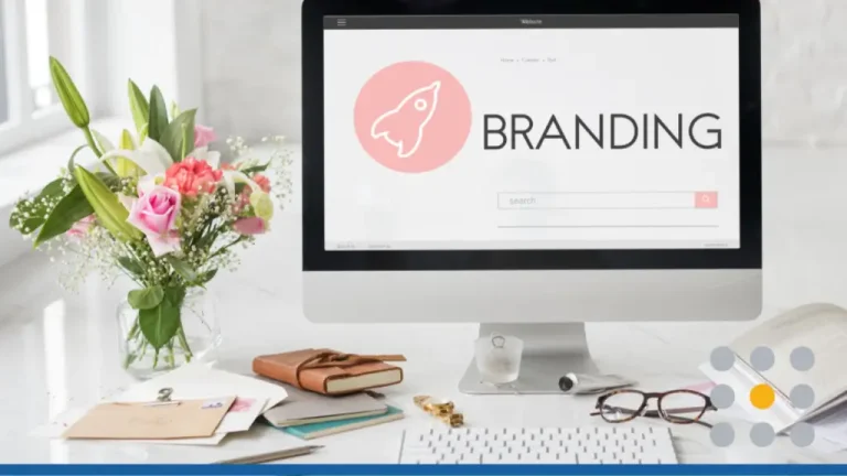
Branding your business is an important aspect when it comes to trying to attract customers. Your brand image is the first thing customers interact with, so it’s essential to put some thought into branding aspects such as your business name, logo design, and slogan or tagline. The most important part about branding your business is your logo design.
Logo designs are the visual aspect of your brand; it’s what customers identify first and usually the first thing they recall when thinking about your business. But not all logo designs will work for all businesses, which is why there are a variety of different logotypes. While you can have any type of logo design you want for your business, keep in mind that some styles are associated with specific industries.
So, what does your company logotype say about your brand? Below we’ll go over some details behind the psychology of logo designs and how they are associated with branding.
What your logotype says about your brand
Wordmark logos
Wordmark logos are logo designs that are text-only. For example, Coca-Cola, Google, Disney, FedEx, and Facebook are all wordmark logos. Wordmark logos are ideal for just about any type of industry – ranging from technology and retail to travel and restaurant.
The one thing business owners should keep in mind is that text-only logos should have a unique design. Don’t just opt for a black and white logo with Times New Roman font. Do some research on unique fonts and which one would be best to use for your industry. For example, modern fonts are best for tech-based companies, while script fonts might be best for clothing and retail businesses. Experiment with accenting one letter in a different color, or using all capital letters or all lowercase.
Overall, wordmark logos make it easy for customers to identify your business – they do not need help recalling the name of your company (which is the case with a pictorial logo).
Combination logos
With combination logos, you get the best of both worlds when it comes to design. Not only do you have your business name in your logo, but also an icon that can be used to describe or enhance your business name. The icon should align with what industry you’re in. For example, if you’re in the landscaping business, consider a tree, flower, or leaf as an icon for your combination logo. Combination logos are ideal for anyone in the services industry, including restaurants, contractors, Realtors, and clothing stores.
If you decide on a combination logo, make sure that you don’t go overboard with the design. It can be very easy to introduce too many colors, shapes, and fonts in combination logotypes. Stick to no more than three colors and use plenty of white space in your design to reduce crowding.
Lettermark or initial logos
Lettermark logos (also called initial logos) are comprised of either a single letter or multiple letters that are used as acronyms. McDonald’s iconic yellow “M” is a lettermark logo, so it’s Hilton’s “H”. HBO, CNN, H&M and ESPN are all lettermark logos used as acronyms for a longer business name. Lettermark logos are more ideal for businesses who are more established. For small business owners just starting out, new customers may not understand what your lettermark logo stands for. If you are set on choosing a lettermark or initial logo, then we recommend flushing out your full business name below the initials.
When it comes to creating a lettermark logo, try to keep it to one or two solid colors. Dark colors, such as dark green, dark blue, maroon, and black are all colors that will help your lettermark logo stand out against competitor logos. We recommend working with a designer if you want to incorporate extra design elements into your letters. Hilton Hotels, for example, has a swirl incorporated into their “H” lettermark logo.
Pictorial logos
Pictorial logos are logos that are only comprised of a picture, or symbol – no words are included with this type of logo design. Icon only logos, much like lettermark logos, are ideal for businesses who are well-established in their industry or community. Corporations such as Starbucks, Target, and Twitter each did away with their combination style logo as soon as they felt comfortable that their customers would be able to identify their brand when just presented with their icon.
If your goal is to design a pictorial logo, then we recommend only doing so if you originally started with a combination style logo. Restaurants, tech companies, travel and leisure companies, and consumer goods companies are generally businesses with pictorial logos. We recommend taking a look at your existing logo icon and seeing where you can make improvements before shifting to a pictorial logo. Determine what elements you can simplify and how you can add more white space or make the lines cleaner.
Emblem or badge logos
Badge logos are defined as logos with text that is enclosed within a perimeter shape. Oftentimes emblem logos will also include small icons – usually geometric shapes – such as circles, stars, triangles, or square. Badge logos are ideal for niche industries such as the brewing industry, the clothing industry, the medical marijuana industry, and the outdoor industry. The US National Parks Service is a great example of a badge logo design. Each national park’s emblem logo consists of the park’s name and an image of an iconic landmark – all housed within a geometric border.
To create a badge or emblem logo, start with your business name and icon. Depending on what geometric shape you choose for the outline, you may need to arrange your icon either above, below, or in the middle of your text. You can either wrap your business name around the icon if you have a circular or ovular badge logo, or place the first word of your business above and the second word below your icon to make the logo more symmetrical. The best part about emblem and badge logos is that they are generally designed in multiple colors due to their intricacy. If you are set on having a logo design with three or more colors, then consider a badge logo for your business.
Logo colors and how they describe your brand
Now that you’ve selected the logotype you want, it’s time to consider colors. Logo color psychology is important in customer purchasing behavior and how others perceive your brand. Just as not all logotypes work for all industries, there are also certain colors that work best for particular industries. Below is a guideline on what colors you should consider for your brand.
Red
The color red, when used in branding and logo design, symbolizes strength, power, and passion. Brands who use the color red are usually tied to the restaurant, financial, healthcare, or legal industry. Red supposedly stimulate appetite and a feeling of desire, which is why you see brands such as KFC and McDonald’s using these as their main branding colors. The urgent care business also utilizes red so it’s easy for citizens to identify where they can get medical assistance.
Orange
Orange is tied to joy, success, creativity, and determination. This color – which falls between red and yellow on the color wheel – is a mix of strength and happiness. You will often see brands in the travel, fitness and tech industries donning this color for their logo design. OrangeTheory fitness, HubSpot, Firefox and The Home Depot all have orange logos that are iconic and easily recognizable.
Yellow
Optimism, joy, clarity and freshness, the color yellow is perfect for brands looking to instill happiness in their customers. Restaurants, retail stores, and tech corporations usually include yellow in their logos. Kodak, Ikea, Best Buy, Spring, DHL and even Snapchat all have yellow logos. The goal is to draw the customer’s eye to their brand name instead of their competitors. Since yellow is such a bold color, this is the brand that will usually be recalled by customers first.
Green
Renewal, nature, growth, freshness and harmony are all descriptions of the color green. Green logos are ideal for any business in the finance industry. Green logos can also be seen in outdoor retail companies, travel and hospitality logos, spa or cleaning logos, and the health sector. Green is one of the most popular logo design colors due to it’s versatility across industries, which is why you’ll see businesses such as Starbucks, Animal Planet, Spotify and TD Bank sporting green branding.
Blue
The color blue is often associated with trust, cleanliness, freedom, intelligence and wisdom. Blue often had a calming effect, which is why spas will often have blue logo designs. Banks, restaurants, tech companies and retail stores will usually have blue logos. General Electric, Intel, Samsun, HP, Facebook, IMB and AT&T all have blue logo designs. The color blue is always in style, which means your blue logo will rarely need a color refresh.
Purple
A less popular logo color than red, blue, or green, purple is associated with royalty, peace, luxury, and ambition. The color falls between red and blue on the color wheel, so it can be associated with both pride and wisdom. Casper, Yahoo, Cadbury and Hallmark all have purple logo designs. Businesses with purple logos are longstanding brands with loyal customer followings.
Pink
Associated with friendship, peace, affection, and youth – pink is usually used sparingly in the branding world but is perfect as an accent color. Pink logos can be seen in the retail industry, beauty industry, and spa and health industries as it has relaxing and luxurious qualities. Brands such as Victoria’s Secret PINK, Vineyard Vines, Lyft and Barbie all have pink logo designs. If you’re set on including the color pink in your branding, be sure to pair it with a darker, more muted color such as blue, gray or black.
Ready to start creating your brand image? Design a logo with FreeLogoServices today!