Without proper color, your marketing material would be nothing more than a sheet of paper or a social media post with words.
How would you ever grab the attention of your desired clientele and tell them why they need to purchase your products or services as soon as possible?
Thankfully, not only do you have colors to choose from, but there are certain color trends that will give the tone you’re going for. The color psychology behind your collateral could be the difference in getting a client and not.
Here are the color trends 2020 has to offer you, install these into your marketing and watch it catch fire like never before!
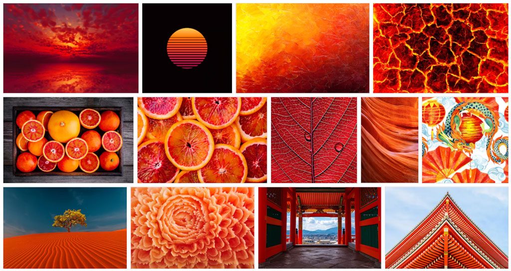
1. Lush Lava
Looking for a color that shows how your brand soars like a phoenix? The lush lava color provides warmth to your company’s marketing material.
Not only that, but it’s eye-popping enough to get a second glance every time someone scans past it.
The beautiful mix of red-orange sends a subliminal message to the customers of your product’s excitement and friendliness. A lethal combination that every client is looking for!
Use this on a trendy piece of collateral to make it stick out like the Nickelodeon sign or merely include it on a phone ad to separate it from the pack. Either way, your prospects will appreciate the beautiful and vibrant lush lava that you’re using.
2. Electrum
You, your company, and all of your prospective clients just turned over into a brand-new decade as soon as 2020 hit. That means that the future is now for your company!
Celebrate your accomplishments with the futuristic, yet equally sophisticated color of electrum.
This color is to be used as the primary on any marketing piece that you place it on. It’s meant to stand out as much as the advertisement that you’re featuring it on.
Better yet, electrum can be used for any business regardless of the industry that you’re in. It can even add a layer of pizazz to industries that normally are very formal such as a law firm or inventory management software provider.
Its perfect blend of yellow and green boasts a layer of optimism and growth.
Is your company just beginning in 2020? Electrum can be the perfect color for your logo design to show that your new business embraces the decade ahead!
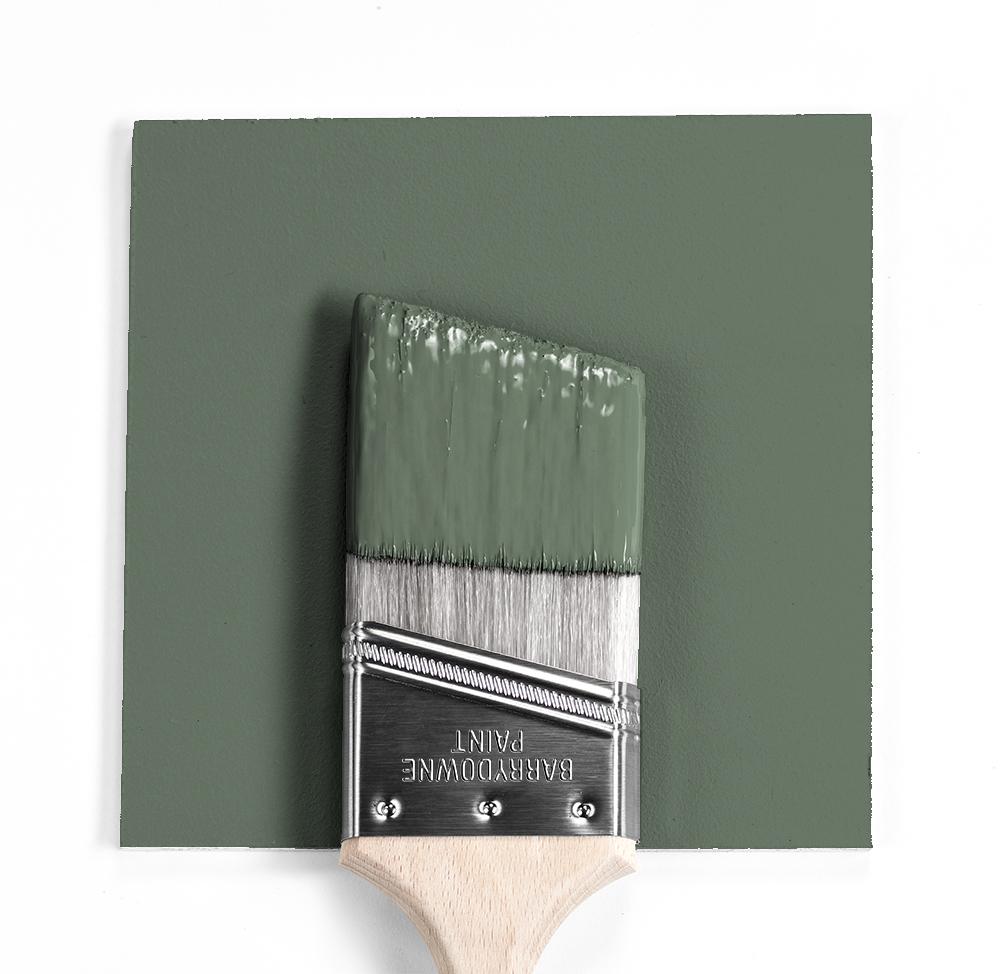
3. Cushing Green
Perhaps you would prefer not to have lively and bold colors for the marketing material you’re pushing. There are some industries out there that just aren’t meant for lively colors and that’s perfectly fine!
That said, it doesn’t mean you can’t have a little fun with the color psychology behind the colors you use.
Cushing green is a great way to use an individualistic shade that no other brand is using for their marketing tactics. It will also give off a message of peacefulness that your customers will find reassuring and refreshing.
Tons of companies use green as their primary color for that reason. Brands such as Starbucks and Spotify, for example, want to capture the satisfaction you’ll have in using their product.
If that sounds like an aspect you’re looking for in your marketing material, then give Cushing green a try!
4. Web Gray
Why hide the era of digital marketing that you’re in? Many brands try to sabotage their clients with all bold colors. They think that, by doing so, they’ll stand out. But if all other brands are doing the same… then they aren’t standing out at all.
Incorporating a color such as the Pantone color known as “Web Gray” into your marketing material can give off a message of sophistication to your clients.
Any shade of grey that’s used in marketing gives off a sense of balance and integrity that prospects long for with the products they use.
By going a bit darker with web gray, you’re separating your ads just enough without saying “Hey! Look at me! I’m trying to trick you!”. Your clients will appreciate the modesty and it will reflect nicely on your logo and/or product catalog.
5. Phantom Blue
Seriously… would this be a legitimate list of color trends without the color blue included somewhere on it?
There’s a reason that millions of companies choose blue as their primary color for their logo and marketing endeavors alike… it gives off the impression of trust.
Trust is an aspect that all customers can get on board with, regardless of what the product or service actually is. In a market where customers hear horror stories of awful business experiences, your brand simply can’t build enough trust.
By using phantom blue, you’re giving your brand an “evolved” look that shows you’ve been around for a while. Your brand can be trusted because it has the experience and know-how to back it up.
Do you love the bluish tint to a night sky right before it turns black? Then you’ll love using phantom blue on your 2020 marketing material.
Choose from All the Color Trends 2020 Has to Offer You
The beauty of picking from all the color trends 2020 has in store is that you have more options than ever before!
Now that you’ve seen a few colors to choose from, you probably have a much better idea of the color trends you want to use in things such as your logo.
Be sure to check out how you can design a killer logo with a designer in just 3 simple steps!
For more inquiries, please feel free to reach out via our contact us page and we’ll be happy to answer any and all questions that you may have!