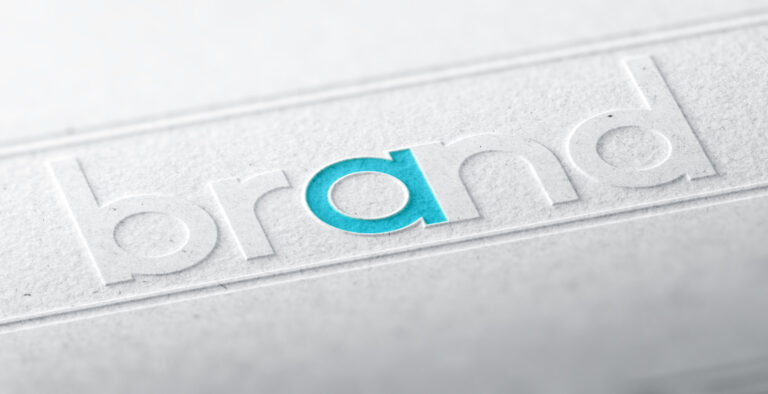
If you’re a designer, developer, or just a font enthusiast, you know the right typeface can make or break your project. And when it comes to timeless elegance, nothing beats the classic charm of serifs. In 2025, the world of serif fonts is more exciting than ever, blending tradition with innovation and offering options for every project, from editorial layouts to cutting-edge websites.
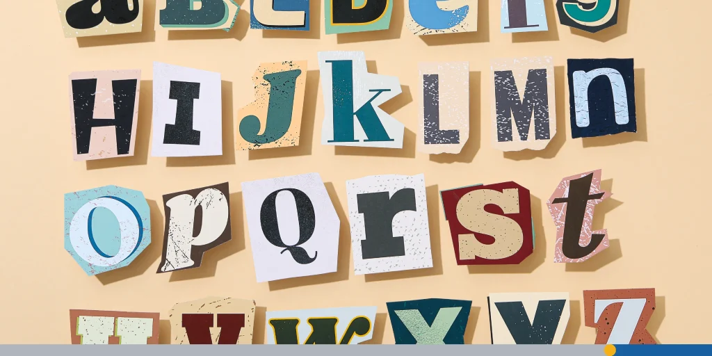
You’ve likely heard the term serif before but might not actually know what it means, and that’s okay! Serif typefaces are those that have small lines or embellishments, called serifs, attached to the ends of the strokes of letters. Serif fonts can look authoritative, professional, and suggest the weight of history or experience.
In this article, we’ll take a look at the interesting history of the serif font, what makes this font special, and which serif fonts are making a splash in 2025!
- A Brief History of the Serif
- What Makes Serif Fonts Special?
- The Best Serif Fonts of 2025
- Classic Serif Fonts Still Going Strong
- The Best Free Serif Fonts on Google Fonts
- Serif Fonts vs. Sans Serifs: When to Use Each
- How to Choose the Right Serif Font for Your Project
- Examples of Serif Fonts in Action
- The Role of Serif Fonts in Modern Web Design
A Brief History of the Serif
The origins of the serif typeface can be traced back to Roman antiquity. One popular theory is that the Roman letter outlines were first painted onto stone, and the stone carvers followed the brush marks, which flared at stroke ends and corners, creating serifs. Another theory posits that serifs were devised to neaten the ends of lines as they were chiselled into stone. Regardless of how they came into being, serifs quickly became a standard element of many modern font designs.
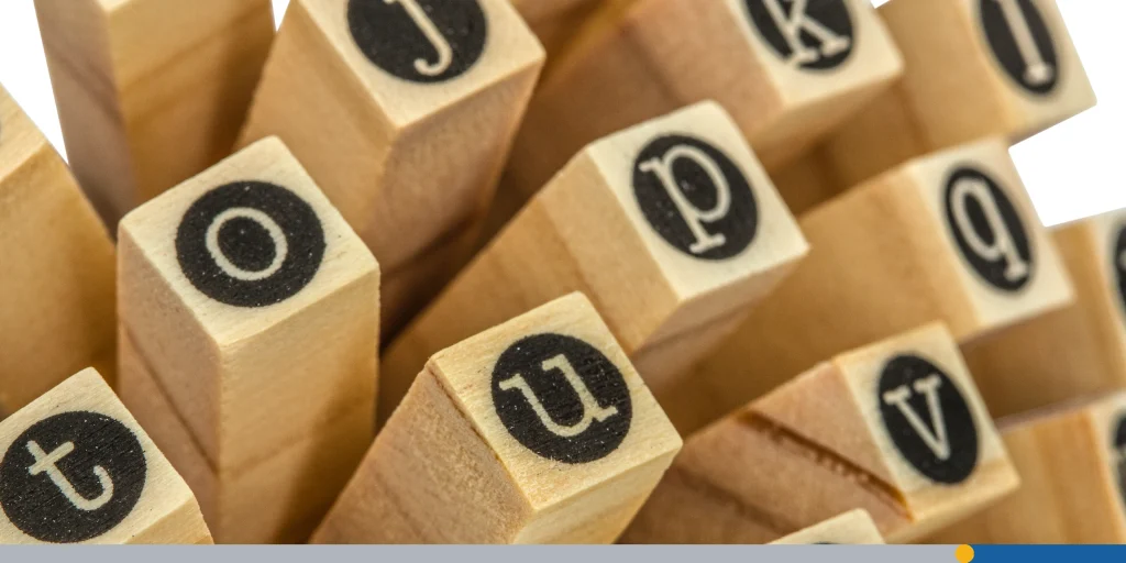
Serif fonts commonly fall into one of four different classifications. The classifications are as follows:
Old-Style
Old-style typefaces date back to 1465, shortly after Johannes Gutenberg (namesake of the WordPress Gutenberg editor) invented the movable type printing press. Early printers in Italy created types that broke with Gutenberg’s blackletter (gothic) printing, creating font styles that were inspired by Renaissance calligraphy. Old-style type is characterized by a lack of large differences between thick and thin lines and by a diagonal stress in the lettering.
Transitional
Also known as Baroque, Transitional typefaces first became common around the mid-18th century until the start of the 19th century. These fall somewhere between Old-style fonts and modern fonts, hence the name Transitional. Differences between thick and thin lines are more pronounced than they are in old style, but less dramatic than they are in the Didone fonts that followed. The ends of many strokes are marked not by blunt or angled serifs but by ball terminals.
Didone
Didone, or modern, serif typefaces, which first emerged in the late 18th century, are characterized by extreme contrast between thick and thin lines. These fonts are often considered to be less readable than transitional or old-style serif typefaces. In the last few decades, Didone typefaces have decreased in popularity in favor of older font styles.
Slab Serif
Slab serif typefaces date to about 1817. Originally intended as attention-grabbing designs for posters, they have very thick serifs, which tend to be as thick as the vertical lines themselves. One of the most famous slab serif fonts is Rockwell, which has a geometric design with minimal variation in stroke width.
What Makes Serif Fonts Special?
Before we dive into the list of our favorite serif fonts of 2025, let’s talk about what sets serif fonts apart. As we mentioned before, serif typefaces are defined by the small lines or decorative strokes attached to the ends of letterforms. These little flourishes aren’t just for show; they help guide the reader’s eye along lines of text, making long passages easier to read and giving your copy a sense of structure and sophistication.
Serif fonts are often associated with tradition, reliability, and elegance. Think of the classic look of a well-loved novel or the authority of a newspaper headline. But in 2025, serifs aren’t just for print—they’re making a big comeback in web design, branding, and even mobile interfaces, thanks to modern, screen-optimized versions.
The Best Serif Fonts of 2025
The world of fonts is always evolving, but some typefaces stand out year after year. Here’s our curated collection of the best serif fonts of 2025, with examples and tips for how to use them in your next project.
1. Apparel
Apparel is the perfect blend of classic and modern. With its contrast of thick and subtle strokes, it’s ideal for retail branding, editorial work, and anywhere you want to add a dash of contemporary elegance. Designed by Daniel Hernández and Alfonso García, Apparel is versatile enough for both print and web, and it shines in display settings.
2. Occitanie
Inspired by the olive groves and vintage signage of southern France, Occitanie brings old-world charm to modern projects. Its elongated letters and elegant strokes make it a favorite for branding, packaging, and grainy, nostalgic designs. If you want your website or product to feel artisanal and sophisticated, Occitanie is a top pick.
3. Monteci
Monteci stands out for its warm, inviting character and rounded serifs. It’s easy to read, even at smaller sizes, making it a great choice for both print and digital projects. Monteci is the typeface you reach for when you want your copy to feel approachable yet refined.
4. Astralaga
Astralaga is a dynamic serif with sleek curves and harmonious proportions. Its unique ligatures and five weights offer plenty of room for customization, making it a favorite for modern editorials, restaurant branding, and retail websites. If you want a typeface that feels both fresh and timeless, Astralaga is a must-try.
5. The Seasons
This font family is all about fluid lines and subtle stroke variation, giving it a calming, organic feel. The Seasons is perfect for wellness brands, hospitality, or any project that needs a touch of natural elegance. Its calligraphic italics add an extra layer of sophistication to your design.
6. Larken
Larken is robust and straightforward, but with a playful roundness that makes it versatile. It pairs beautifully with both serifs and sans serifs, making it ideal for text-heavy documents, display, and branding across industries.
7. Ringift
Ringift is a modern serif that balances sharp serifs with flowing ligatures. It’s a stunning choice for classic restaurant branding, menus, and product packaging. If you want to evoke tradition with a modern twist, Ringift delivers.
8. OV Treasure
For a retro vibe with a dash of elegance, OV Treasure is your go-to. This bold font comes in seven different typefaces and is perfect for vintage-inspired branding, headlines, and creative projects that need to stand out.
9. Mafins
Mafins channels mid-century modern style, blending structure with organic shapes. It’s great for editorial layouts and projects that need a balance of formality and creativity.
10. Bile
Graceful and balanced, Bile is a favorite for cosmetic and fashion brands. It pairs well with sans serifs, making it a flexible option for brand identities and magazine settings.
11. Romie Regular
Romie Regular is all about high fashion and Art Nouveau flair. With 12 styles and support for over 300 languages, it’s a display font that adds instant luxury to magazines, packaging, or high-end branding.
12. Elgraine
Elgraine is expressive and bold, designed for beautiful branding. With an extended character set supporting over 200 languages, it’s as functional as it is eye-catching.
13. Fortnight
Hand-lettered and full of charm, Fortnight is a unique choice for branding and packaging. It’s approachable, authentic, and sure to make your project memorable.
14. Hacky
Hacky is multifaceted—luxurious yet contemporary. With unique features and plenty of weights, it’s ready for both classic and innovative projects.
15. Bodoni
No list is complete without Bodoni. This classic serif, known for its high contrast and refined elegance, is a staple for body text and long-form print. The 2025 version is a modern remake that’s perfect for editorial layouts and luxury branding.
Classic Serif Fonts Still Going Strong
While new fonts are exciting, some classics never go out of style. Here are the timeless serif fonts that continue to dominate in 2025:
- Times New Roman: The gold standard for formal documents and academic writing, Times New Roman is as versatile as ever.
- Georgia: Designed for screen readability, Georgia’s large x-height and open letterforms make it a favorite for web and print alike.
- Didot: High-contrast and elegant, Didot is the font of choice for fashion, luxury, and editorial projects.
- Caslon: With roots in the 18th century, Caslon remains a reliable choice for books, magazines, and corporate communications.
- Garamond: Known for its old-style elegance, Garamond is ideal for long-form reading and classic branding.
The Best Free Serif Fonts on Google Fonts
Not every project has a big budget, but that doesn’t mean you have to sacrifice quality. Google Fonts offers a fantastic collection of free serif fonts that are optimized for web use, easy to integrate, and highly readable.
Here are the top picks for 2025:
- Playfair Display: Elegant, sophisticated, and perfect for headings or titles. Its variable font options make it versatile for both display and body text.
- Lora: A modern serif with calligraphic roots, Lora’s balanced contrast makes it a favorite for both headings and body copy on websites.
- Merriweather: Designed for readability, Merriweather is a classic serif that works beautifully for long articles and books.
- Libre Baskerville: Inspired by the classic Baskerville, this font’s tall x-height and wide counters enhance on-screen legibility, making it perfect for website body copy.
- Crimson Text: Vintage-inspired and highly readable, Crimson Text is a great choice for editorial content and print.
- Arvo: A geometric slab serif that’s bold and modern, Arvo works well for web headings and branding.
- Bree Serif: Friendly, stylish, and contemporary, Bree Serif is great for projects that need a touch of personality.
- Josefin Slab: Vintage, geometric, and thin, Josefin Slab is perfect for retro-inspired websites and branding.
All these fonts are free to use, easy to embed in your website, and come in multiple weights and styles, making them perfect for any project on a budget.
Serif Fonts vs. Sans Serifs: When to Use Each
The eternal debate: serif or sans serif? Here’s the lowdown. Serif fonts, with their decorative strokes, are perfect for projects that need to convey tradition, elegance, or authority. They’re great for:
- Editorial layouts (magazines, newspapers, books)
- Branding for law firms, luxury goods, or medical professionals
- Websites that want a classic, trustworthy vibe
Sans serifs, on the other hand, are clean, modern, and minimalist. They’re ideal for:
- Tech startups and digital products
- Modern fashion brands
- User interfaces, apps, and websites where clarity and legibility are key
But here’s the fun part: you don’t have to choose just one! Pairing a serif font for headlines with a sans serif for body text (or vice versa) creates visual contrast and hierarchy, making your design more engaging and readable.
How to Choose the Right Serif Font for Your Project
With so many options, how do you pick the best serif font for your website, article, or branding project? Here are a few tips:
- Consider your audience: Are you aiming for tradition or innovation? Formality or friendliness?
- Think about readability: For long-form content, choose serifs with clear letterforms and good spacing.
- Mix and match: Pair serifs with sans serifs to create contrast and guide the reader’s eye.
- Check weights and styles: Make sure your chosen font has the weights (bold, light, italic) you need for your design.
- Test on all devices: Some serifs look great on desktop but lose clarity on mobile screens. Always preview your font choices in context.
Want to try out a serif font for your company logo? FreeLogoServices’ AI-powered logo maker allows you to try out thousands of different font options until you find one that is a perfect fit!
Examples of Serif Fonts in Action
Some of the world’s most famous brands use Serif fonts. Here are some of our favorites:
GAP
Since the mid-1980s, the GAP logo has used a sans serif font called Spire Regular. Although in 2010, GAP did go through a misguided rebranding that saw them pivot to a sans serif font. The company quickly changed back to a serif font, which gives the logo a classic, timeless look that is perfect for their brand.
Rolex
The iconic luxury watch brand has used a serif font for decades. The custom font was based on a serif font called Stempel Schneidler-Lubell Pro. The Rolex font makes the brand seem historic and prestigious.
Time Magazine
Time magazine uses the classic serif font Times New Roman. This font was originally designed by Stanley Morison in 1929 for the Times of London. Times New Roman lends a sense of credibility, authority, and stability to the famous publication.
Sony
While the Sony logo uses a custom typeface, it draws heavy inspiration from classic sans-serif fonts like Helvetica. Many tech and electronics companies use the more modern-looking sans serif typefaces, but Sony has opted to go for a more classic and traditional look.
The Role of Serif Fonts in Modern Web Design
Serif fonts aren’t just for print anymore. Thanks to advances in font rendering and responsive design, serifs are making a big comeback on the web. They add personality, improve readability for long-form content, and help brands stand out in a sea of sans serifs.
When using serifs on your website, keep these tips in mind:
- Use larger sizes for headlines and display text.
- Adjust spacing and kerning for mobile screens.
- Pair with a clean sans serif for navigation and UI elements.
- Test for SEO benefits—serif fonts can improve readability, lower bounce rates, and enhance your site’s credibility.
Conclusion
Serif fonts are having a major moment in 2025. From timeless classics to innovative newcomers, these typefaces offer endless ways to elevate your design, whether you’re working on a website, branding project, or editorial layout. The best serif fonts combine elegance, readability, and versatility, making them a smart choice for designers who want their work to stand out.
Ready to change up your font game? Explore the full collection of the best serif fonts of 2025 using FreeLogoServices‘ initiative and easy-to-use logo maker!
FREQUENTLY ASKED QUESTIONS
What are the best serif fonts for professional use?
Classic choices like Times New Roman, Georgia, Caslon, and EB Garamond are top picks for professional documents, books, and editorial content. Modern options like GT Super and Recoleta add a fresh touch while maintaining a professional look.
Where can I find the best free serif fonts?
Google Fonts is the go-to source for free, high-quality serif fonts. Popular choices include Playfair Display, Lora, Merriweather, Libre Baskerville, and Crimson Text. Font Squirrel and Adobe Fonts are also great resources.
How do I pair serif fonts with other fonts?
Serif fonts pair beautifully with sans serifs. For example, use a serif like Bodoni or Times New Roman for headlines, and a sans serif like Open Sans or Lato for body text. This creates contrast and improves readability.
Are serif fonts good for web use?
Yes, especially modern serifs designed for screens. Fonts like Georgia, Lora, and Playfair Display are optimized for digital use and look great on both desktop and mobile.
What’s the difference between display and text serifs?
Display serifs are designed for headlines and large text, often more decorative and eye-catching. Text serifs are optimized for readability at smaller sizes, making them ideal for body copy.
Can serif fonts improve my website’s SEO?
Absolutely! Serif fonts enhance readability, keep visitors engaged, and lend authority to your site, all of which can contribute to better SEO and lower bounce rates.